Project name: Traektoriya Flagship Store in Aviapark
Interior design: Sinitsa Bureau
Design Team: Anastasia Kolchina, Darya Kirpichnikova, Varvara Serebrova, Andrey Stenyushkin, Anastasia Emelyanova, Tatyana Butrinova, Kristina Yakovleva
Location: Aviapark ,Khodynsky Blvd, 4, Moscow, Russia
Photo: Dmitry Suvorov
Area: 300 m²
Year: 2025
Project description from design firms Sinitsa Bureau
Traektoriya is more than a sports retail chain: in its own legend, it began as a surf party that gathered together people who never miss a festival in their sport and who are willing to invest in truly high-quality gear. Over time, the brand itself became a mark of trust: if something is sold at Traektoriya, it is perceived as one of the best products in its segment. The Aviapark location already existed in an older design, but with the intention to widen the audience and raise the bar, the company decided to make the store bigger and better—turning it into a flagship.
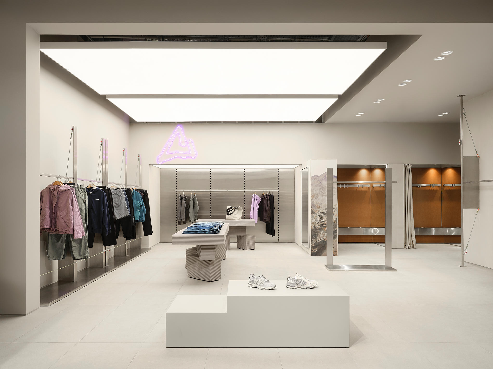

The architects received a challenging “original”: a long, narrow, elongated space with the stockroom at the far end, plus an additional trading level above it. The previous layout felt discouraging at first—because in retail, the plan is everything: it influences navigation, the customer journey, and ultimately the success of the store and the clarity of the interior. After a period of real struggle with planning, the team found a solution that “turned lemons into lemonade,” transforming constraints into a strong spatial concept.
The core idea of the flagship can be summarized as: a surf party that has grown up into a serious store, while keeping its social, community spirit alive. The interior aims to remain a “place to hang out” rather than a cold marketplace—despite the fact that the client’s key requirement is to show a wide range and a large quantity of products. From the start, it was understood that the merchandise would be abundant and present throughout the space, and the design had to embrace this reality, not fight it.


YOU MIGHT ALSO LIKE
At the same time, Traektoriya’s audience is modern and visually literate. Neither the designers nor the client team wanted the flagship to resemble a market of racks and shelves. The main task therefore became a careful balance: functional retail efficiency + a fashionable, coherent environment that feels friendly and welcoming. The project began with a small meditation that produced an image the team held onto; although the path was labor-intensive, that initial image ultimately guided the final atmosphere.
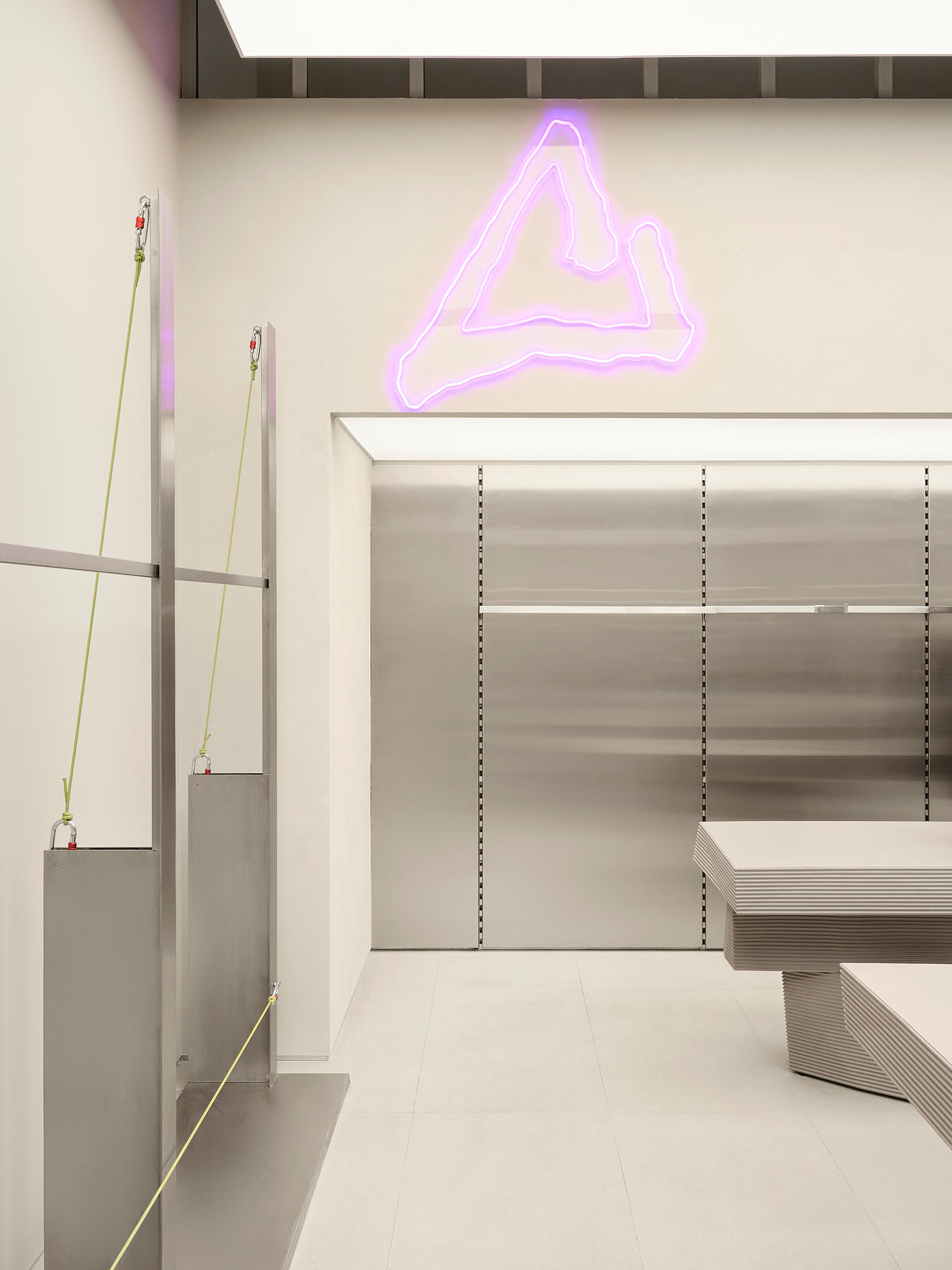
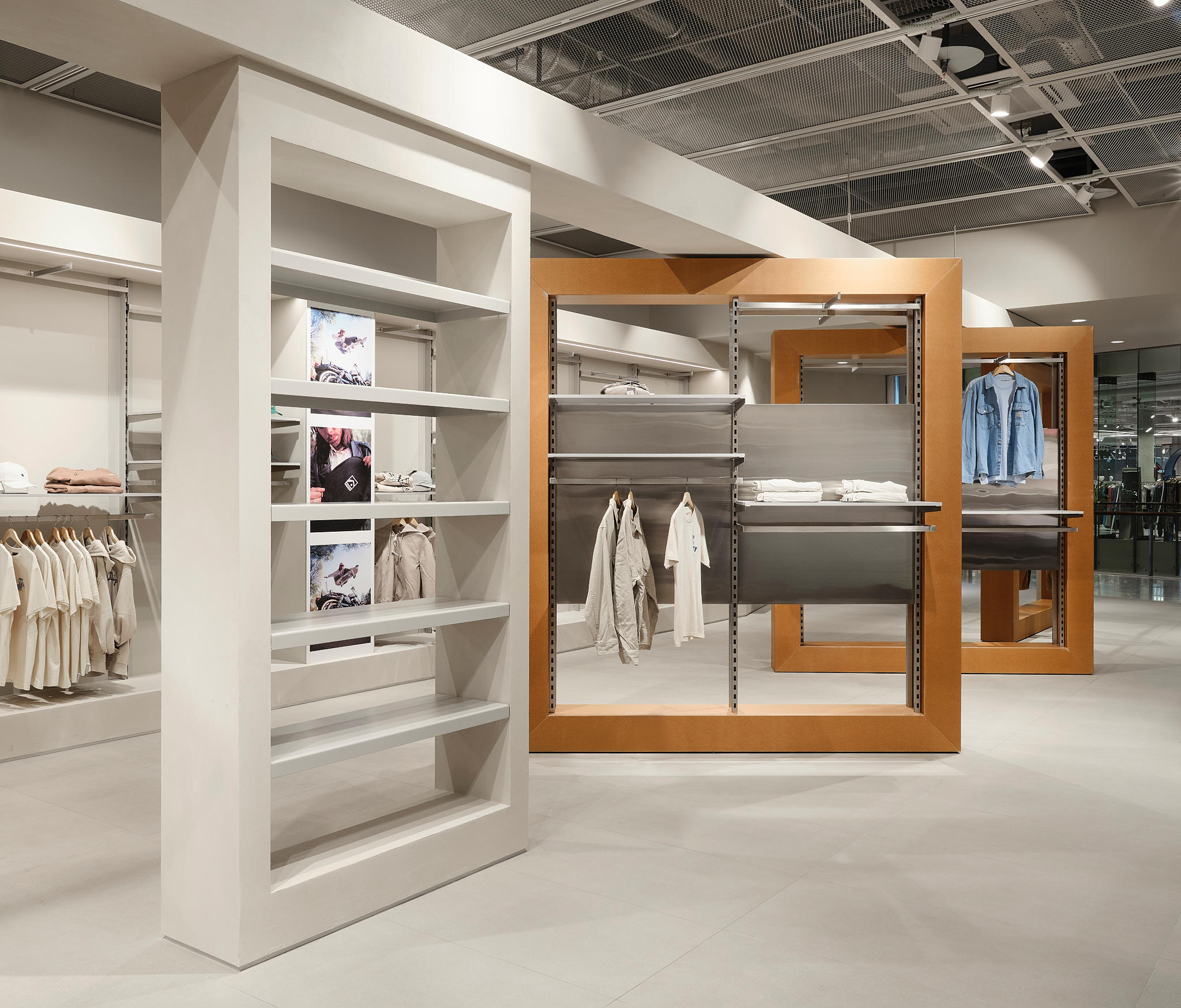
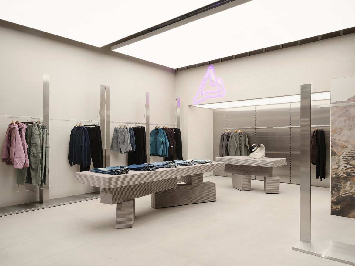
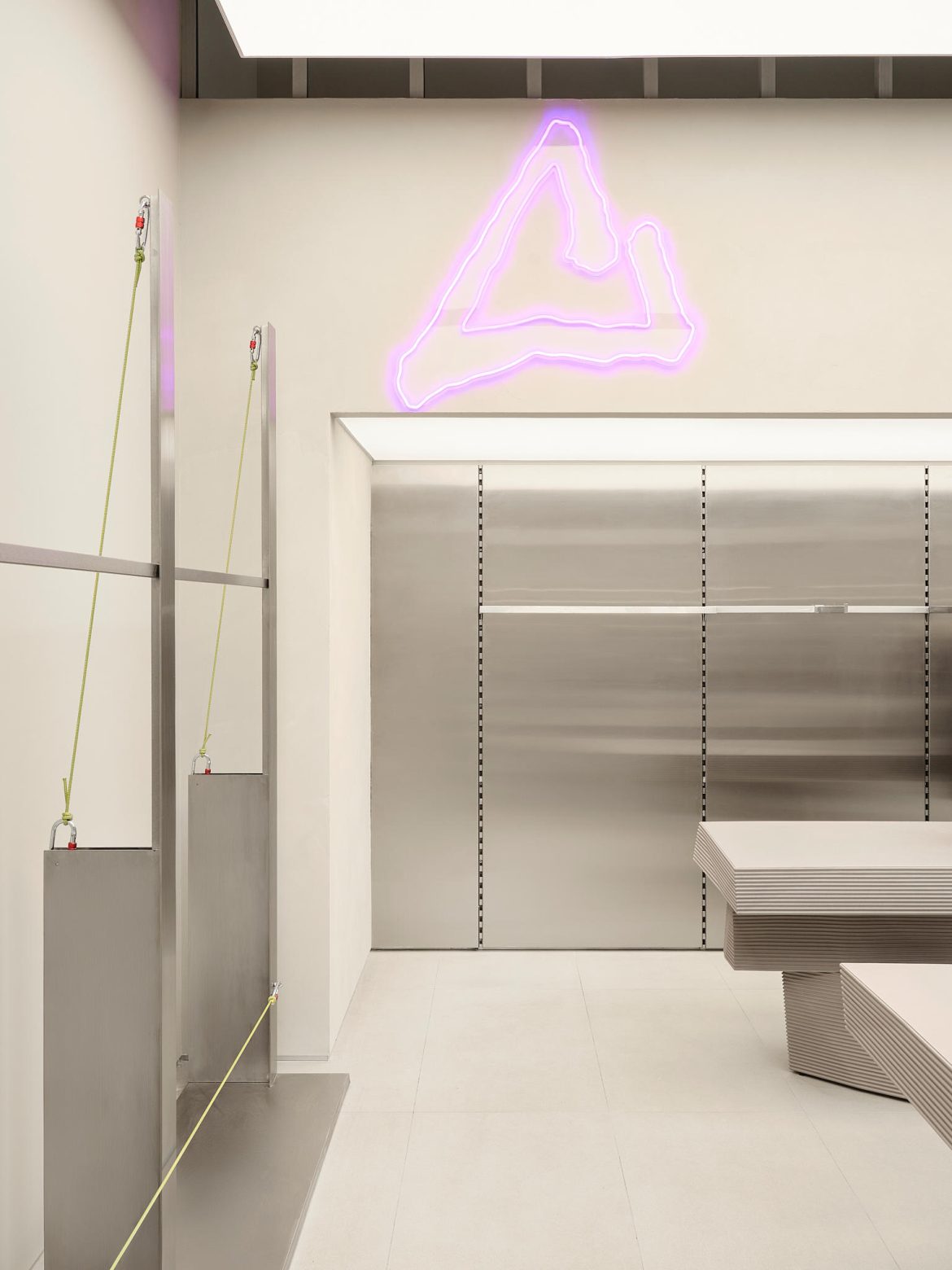
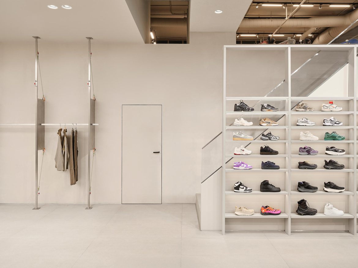
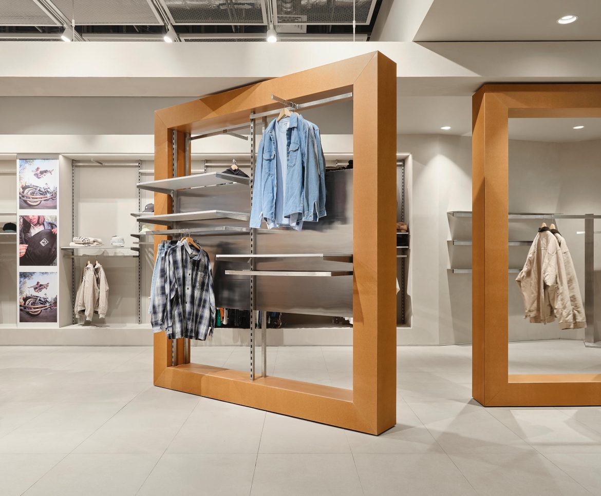
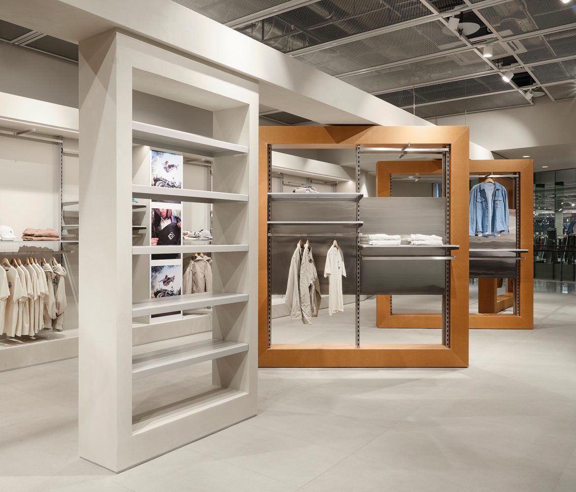
Spatially, the store is conceived as a labyrinth of adventures—a journey shaped by the architecture of the “original” space: its elongated depth, columns, and high ceiling. The hero element is a “smart” transformable wall at the entrance. This wall can reconfigure into a labyrinth and became the project’s “main star.” It sets a playful tone right away: a customer doesn’t simply walk into a rectangle filled with goods; instead, they enter a space that invites exploration and can be “changed” through a shifting spatial game.

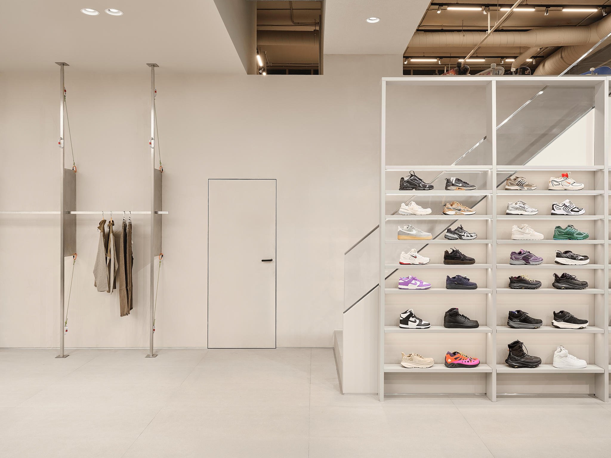

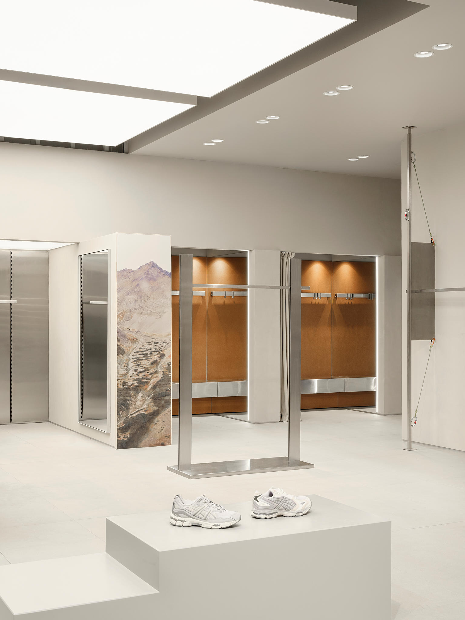
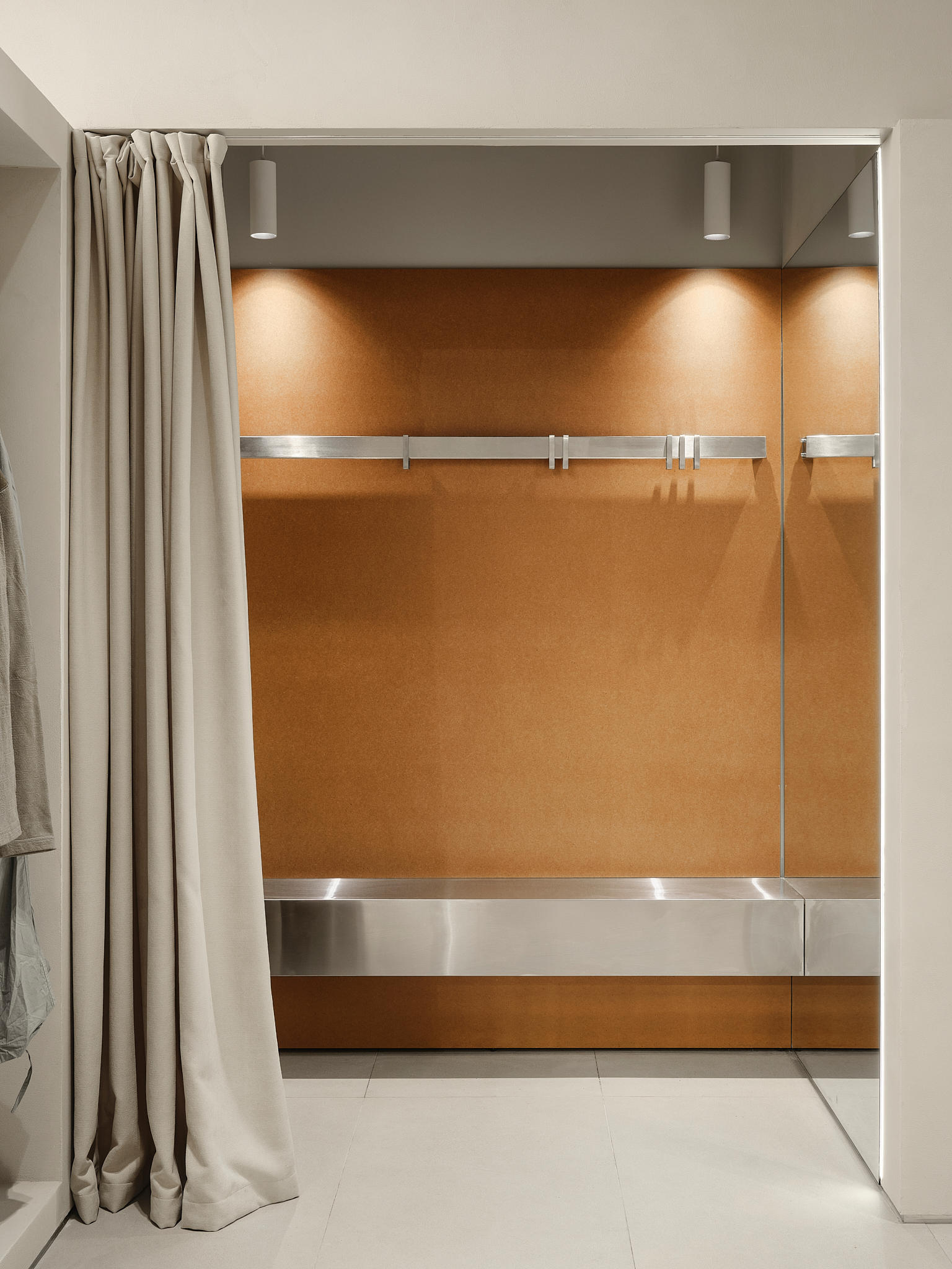
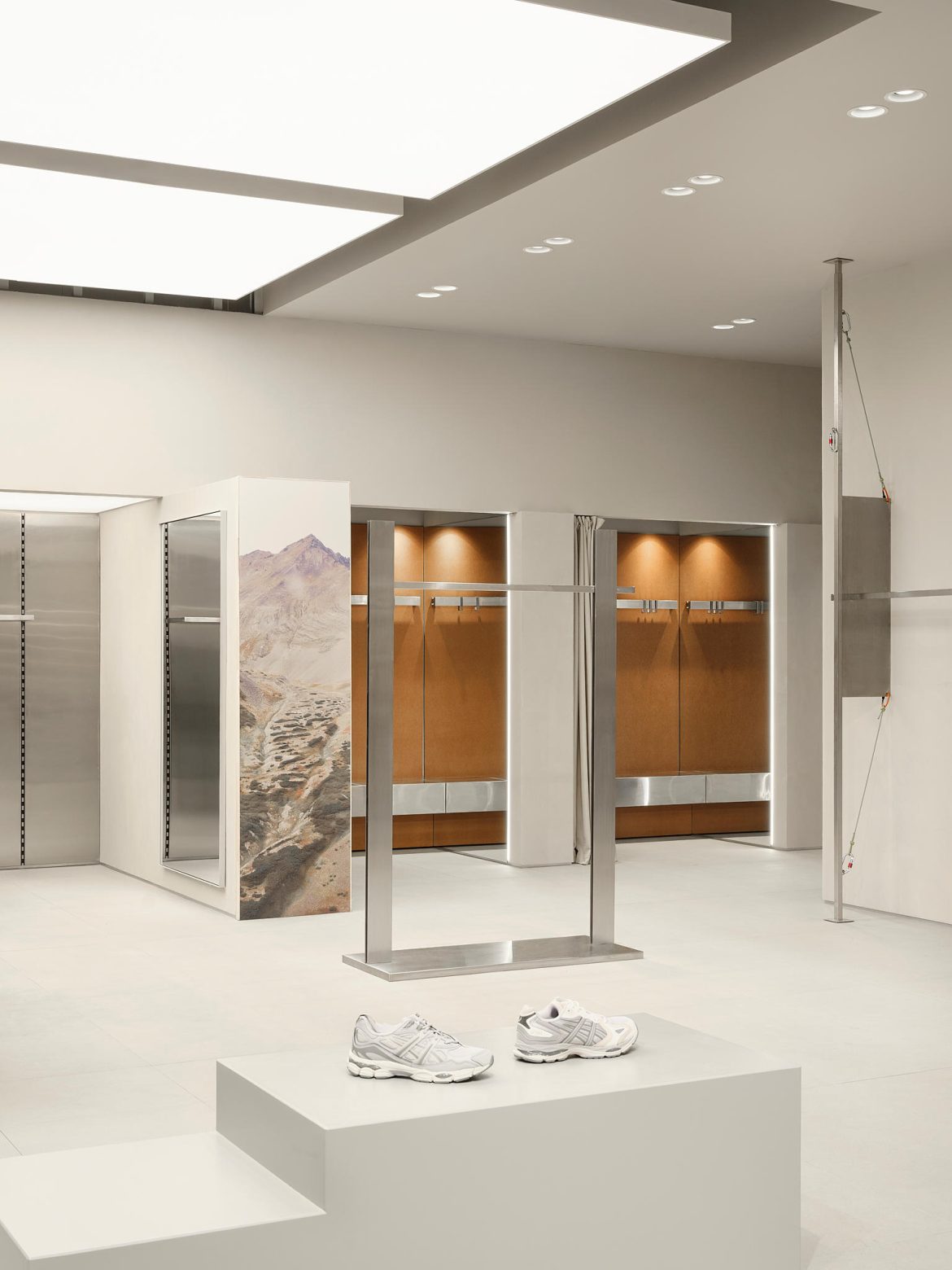
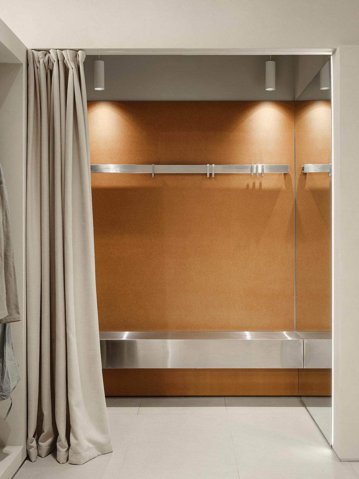
Practical decisions reinforce this concept. The second level above the stockroom was solidly built, and dismantling the metal framework would have been expensive, so it was preserved. The customer route was adapted to the already established contour rather than forcing a full rebuild. Fitting rooms were placed to the left of the stockroom, and they were made generously sized—comfort is treated as part of the flagship experience, not an afterthought.
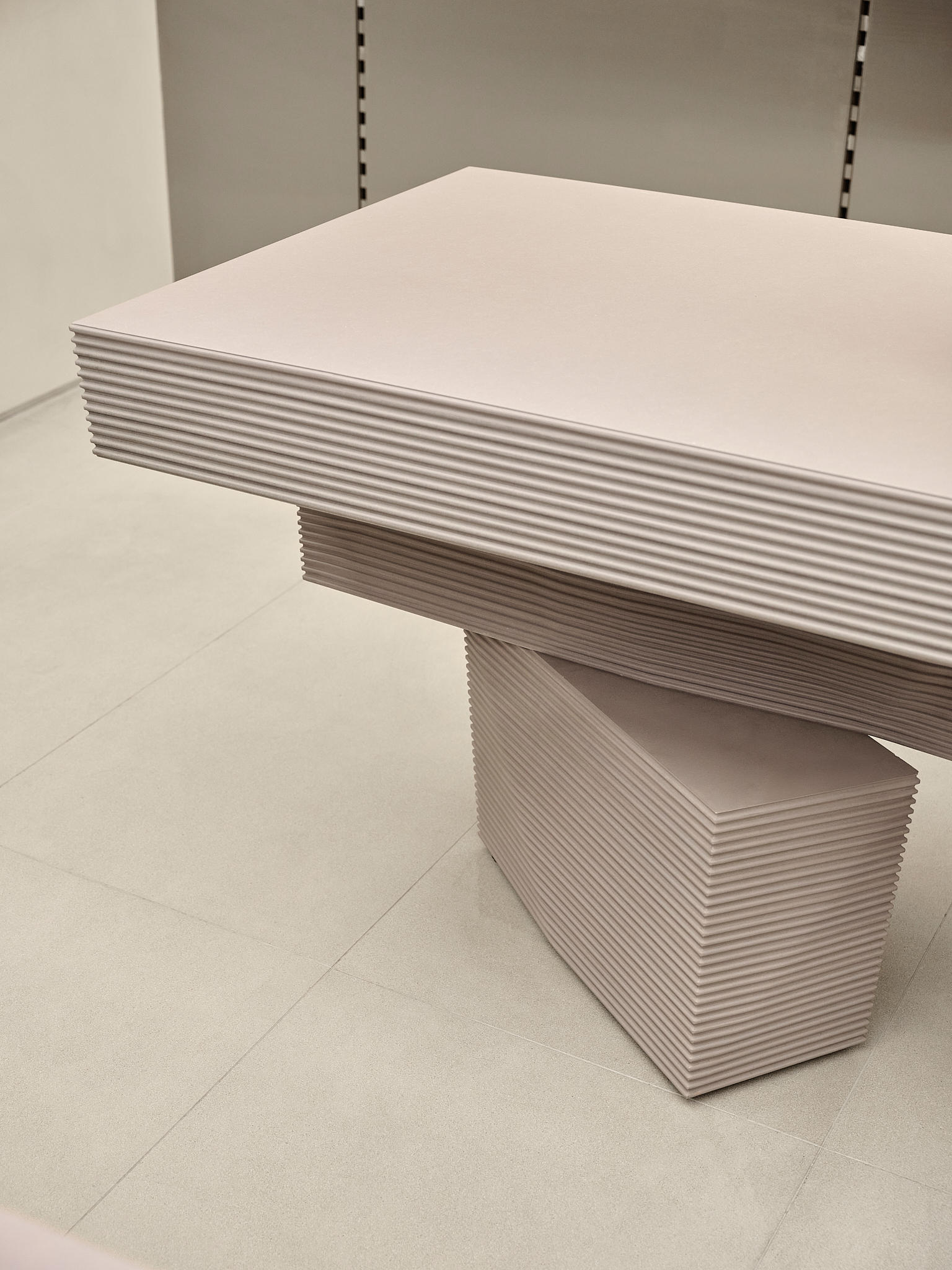
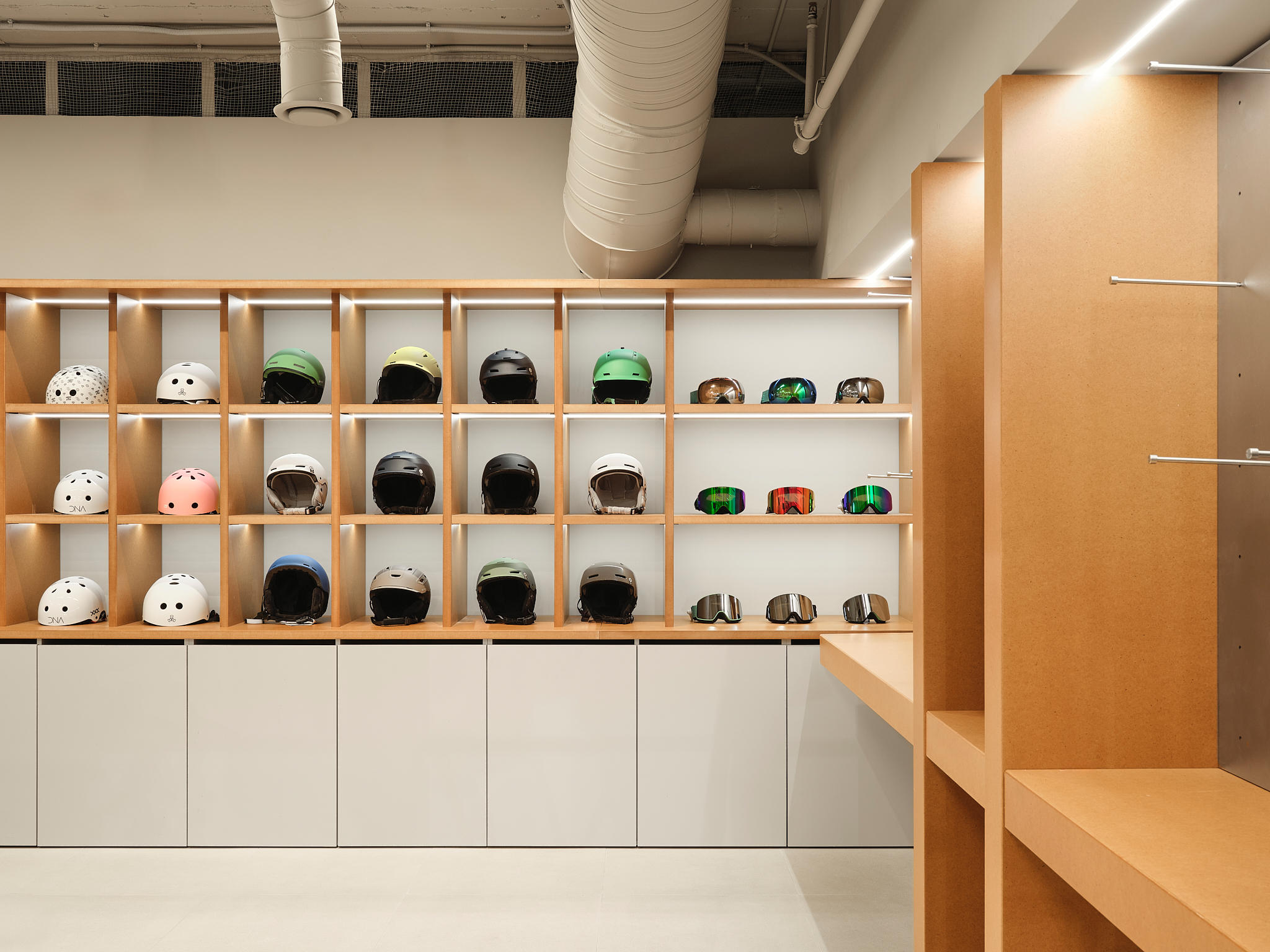
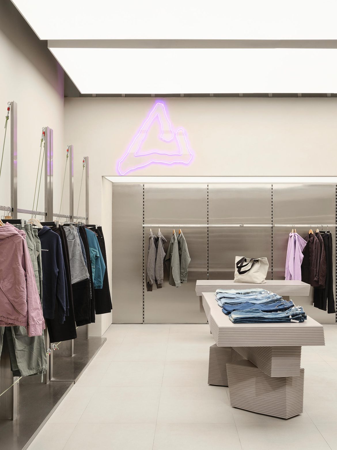
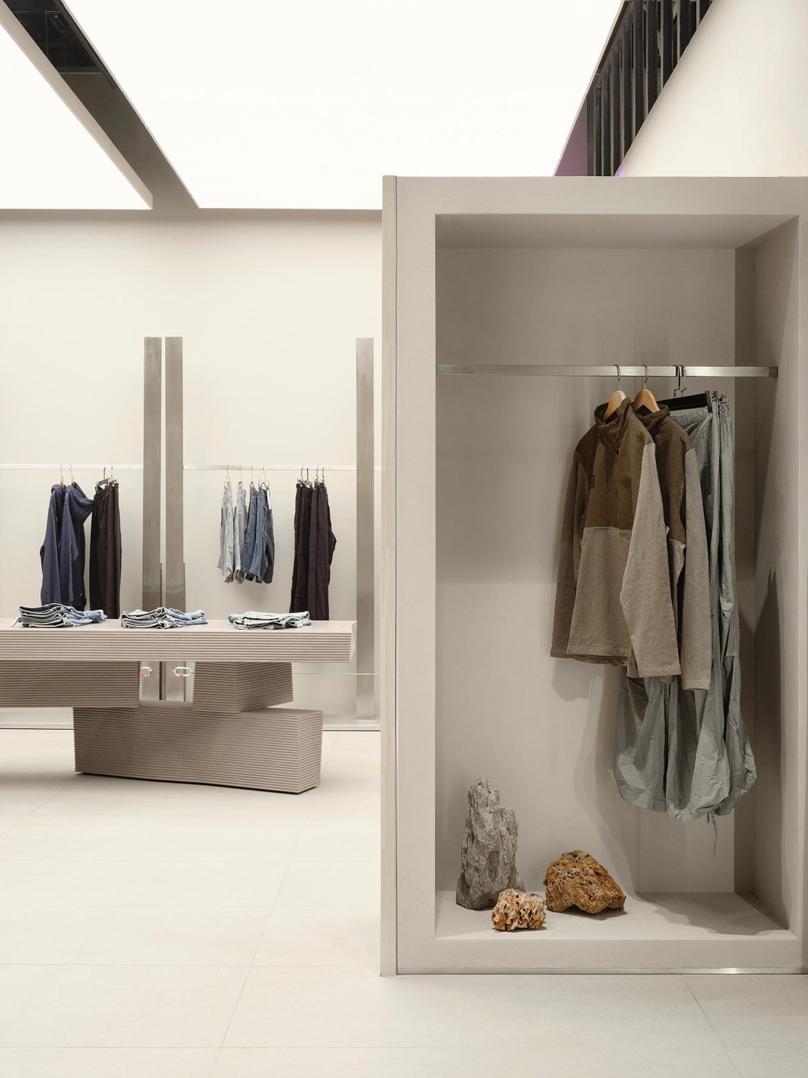
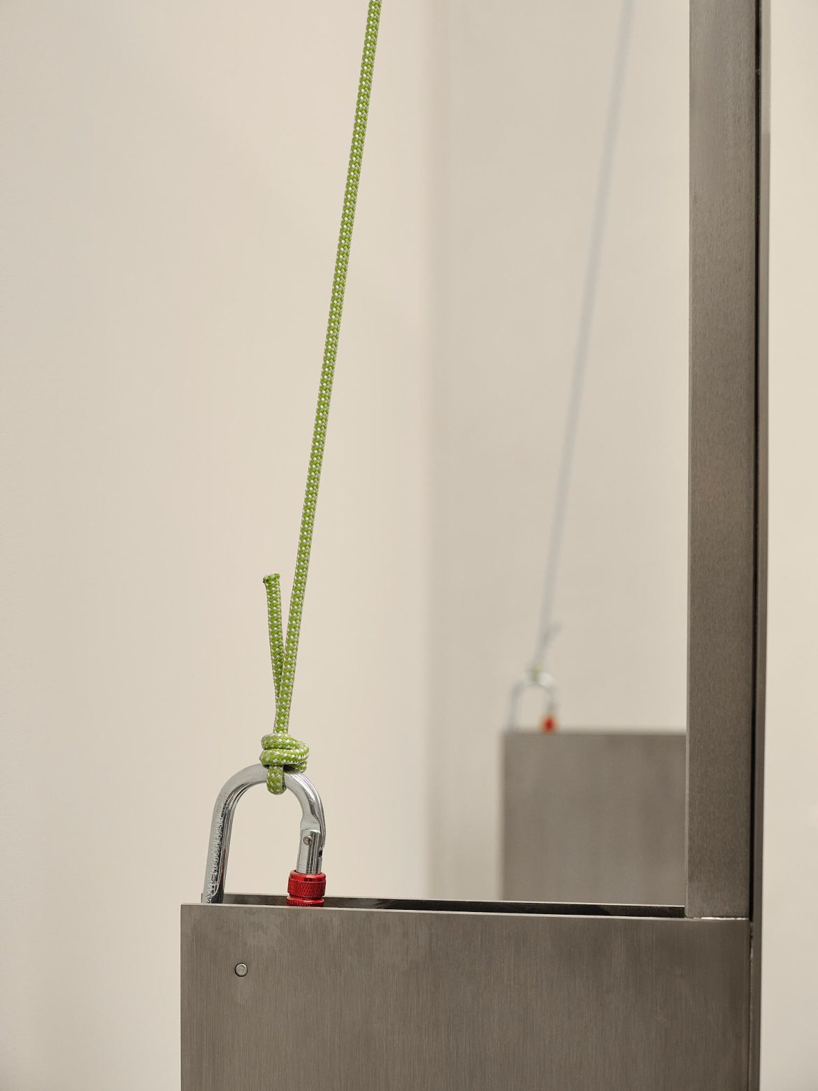
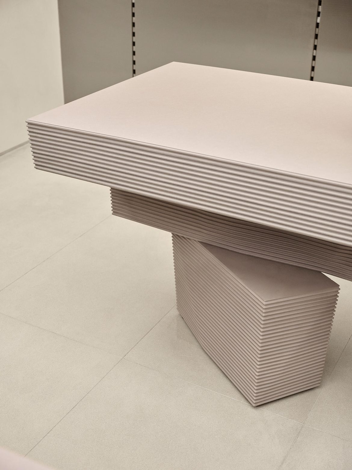
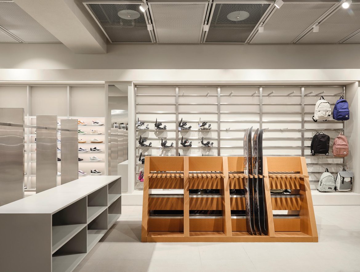
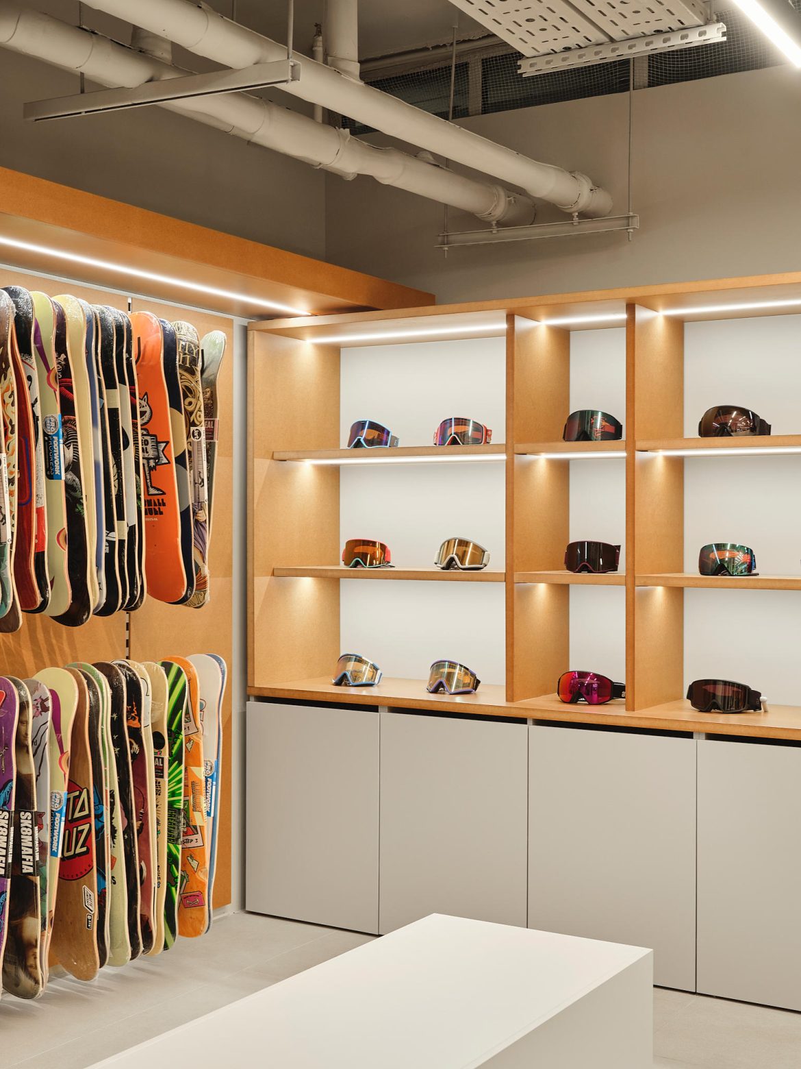
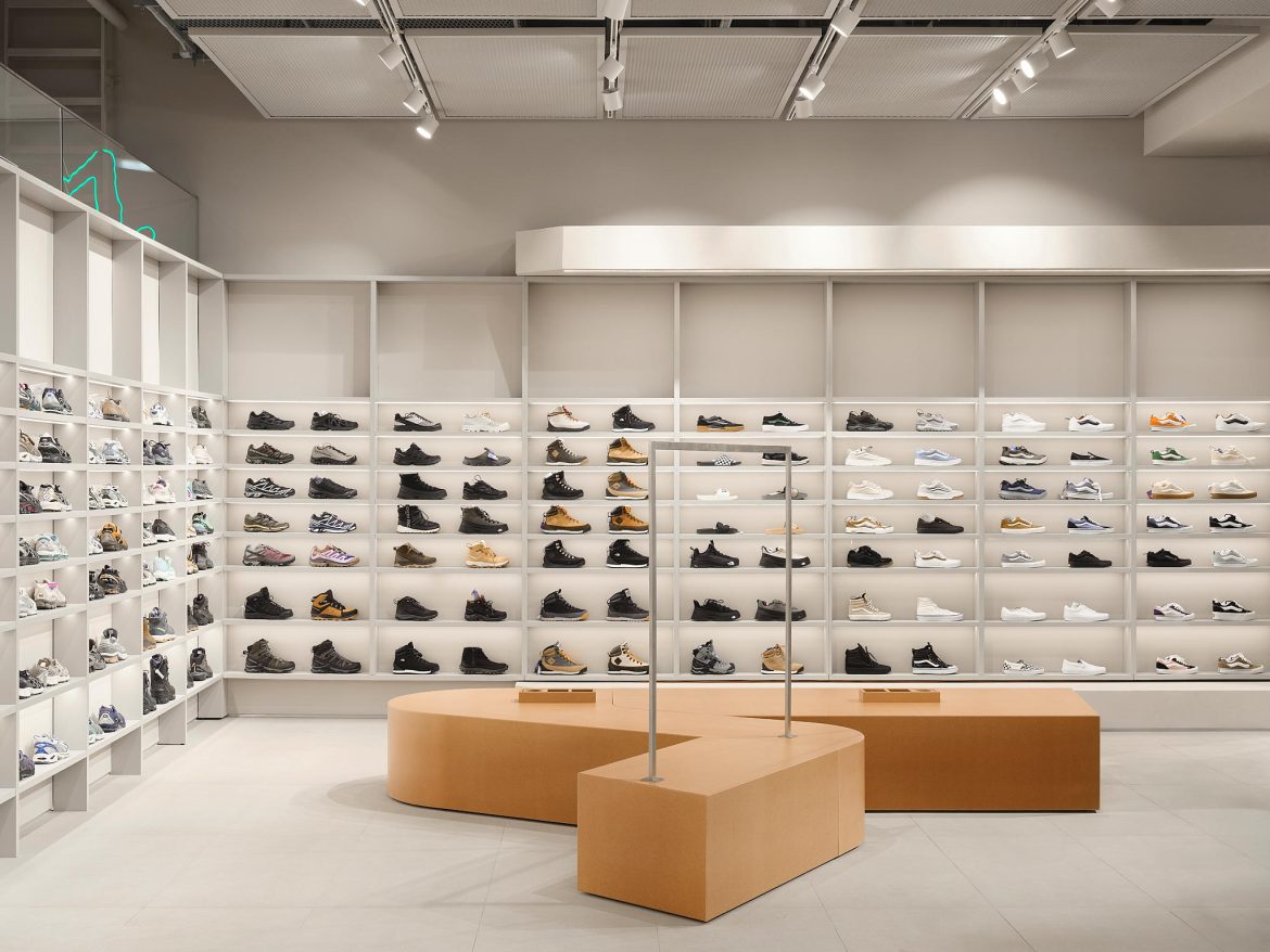
Key zones punctuate the journey. In the back, a shoe department awaits, organized to present “everything at once” in a convenient way, with a spacious fitting area at the center. A Peak corner before the fitting rooms is distinguished by its own lighting and equipment details; large lightboxes create the feeling of a “store within a store” without heavy-handed tricks. Detail work adds character: rails with inventive carabiners and straps, and tables that look either carved from rock or 3D-printed—enhanced by the soft, slightly comic glow of the lightboxes.

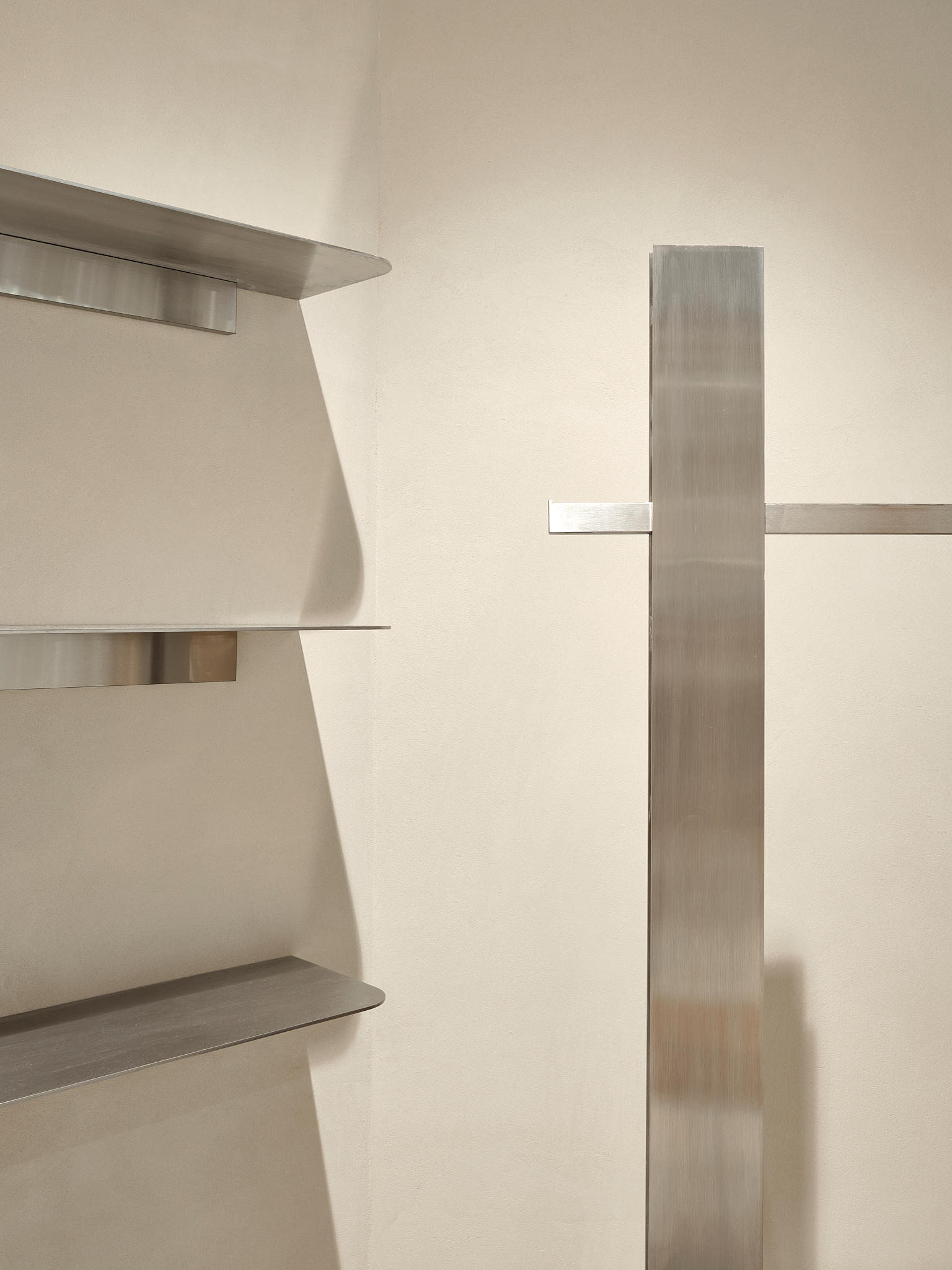

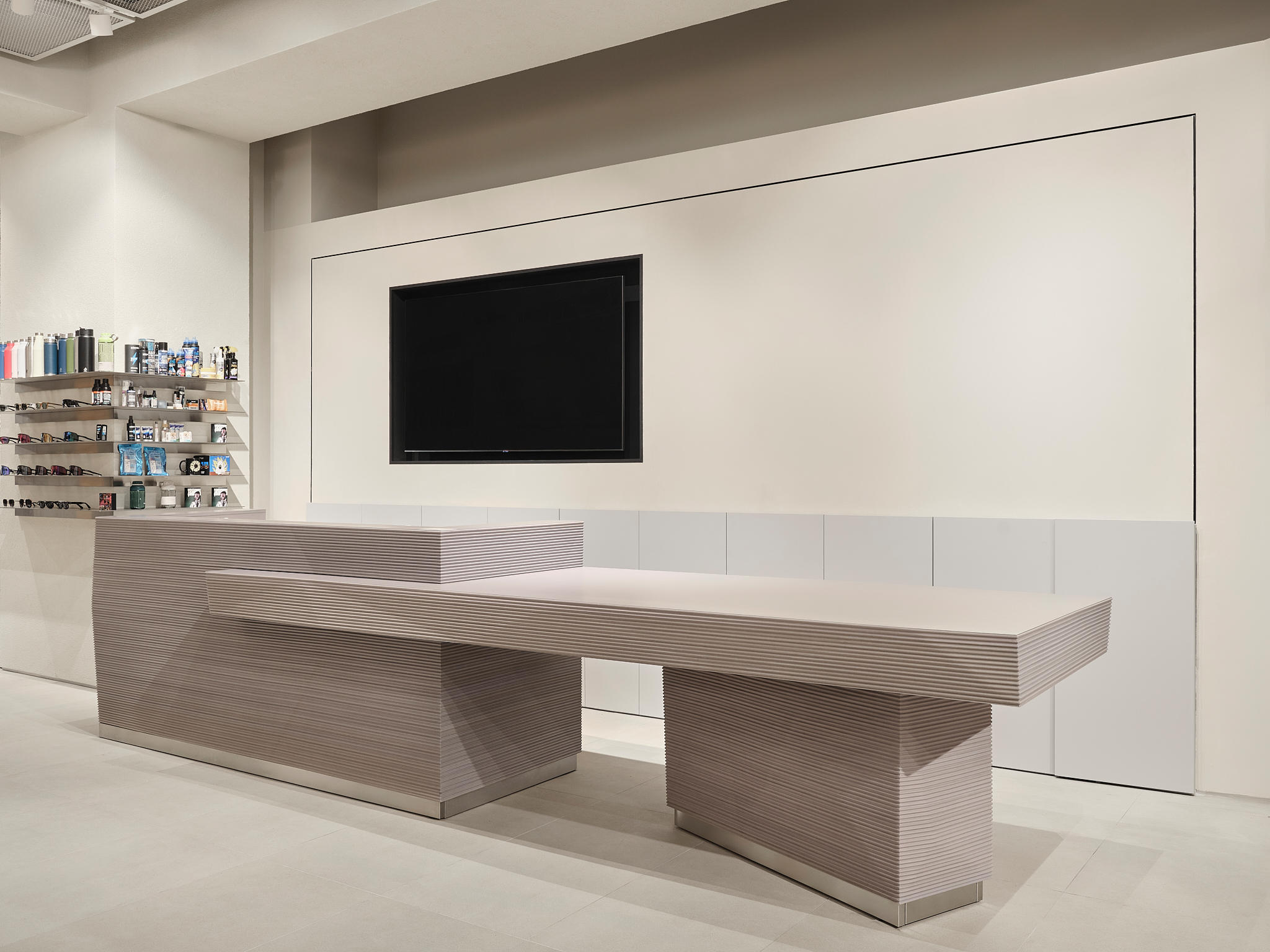
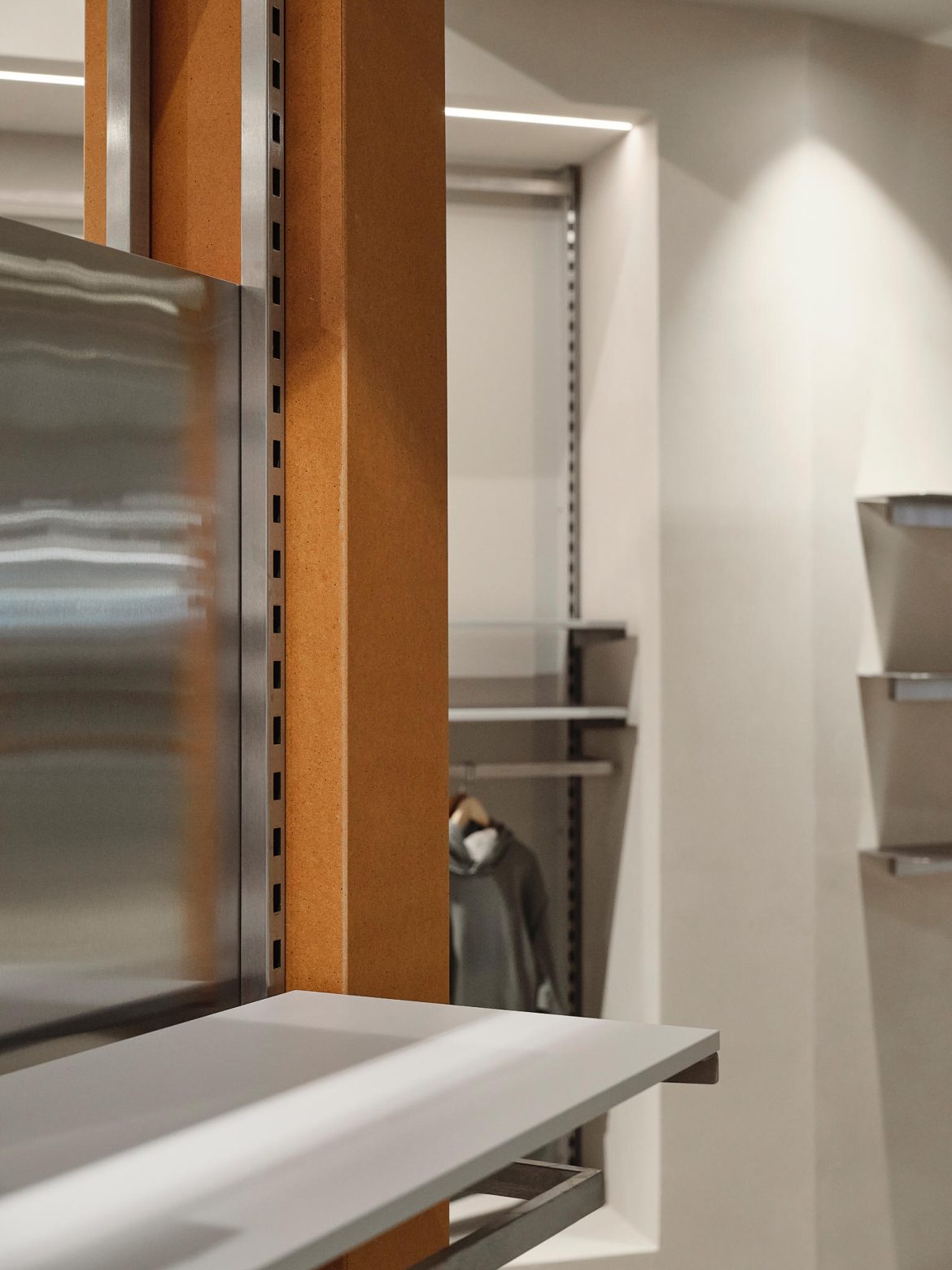
Material and lighting choices are deliberately restrained yet expressive. Much of the visual identity is built on the color of plaster, the tone of lighting, and unpainted MDF. Stainless steel plays a role “like a violin in an orchestra,” placing sharp accents rather than dominating everything. Valchromat—through-colored MDF—became an experimental but important element: it can be milled, and the ribbed surfaces that make certain forms so distinctive are created simply through CNC routing. Even the ceiling evolved: the initial idea of leaving it fully open shifted toward a mesh solution that made the store feel more precise and orderly.
The result is a flagship that does not compete with the typical “cold light + shiny steel” retail stereotypes. Instead, it offers a place where visitors want to linger, try on sneakers—and perhaps try on a dream version of themselves.
