Project name: POISON DROP store
DA Bureau : Anna Lvovskaia, Boris Lvovskiy, Fedor Goreglyad, Maria Romanova
Project team: Anna Lvovskaia, Boris Lvovskiy, Fedor Goreglyad, Maria Romanova, Olga Belyakova, Alexander Pankov
Location: Moscow, Russia
Photo: Nikita Subbotin (Landon Studio)
Area: 160 m2
Year: 2023
Project description from design firms DA Bureau
Poison Drop is a multi-brand jewellery shop positioning itself as a ‘jewellery department store’ where everyone can find a stylish accessory reflecting the latest trends. The brand aims to change stereotypes about jewellery as something expensive and inaccessible, while avoiding the mass-market approach associated with low quality. Poison Drop carefully positions its selection of jewellery in the middle price segment, which is a bright accent and a spectacular addition to any brand. The stylistics of the presented jewellery are diverse – from super minimalist and basic jewellery, to flashy and large statement jewellery.
AXONOMETRY OF THE GROUD FLOOR


NOW

The brand already had an online platform and a few offline shops, but their interiors were rather bland and lacked the manifestation of the very strong ideology of the brand. At the same time, all the internal technical processes at Poison Drop were organised at the highest level and needed to be preserved.


We had a task to rethink the visual image of the brand, giving it brightness, uniqueness and recognisability, combining it with suitable logistics of the space for the convenience of visitors and staff. We wanted to visualise the brand ideology and bring the interaction of customers with the shop space to a whole new level. We developed a new visual corporate style and implemented it in our first project – Poison Drop on the Patriarch Ponds in Moscow. We are also working on several more shops in different locations.


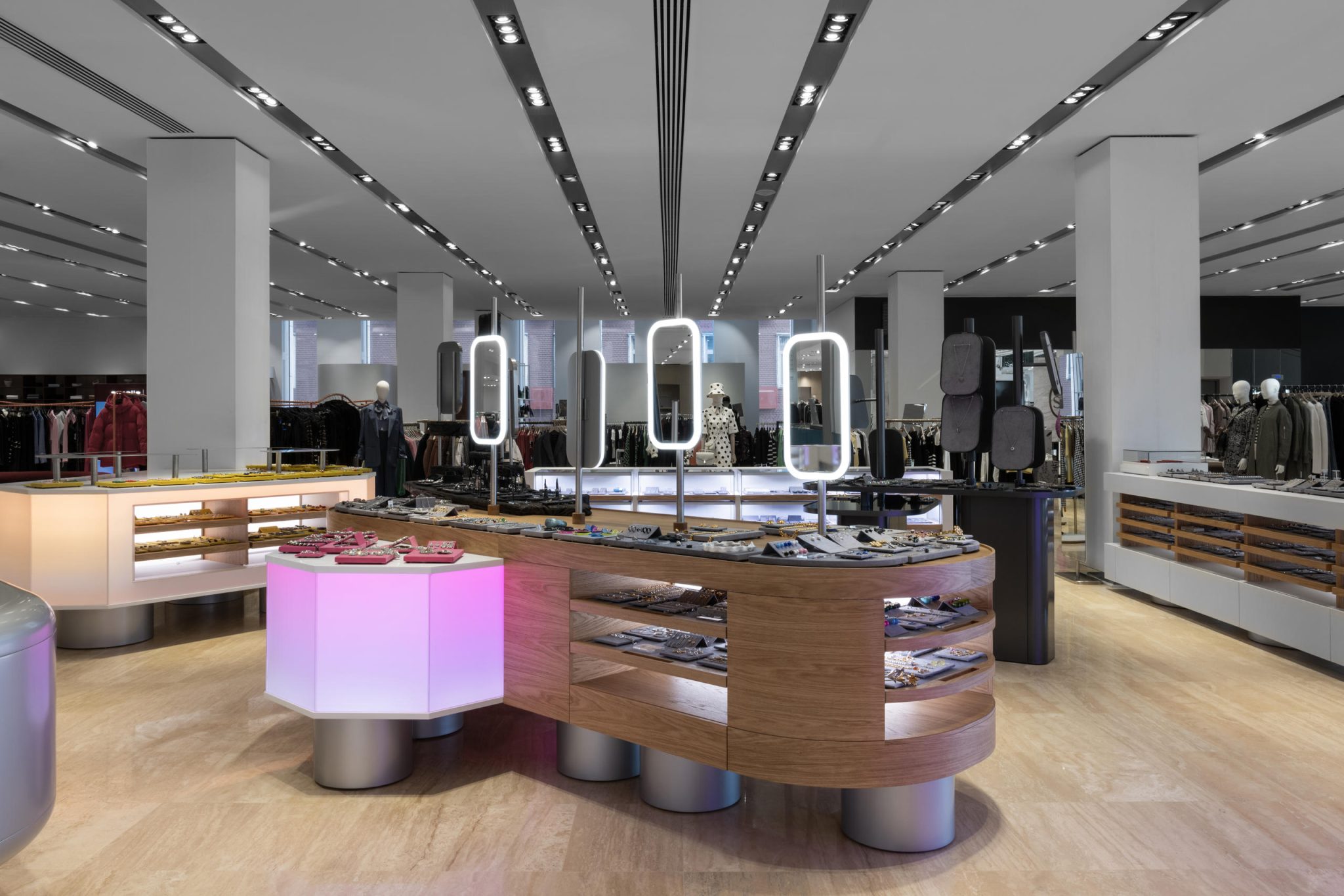
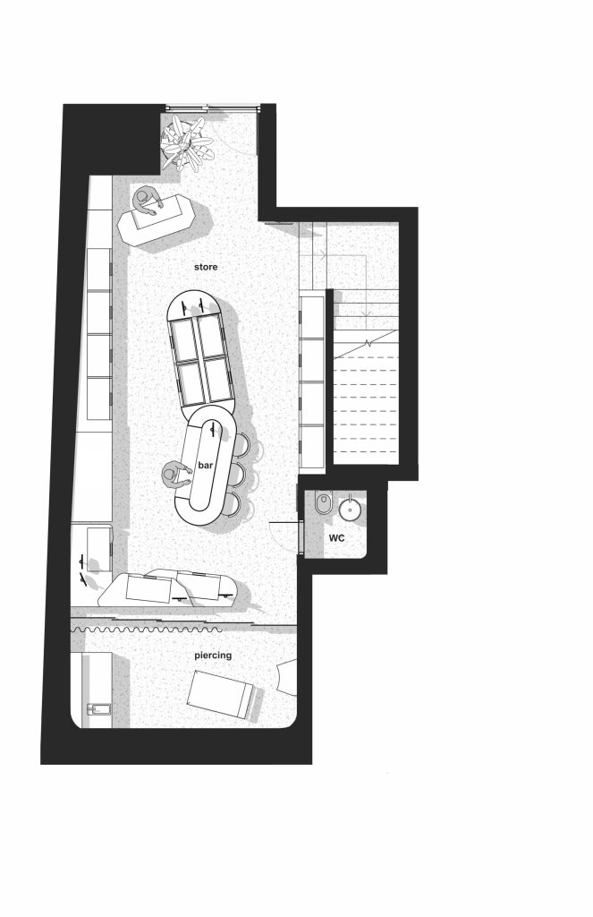
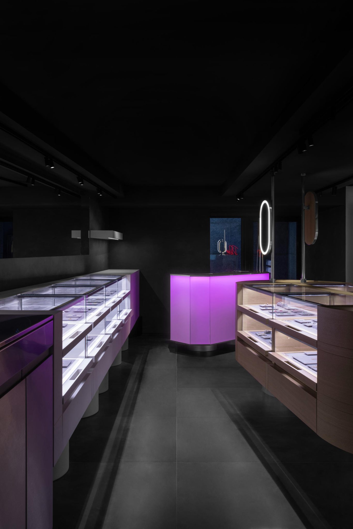
For the shop on the Patriarch Ponds, we distributed all the functionality over two floors, with a different visual concept. The ground floor is bright and open, with basic and trendy jewellery within the medium price segment. All showcases here are open – part of the display is located on the upper surface of the racks, the rest is placed in the front-open pallet boxes. This is the idea of a jewellery box, where you can dig around and look at all the jewellery as much as you want, andwhere you can find a piece of jewellery of your dreams. Hereyou can open the drawers, measure the jewellery, take theitems you like most in the fitting area and choose in a quiet atmosphere with a glass of non-alcoholic special cocktail (wehave provided a small cocktail station on this floor).

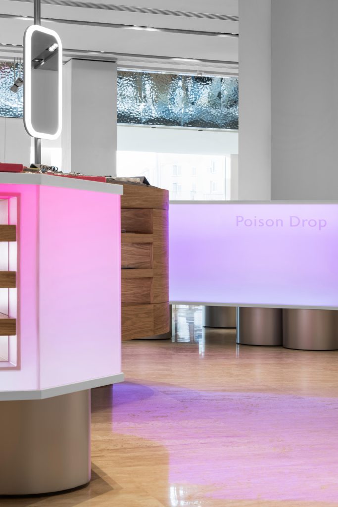
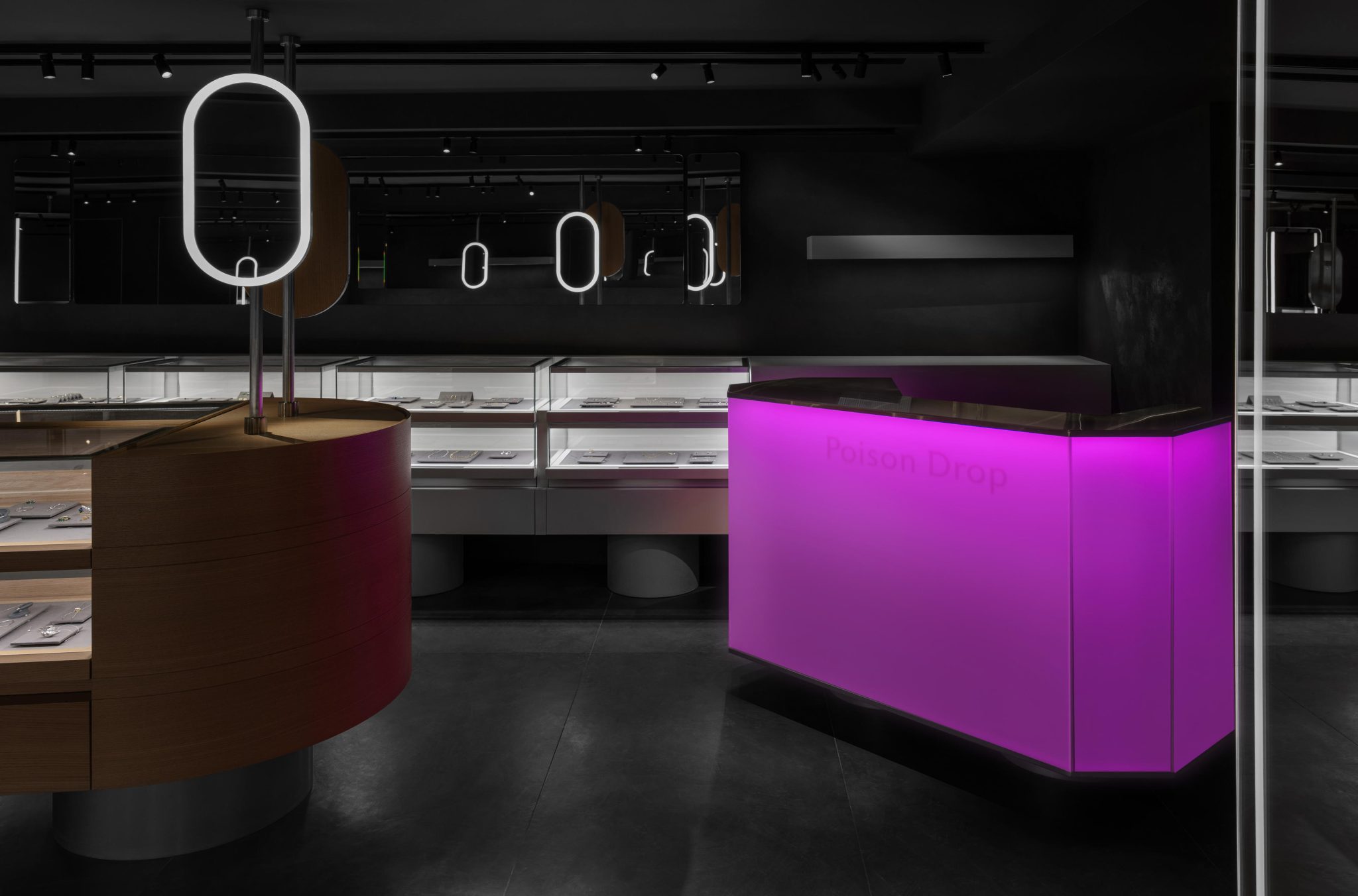
In order to emphasise the concept of a ‘jewellery department store’, we created a unique type of showcases for each direction. They are like pebbles scattered in the space of the hall – bright, interesting, different, reflecting the ideology ofeach segment.

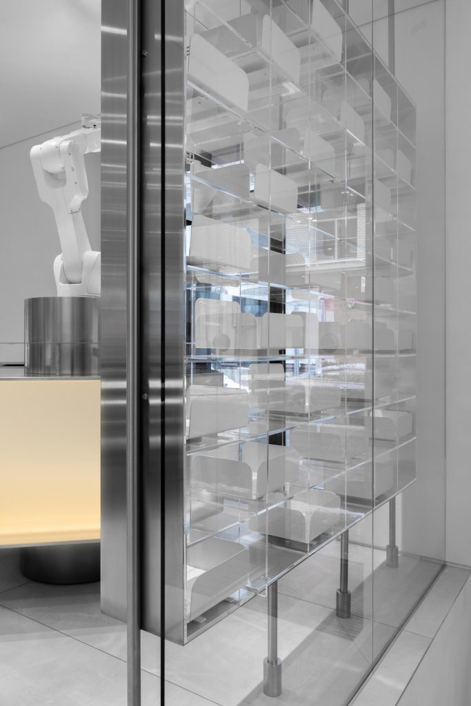
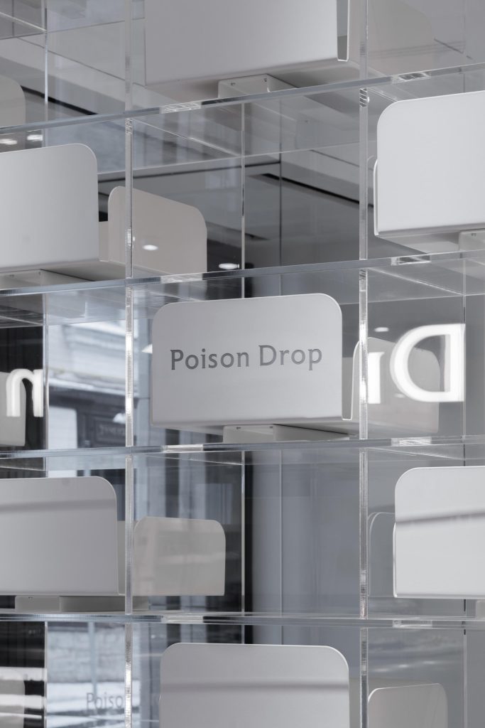
Around the perimeter, there are the basic display cases: they present everyday universal jewellery. The central counters aremore characteristic. In the centre, there is a large wooden showcase with jewellery from world brands, a fitting area andan automated conveyor belt (like in a sushi bar) where jewellery is moved in a circle; this which adds to the interactivity of the selection.

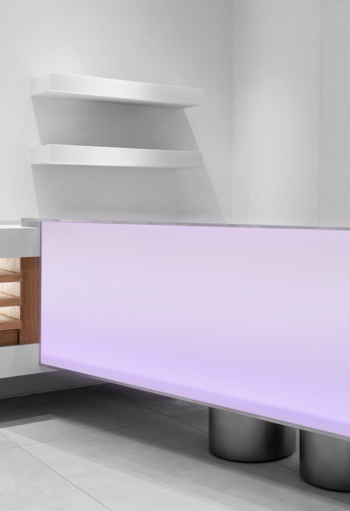
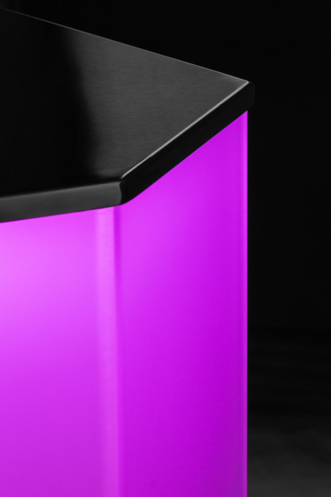
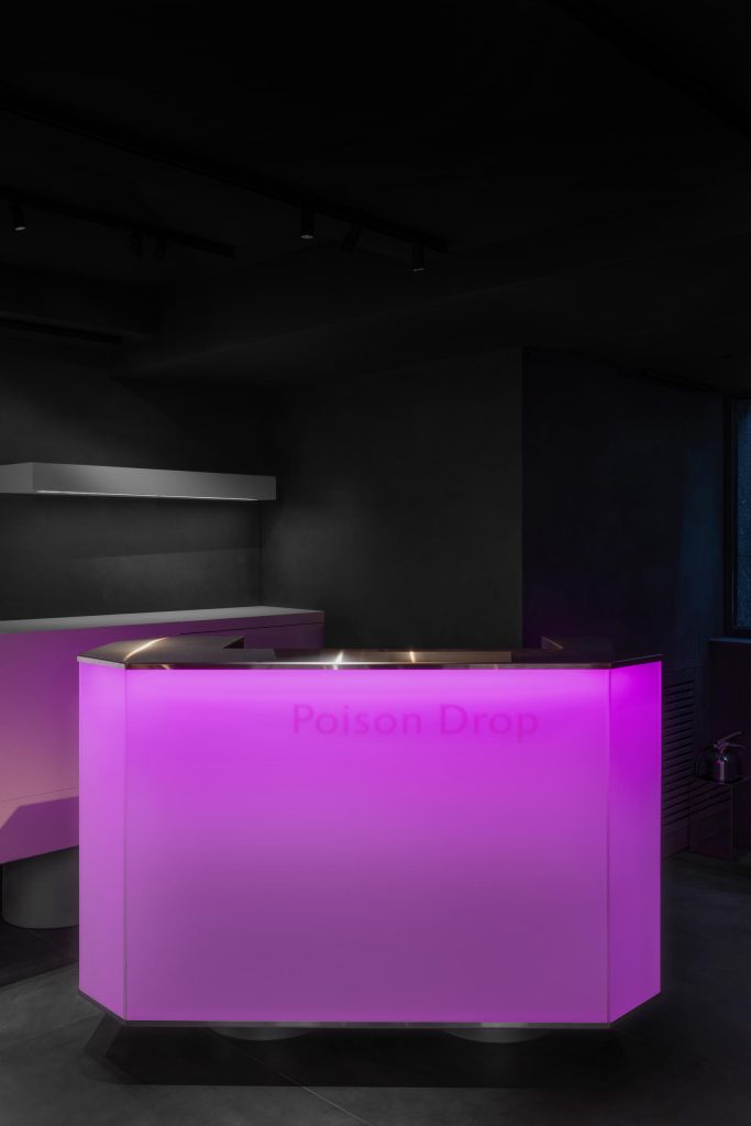
Glowing crystals in different colours are used for functional areas, such as checkout, ordering areas, promotional items. Atextured, rough, black display case made of aged oak slab isintegrated for Dark Fashion.


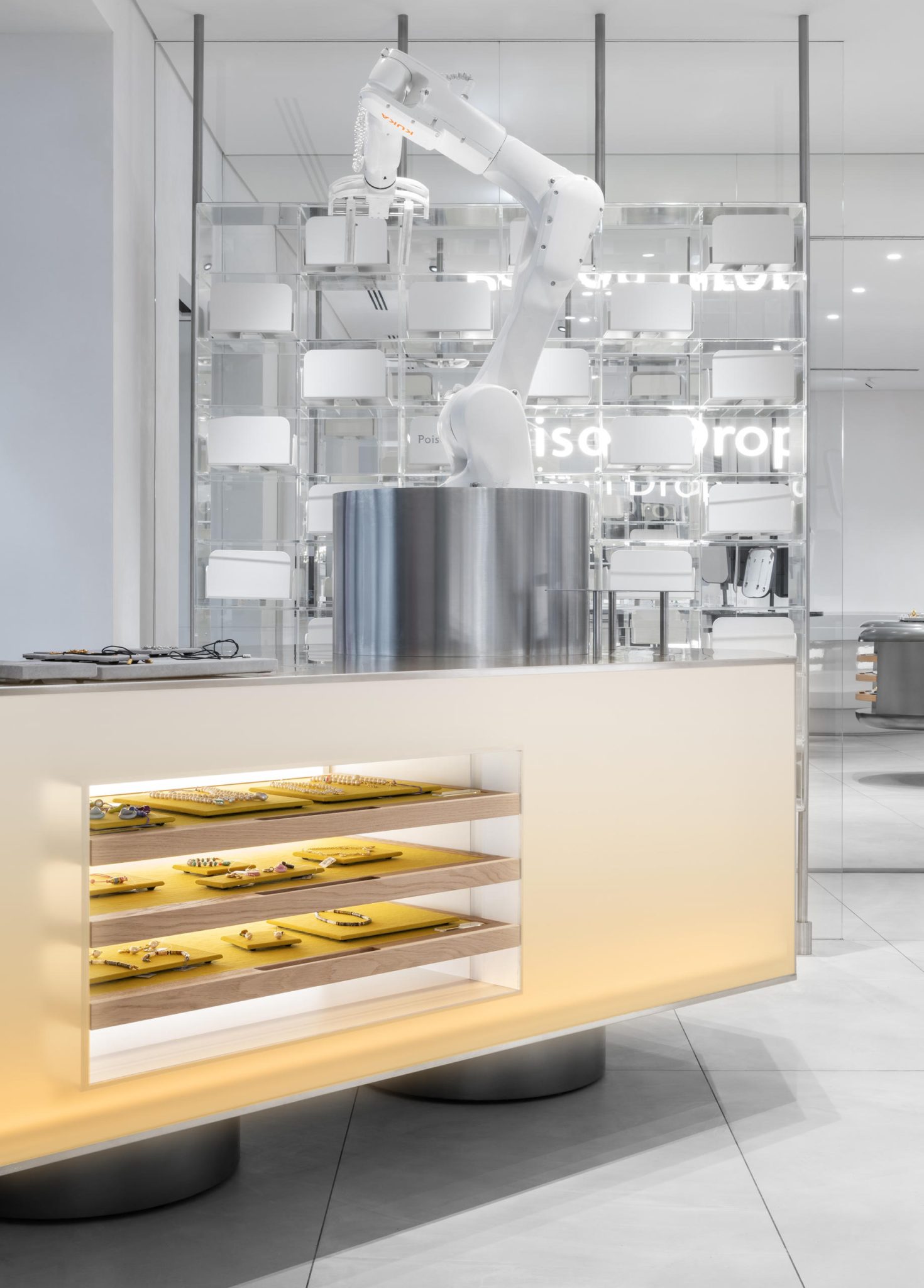
An important element of the ground floor is the online order dispensing counter with a robot arm: a person enters an order number on a screen next to it and the robot arm dispenses the box, taking it from the shelf. In its spare time, the hand waves to passers-by through the windows and communicates with visitors inside the shop.

AXONOMETRY OF THE BASEMENT FLOOR

The lower floor has been designed to be fundamentally different in visually distinctive ways, but the same general principles are applied. It is dark and mysterious, with premium collections of jewellery made of precious metals and stones. It retains the concept of opening drawers in the same design code, but with the addition of glass.

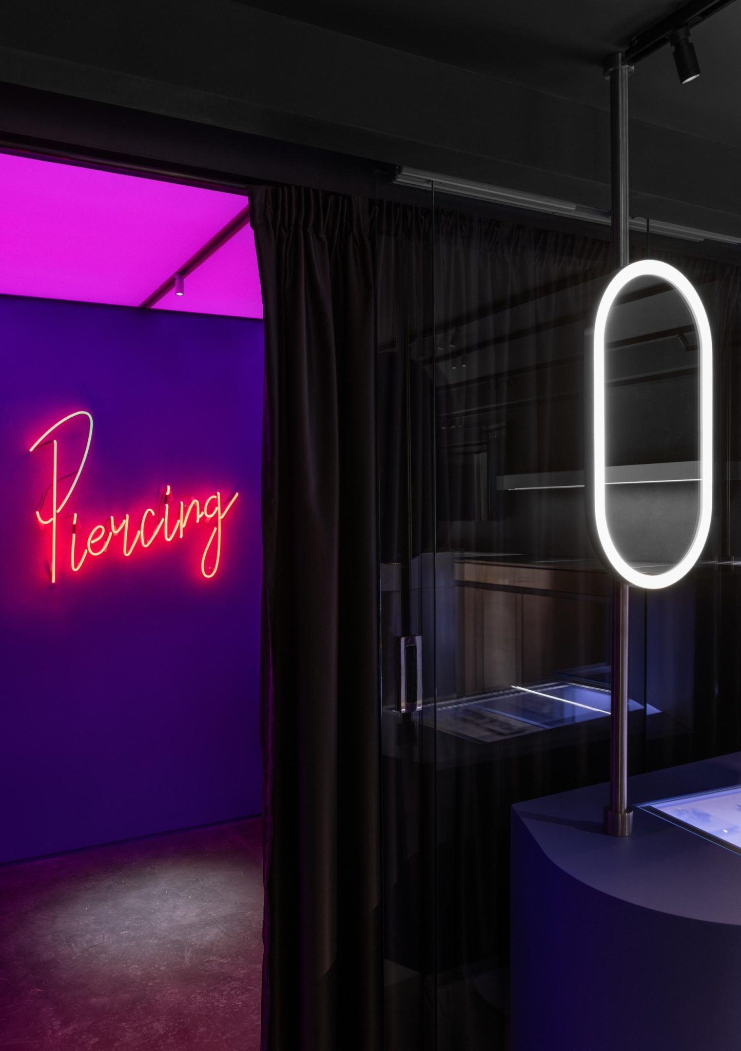
Also on the ground floor, there is an aperitif bar with unique cocktails developed especially for Poison Drop by the Barpoint team. It is integrated in one of the storefronts and is open from Friday to Sunday. In addition, there is a piercing room where you can get almost any kind of piercing, with a selection of unique jewellery.
As a result, the developed visual style of Poison Drop clearly distinguishes them in the market: it gave them recognition and attracted a lot of new customers, who were able to get acquainted and perceive the concept and ideology of the brand with the help of the visuals.


We have brought interaction with the client to a completely new level by digitalising some of the processes and making the display as open as possible, together with a
well-thought-out spatial organization that is interesting and intuitive. This makes you want to come here. And inside, it is very comfortable so that you can spend much more time here in a pleasant and relaxing atmosphere.

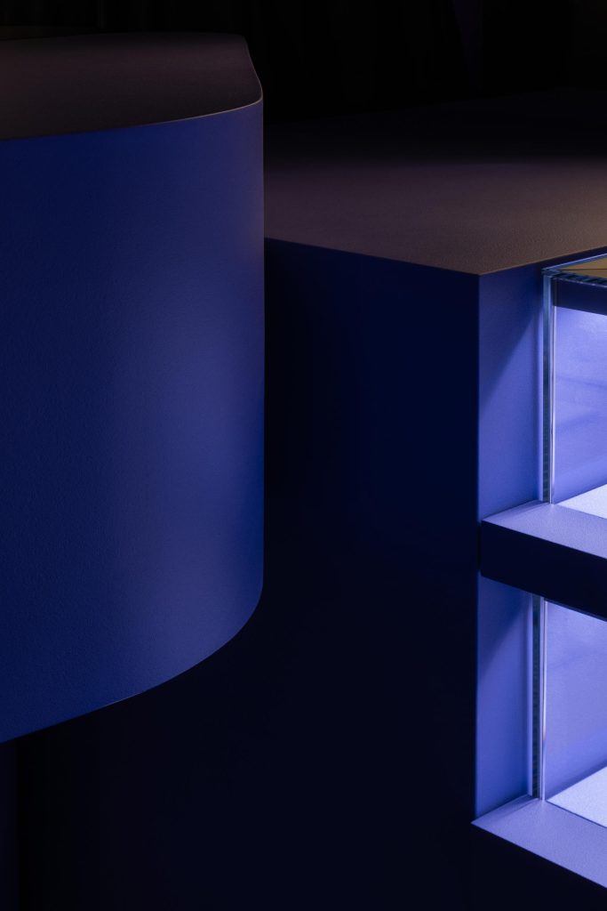

CORNER IN TSVETNOY
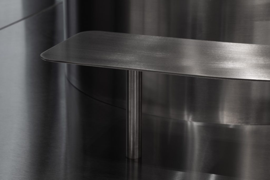
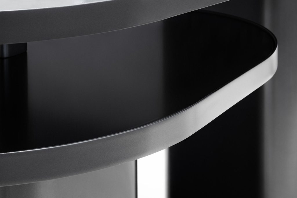
An important task, which we also managed to complete in this project, was to develop a standardisation of showcases like a constructor. 90% of elements can be docked with each other, all technical drawings are ready for them, contractors for manufacturing have been approved, and a clear design code has been developed for new brands, simplifying design and coordination. This makes it possible to quickly adapt the corporate identity to any new site and significantly reduces the implementation time. Meanwhile, for each new shop we come up with several different and colourful elements, which gives us the opportunity to slightly change the visual image and adapt to the characteristics of the premises.


Poison Drop’s renewed commitment to innovation and unique customer experiences is reflected in their approach in shop design and jewellery presentation.
