Project name: One-bedroom apartment with a perfect layout solution, large kitchen and Moscow City view / 42 m2
Interior design: PLANKA bureau
Location: Wellton Towers Residential Complex in Moscow, Russia
Photo: Anton Ermakov
Area: 42 m2
Year: 2024
Project description from design firms PLANKA bureau
The magnificent view is not the major privilege of the apartment. To create the best possible space for a young couple Planka büro design team and construction crew have done a great job and transformed 42 m2 into a masterpiece.
Smart layout solution
The first thing to address was the original state of the apartment. It was lucky for us to get the space with no limitations for future modification: 2 large windows, proper geometry, corner location of plumbing units and no concrete partition walls.
The basic layout solution by developer for such an apartment was imperfect due to unwise allocation of zones. As every inch counts in such a small area, we optimized the space, created large kitchen and open joint kitchen-living room area.
The smart hallway space organization was the key to the best layout variation, but more on that later. Here we designed several niches to ensure the closets fit seamlessly, and also slightly adjusted the bathroom.
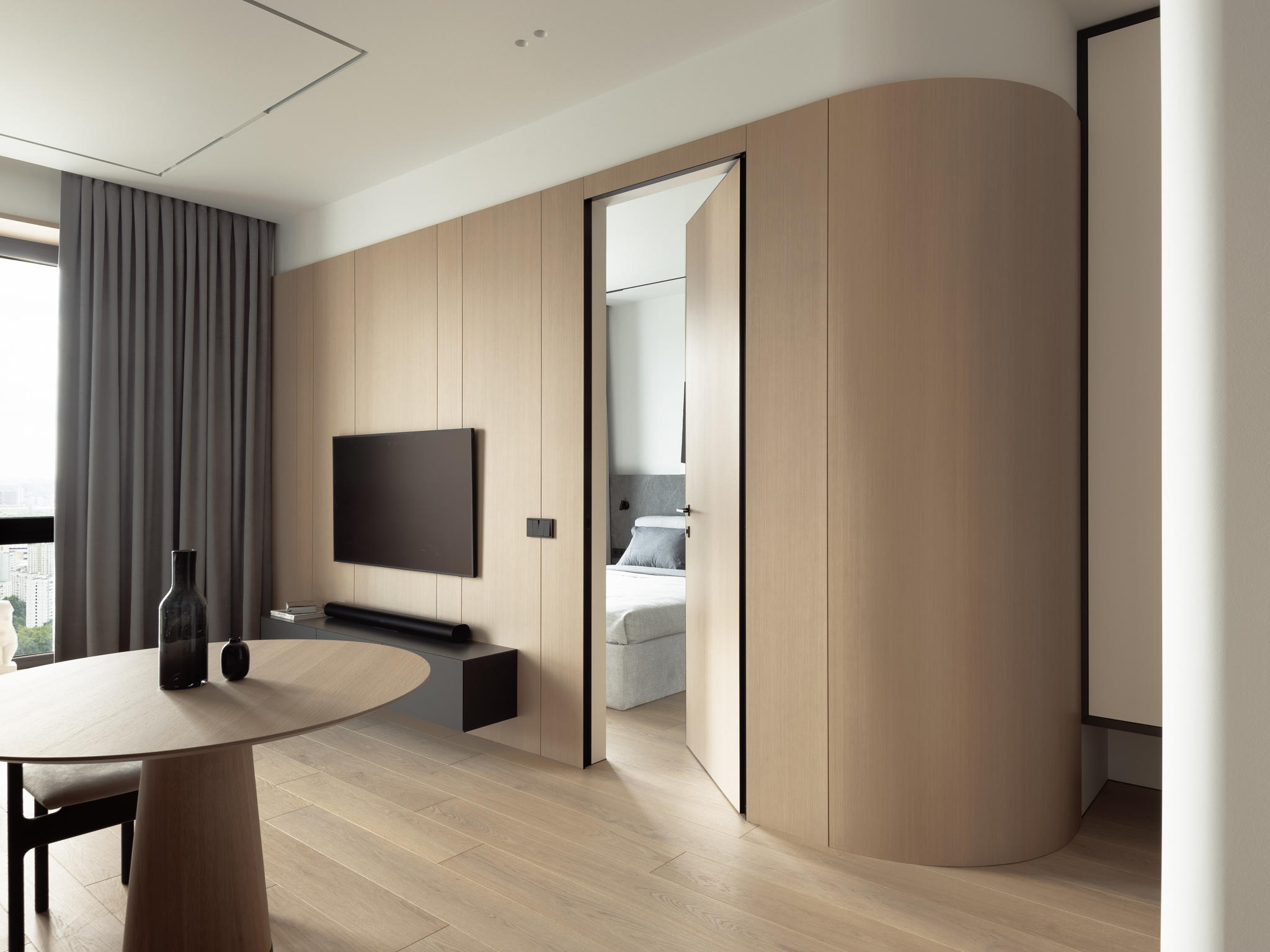
Besides, to enlarge the passage from hallway to kitchen we cut off an corner to a radial shape, and also echoed the curved elements from the kitchen side.


Functional hallway
A few word on constructive information about the curved elements: they were created to avoid an acute angle shape opposite the front door, that would just waste precious space we had.
Moreover, such a corner in a narrow passage is a constant risk for a finishing wall cover to be chipping away or get dirty. To avoid these problems, we created a radial corner shape and echoed radial elements in the partition wall between hallway and kitchen. This choice allowed us to enlarge the passage, avoid soiled walls issue and create an accent that unifies the visuals of different zones. Such a solution is only possible when the partitions are made of plasterboards.
Another design decision that unifies two areas is the light-wood veneered MDF panel, used as a finishing cover for a living room partition wall from the TV zone to the hallway.
To visually enlarge the narrow hallway space we used mirrors as a fronts of the floating coat wardrobe. The niche under is designed for the robot vacuum cleaner station.
On the opposite side, there are two closets with the contrast-colored fronts. The first one is dark grey, with the distribution board and low-voltage panel hidden in the wall behind it. The second one shows veneered MDF panel with mirror insert and copies the recurring curved elements.
You would never guess what’s hidden in this closet! The washing and drying machines take place here. To prevent moisture accumulation in this area we designed small vents in the closet front. Such an unusual placement of household equipment allowed us to visually ease the bathroom and utilize every inch the smartest way.
Another functional solution is a lowered ceiling level in this area, as the AC indoor unit is located here in the hallway. We would recommend to place such an equipment in the hallways or utility zones, to locate ones while not compromising the aesthetics.


Bathroom
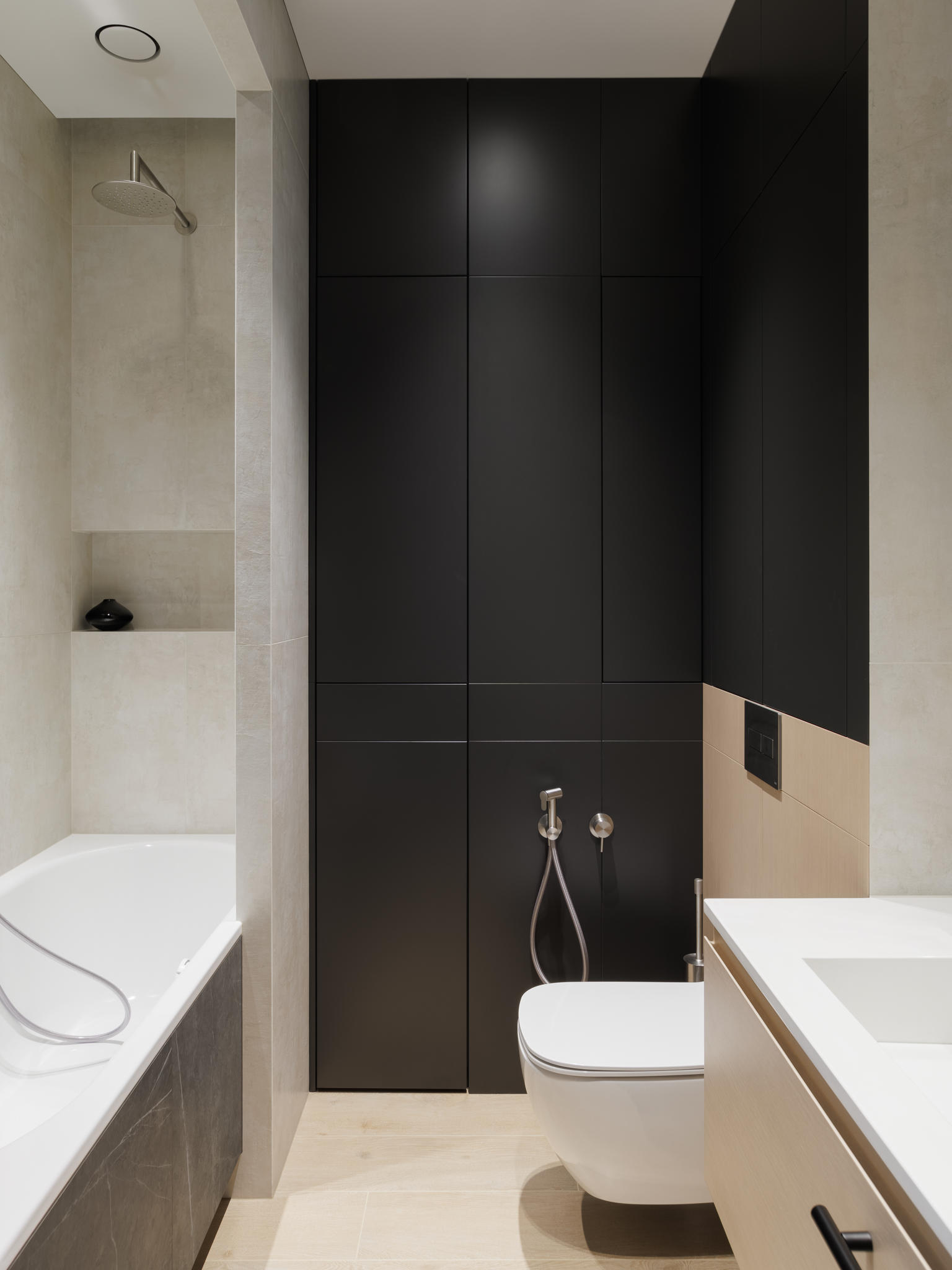
The bathroom design is strict and concise. Three different tile collections are used here: wooden-textured is on the floor, accent anthracite and sandy travertine-like are on the walls. We also used dark grey colored MDF panels as fronts to water supply plumbing unit.
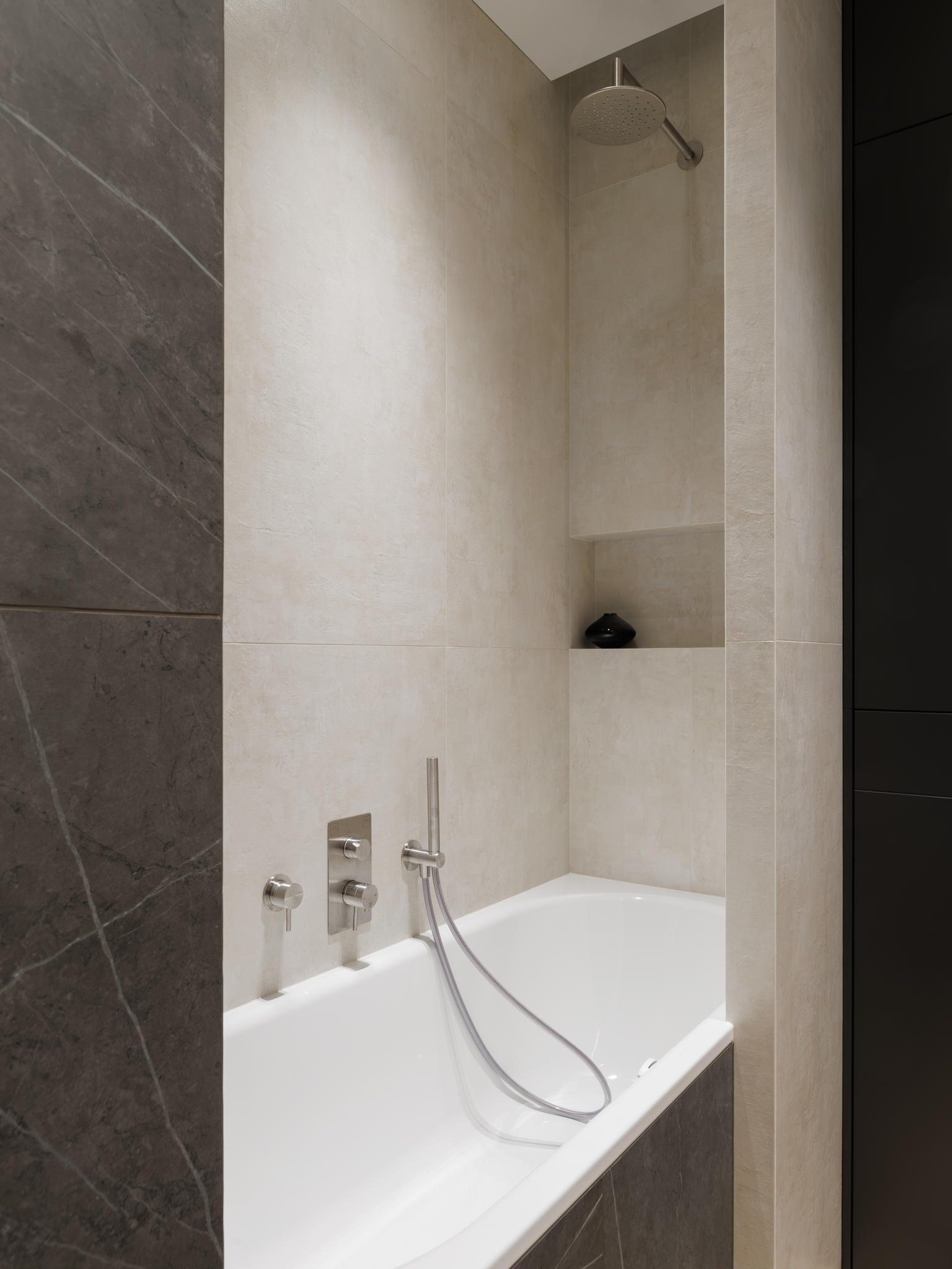
An unusual design solution was to place the bathtub in a niche. To avoid installing a shower bath screen and keep this zone rather private, we decided to erect one more partition wall. That decision was made out of aesthetic purposes, but it’s a pragmatic choice as well – since any glass screen would constantly show water splash marks and limescale.
Shower set is also placed in the niche, so water won’t splash and leak onto the floor. There are both an overhead shower and a handheld spray to provide flexibility.
Let me show the detail that most of contractors would turn a blind eye to, and prove you that we are the true construction enthusiasts.
The bathtub decorative panel is in the same plane as this wall from the left side. At the same time, tiles should stand over the bathtub while installed to ensure a proper conjunction. In such case, rounded bathtub corner remained visible and spoiled the overall picture.
So what have we done to handle this? We’ve just cut off the rounded corner of the bathtub. It seems like a simple solution, but in most cases, contractors would just ignore such details.


Kitchen
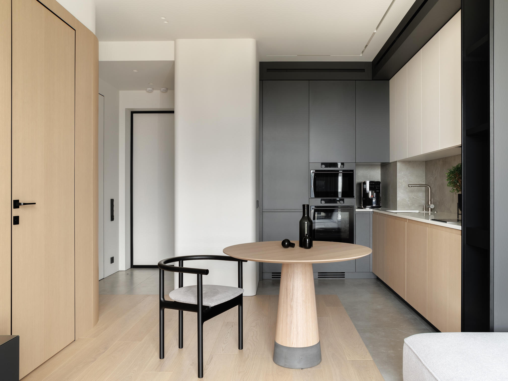
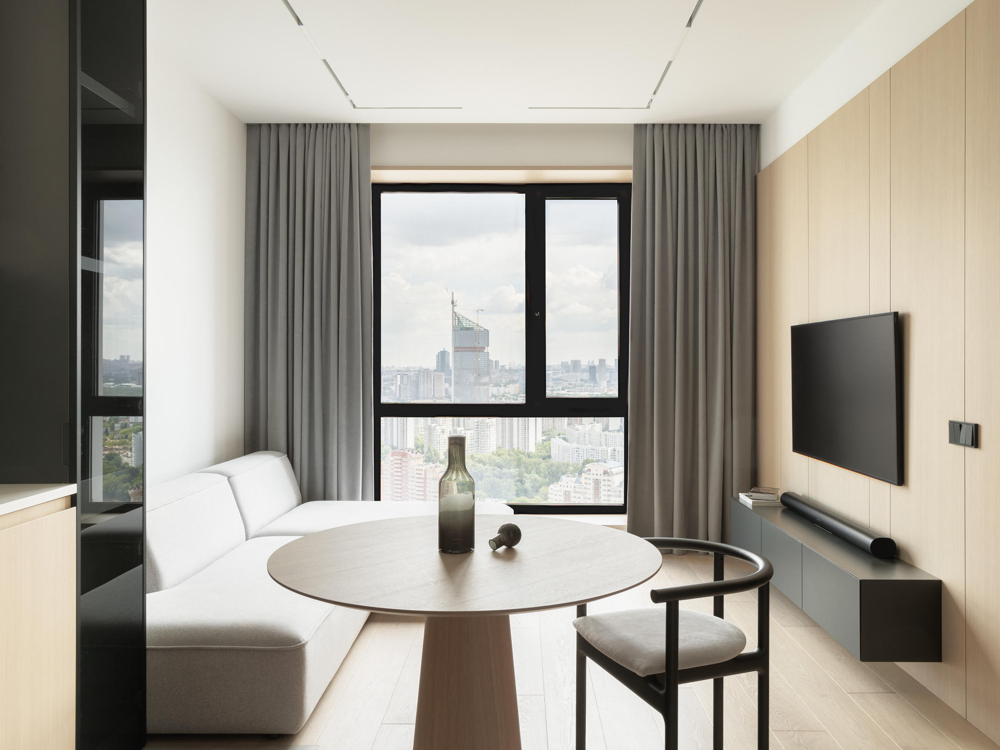
The joint kitchen-living room area turned out to be bright and concise. Design is both strict and soft – regular shapes and dark colors coexist with the light textures and rounded elements.
We chose airless painting technique as a dominant type of finishing to achieve a perfectly smooth surface. And the veneered MDF panel served as an accent for this zone.
The wall to floor seam is sealed with silicone. The transition between the parquet and the porcelain stoneware on the floor is done the same way.
The kitchen itself is spacious and functional. All the necessary equipment is placed here – refrigerator, oven and microwave installed in column, dishwasher, sink and a two-burner cooktop. There is a plenty of storage space as well.
Likewise for the hallway, there are two colors used for the fronts of the kitchen cabinets. Air conditioning vents are located above them. To maintain the symmetry we matched vents’ length to the ceiling lighting track. The dining group for two is placed nearby.


Living room
There is a light grey corner sofa here in the living area. TV zone and a floating stand are on the opposite side. The TV connection is done with a use of hidden cable channel, so no wires spoil the aesthetics.
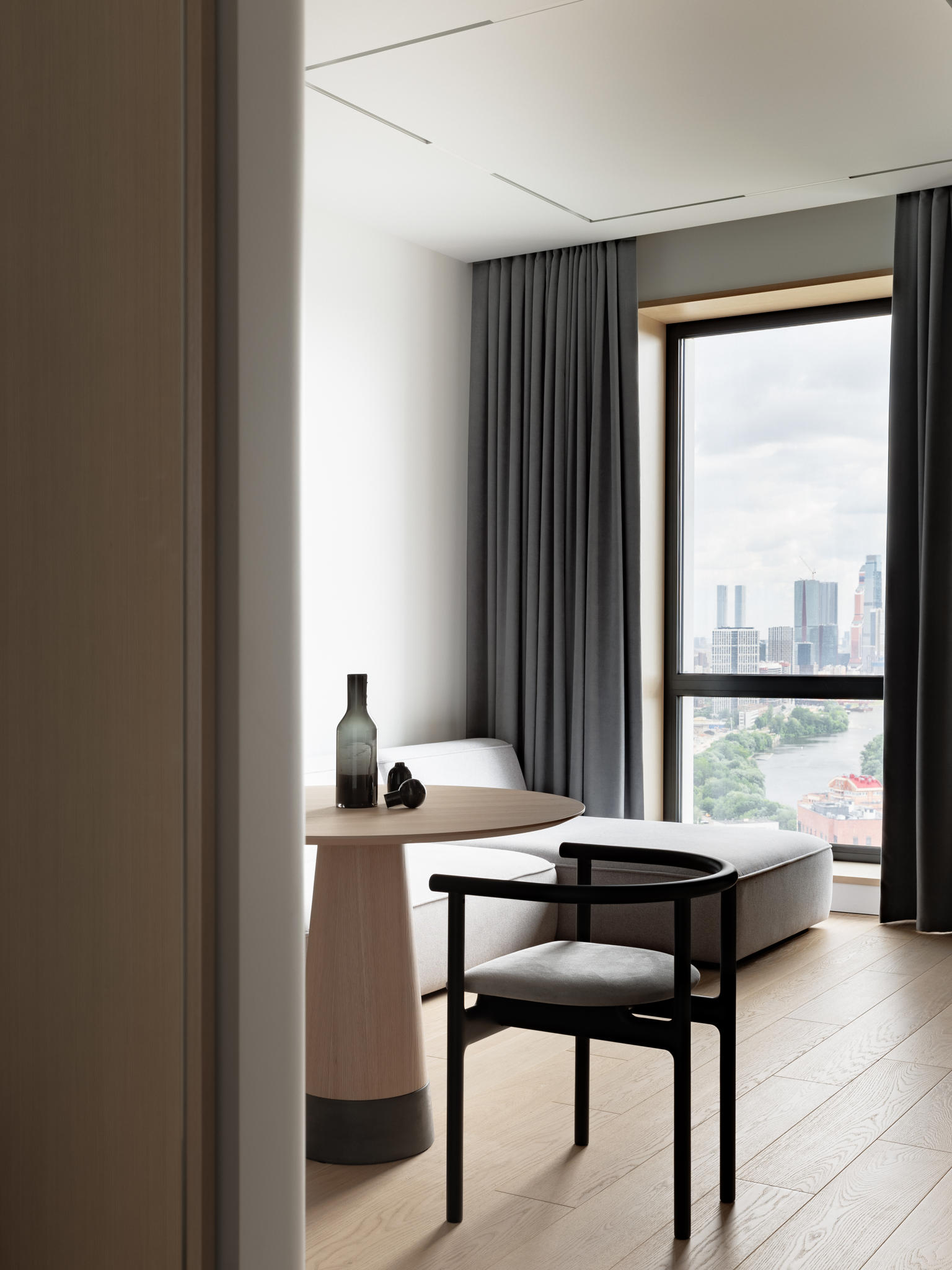
The window side jambs, faced with veneered MDF panels, have become the distinctive feature of this apartment. They serve to draw extra attention to the beautiful sights of Moscow.
Note a useful trick – we set a power outlet in a window side jamb. That would be very convenient for plugging Christmas lights, during the holidays or just to create a cozy atmosphere.


Private bedroom
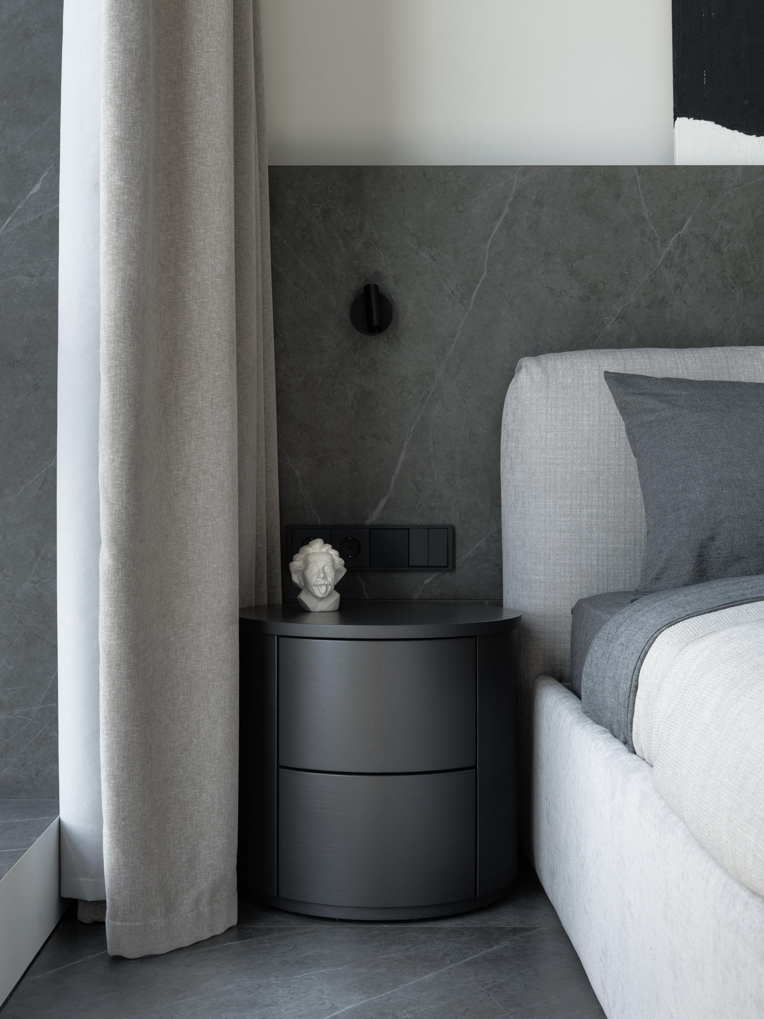
The main accent piece of the bedroom is a porcelain stoneware headboard. This is yet another solution that combines utility and aesthetics. Would you agree that the light-colored paint finishing is easily soiled? Plus the headboard is constantly touched in usage. That is why we chose wear-resistant finishing for this area, to avoid possible issues with paint covering. To draw even more attention to this design solution, LED lighting was installed.
For the sake of wear-resistance we chose porcelain stoneware as a floor finishing as well – chair legs could scratch the parquet over time.
It’s important to note that due to the sound insulation regulations in Moscow, it is not allowed to use porcelain stoneware as a floor finishing in bedrooms or living rooms. To implement such a solution we have designed proper acoustic insulation for the whole apartment. We’ve been meticulous on this issue and installed acoustic insulation products throughout the whole floor, bedroom ceiling and every plasterboard partition.
First, we have installed the acoustic insulation product throughout the floor, then the water supply and the central heating communications were done. Screed works were the next step, following by electrical works and central AC system installation. After that, partition walls were finished – basalt slabs in the base covered with two leaves of Knauf insulated plasterboard.
The acoustic insulation of the ceiling was installed only in the bedroom area, plus we’ve made soundproof boxes for all built-in elements. As a result, future residents of this apartment and their neighbors won’t be disturbed by any noise.
But let’s get back to the bedroom itself. The desk is designed as a floating stand and invades the wardrobe area. The closet fronts match the apartment color solution.
To aesthetically arrange the air supply and return vents, we’ve designed such a forehead overhanging the wardrobe niche. This way we could set the vents above the wardrobe and keep the unified look of this sight.
And the final highlight – we’ve made windows side jambs an eye-catching detail here as well and covered them with porcelain stoneware.


Conclusion
In our humble opinion, this apartment is perfect for a young couple – it literally blends masculine and feminine, practical and aesthetic, brutal and cozy.

