Project name: UNICORN
Interior design: Sinitsa Space
Design Team: Anastasia Kolchina/Lead Architect, Serafima Demidova, Varvara Serebrova/ Technical Architect, Ansar Dokhtov/ Visualizer, Yulia Kozlova/ Project Coordinator
Area: 48.6 m²
Year: 2026
Project description from design firms
Our client, Olga, initially had a complex and contradictory brief. We needed to combine seemingly incompatible requirements: a small space packed with multiple functions, and a brand with a bold character that still had to avoid feeling “too childish” or “too feminine.” One of the team’s main tasks was to organize these contradictions into a cohesive concept.
The team achieved the nearly impossible: on a very limited area, we arranged diverse product displays, a fitting zone, and sufficient seating. The space is functional yet uncluttered, and the design creates a memorable visual identity that becomes part of the brand itself.


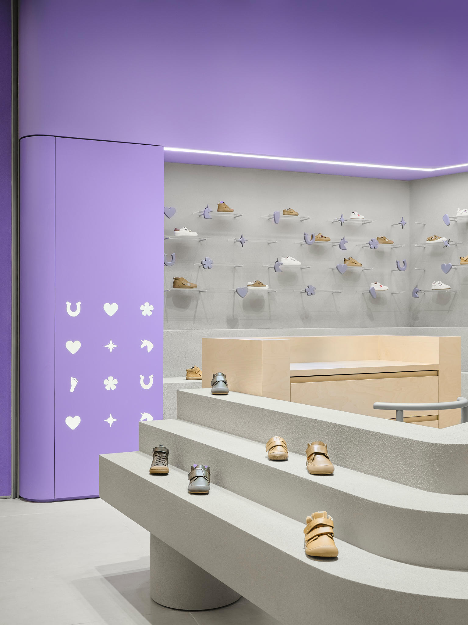
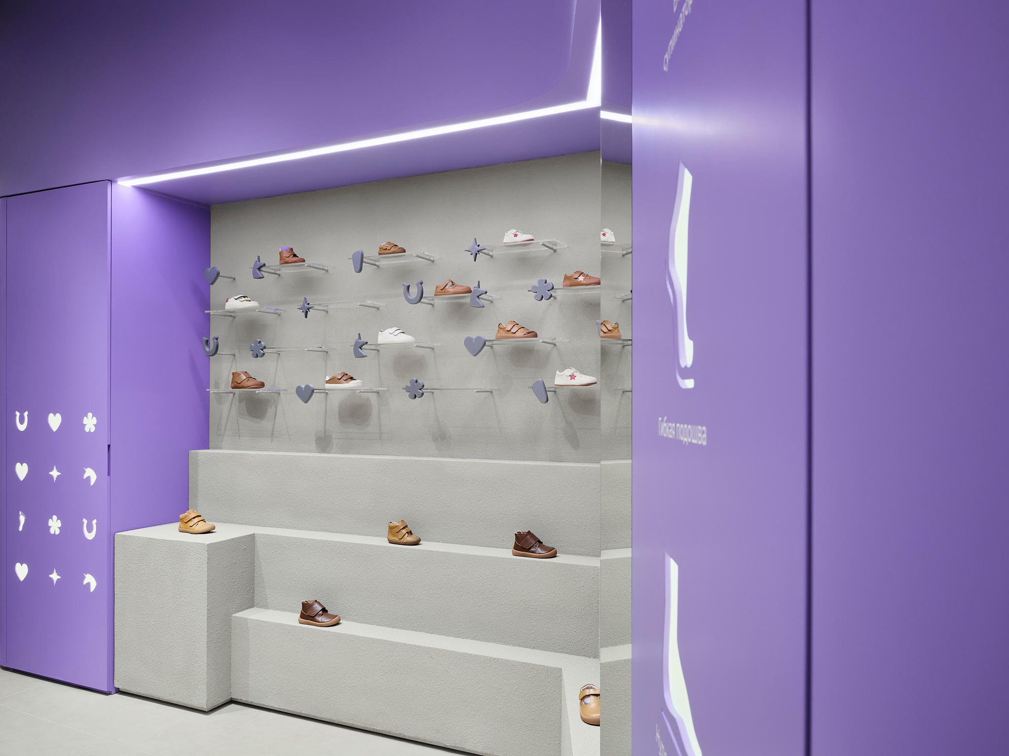
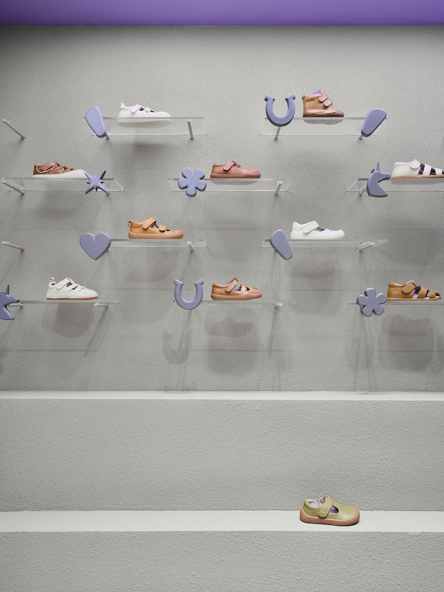
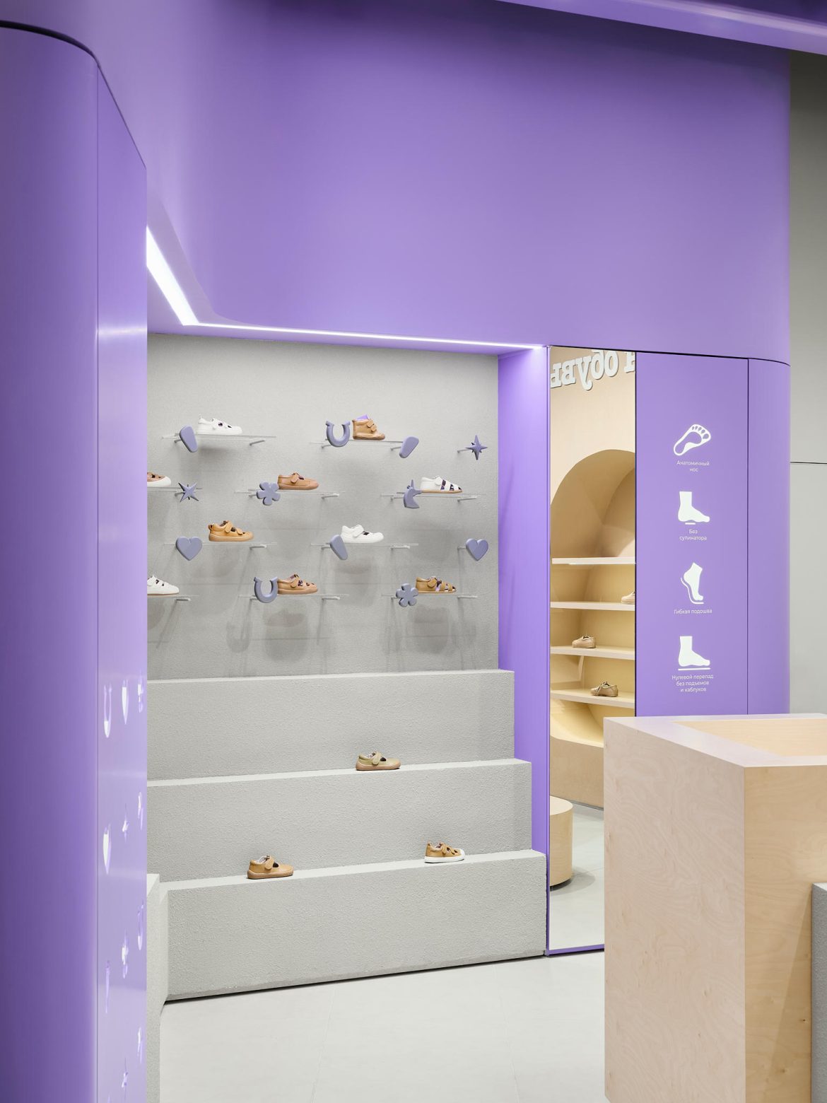
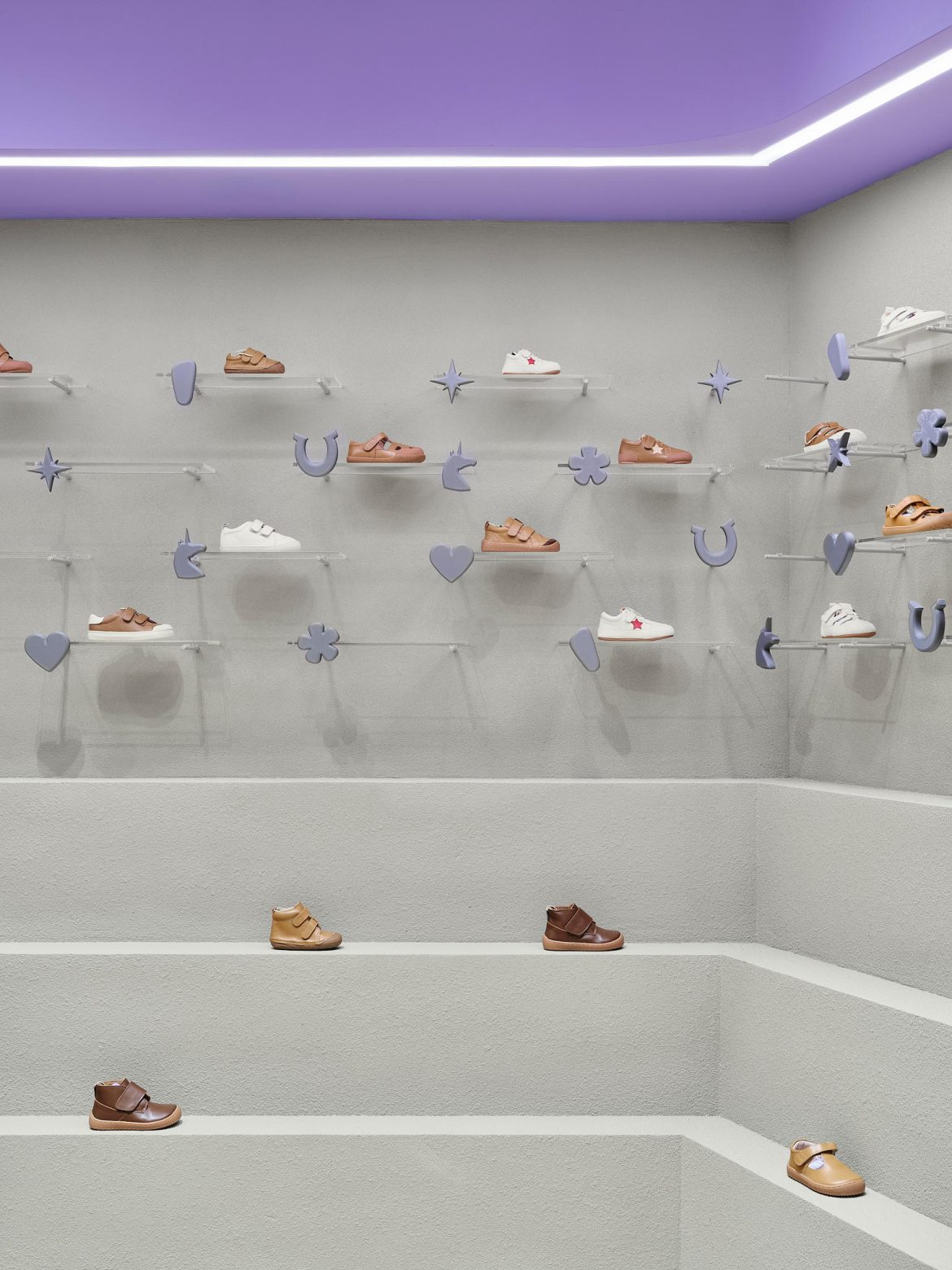
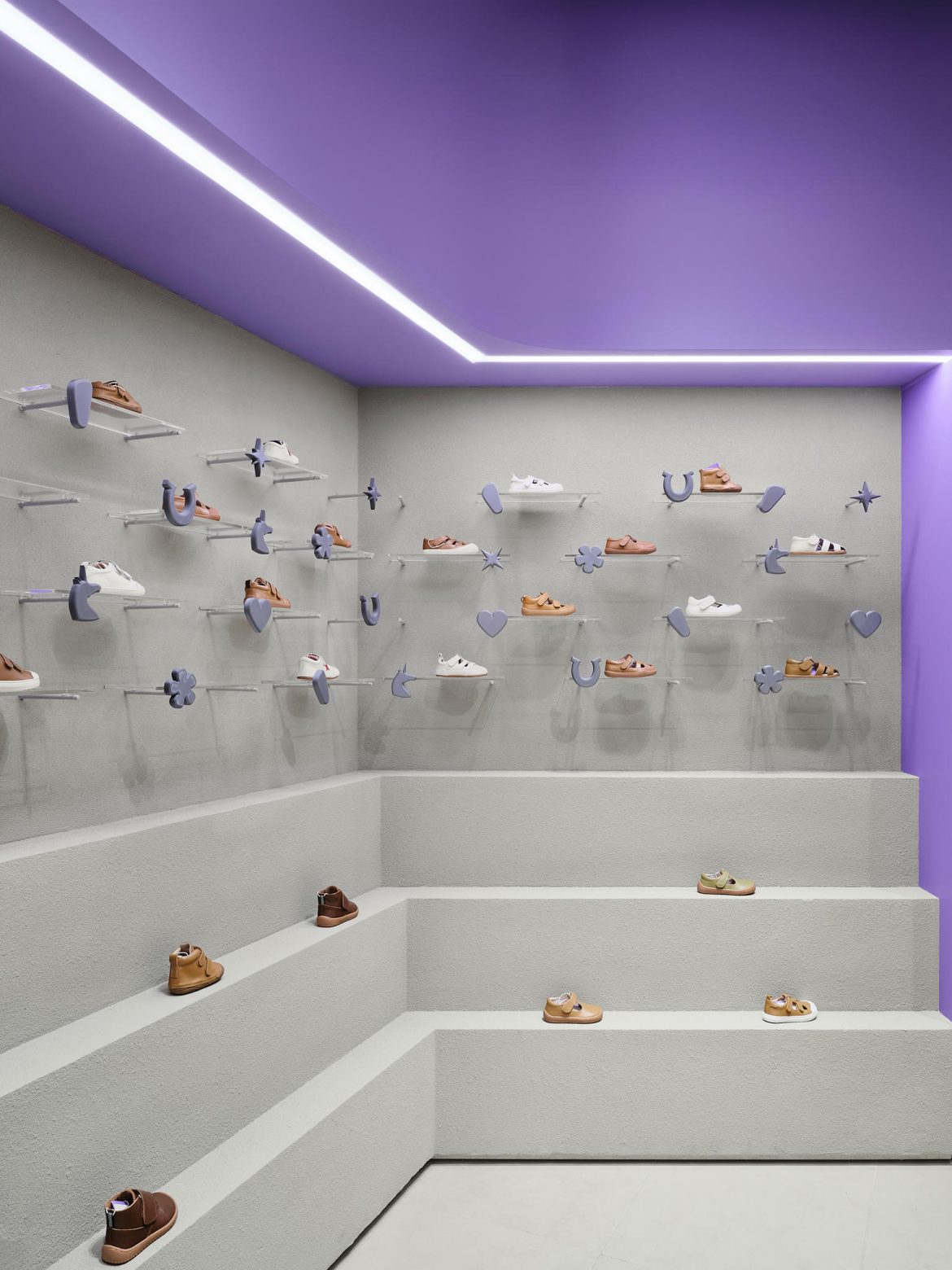
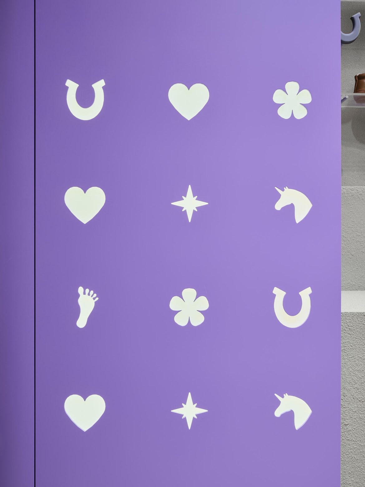
Several design directions were explored. Early ideas included a more “medieval” or even mythical aesthetic, with carved details and decorative elements. Some of these survived in subtle ways — for example, small “windows” in walls with decorative figurines — while the main approach evolved toward soft, flowing, contemporary forms.
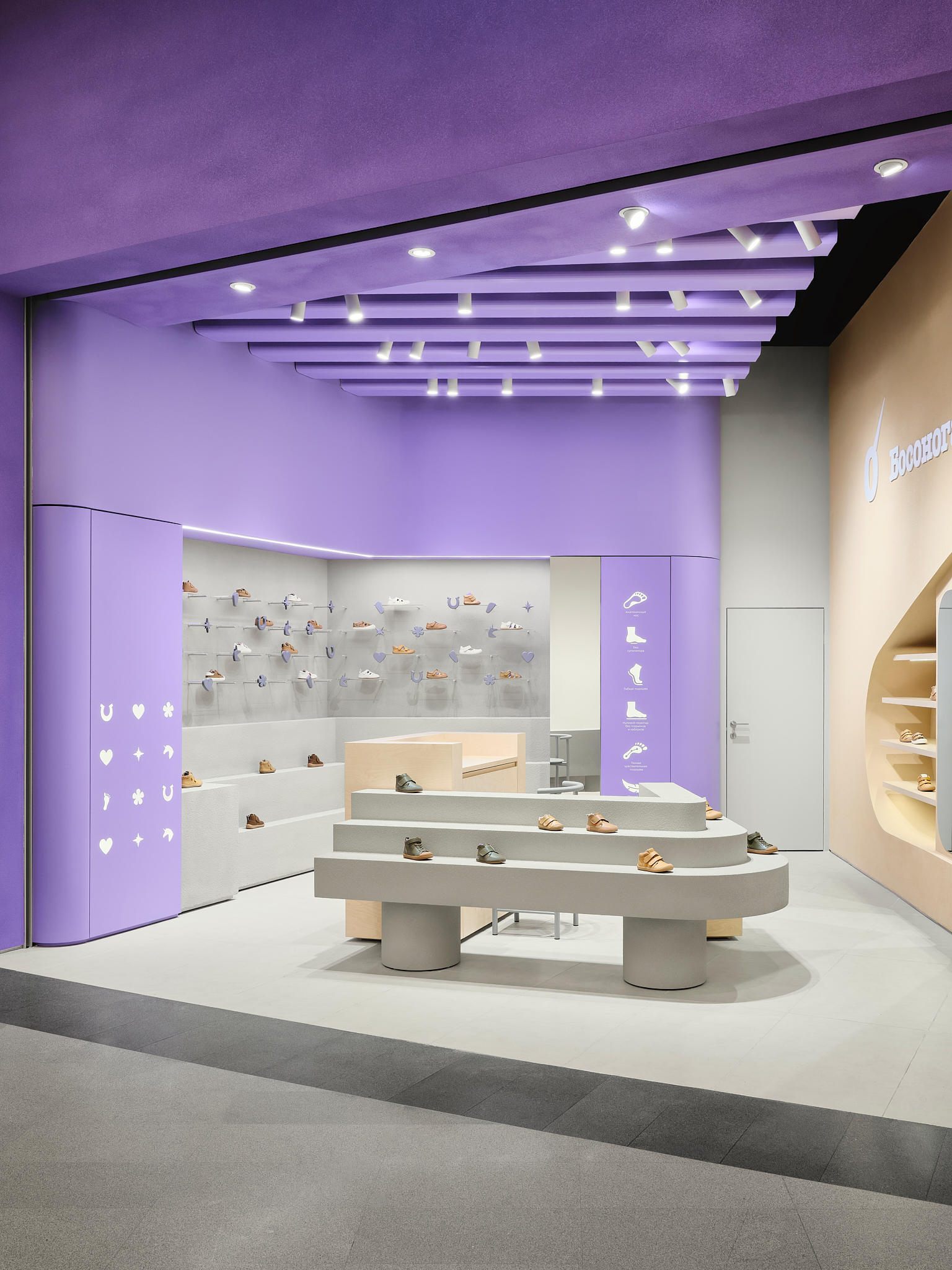
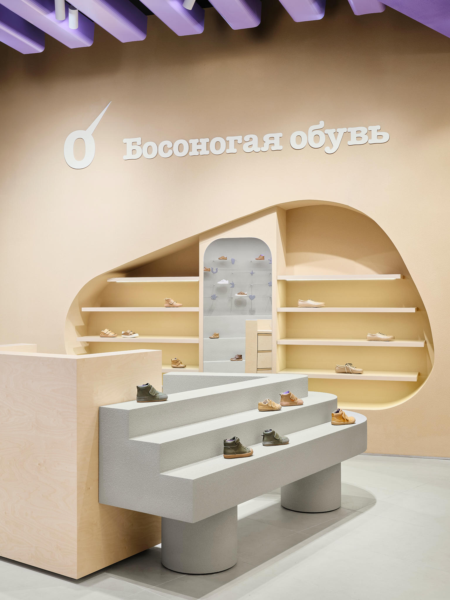
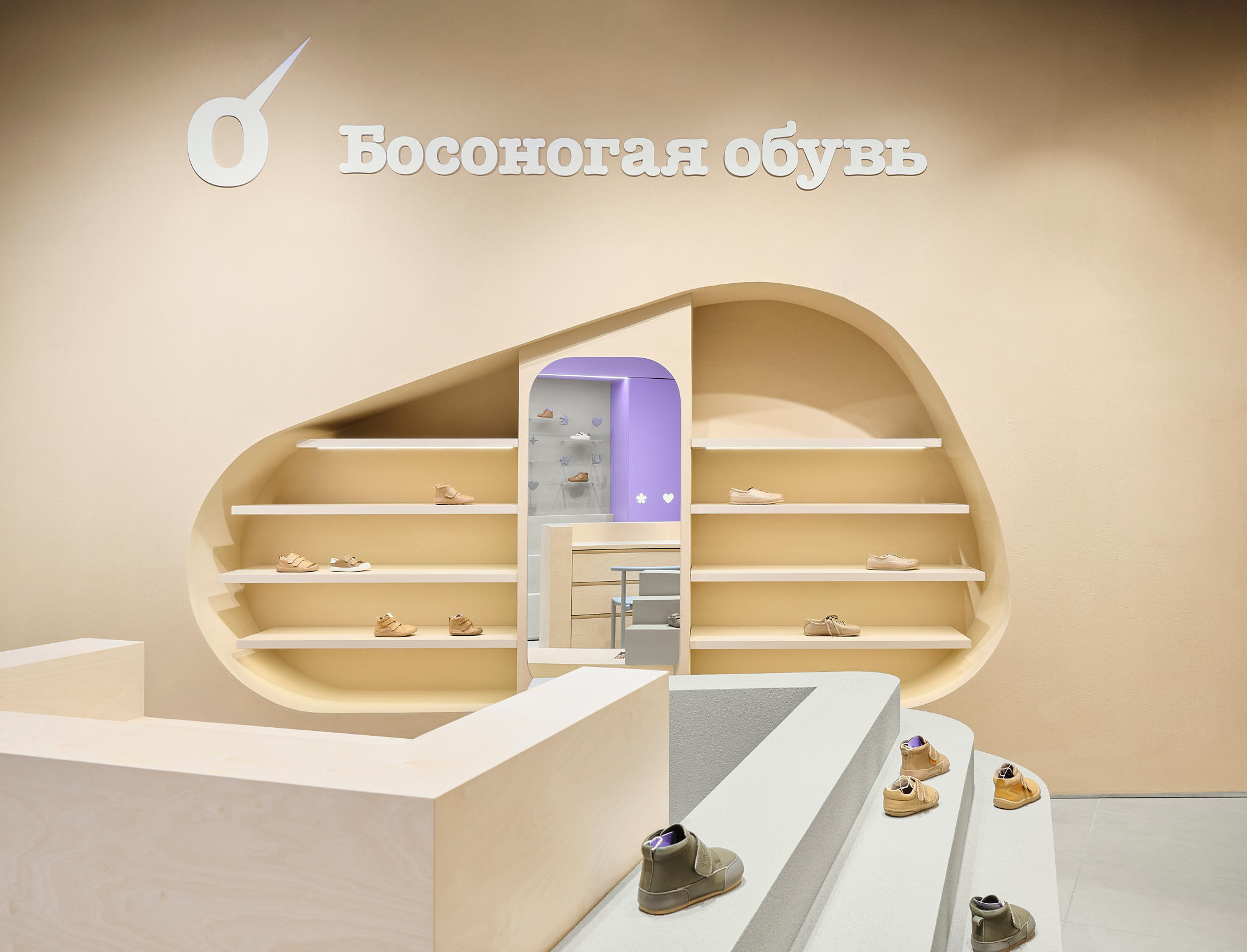
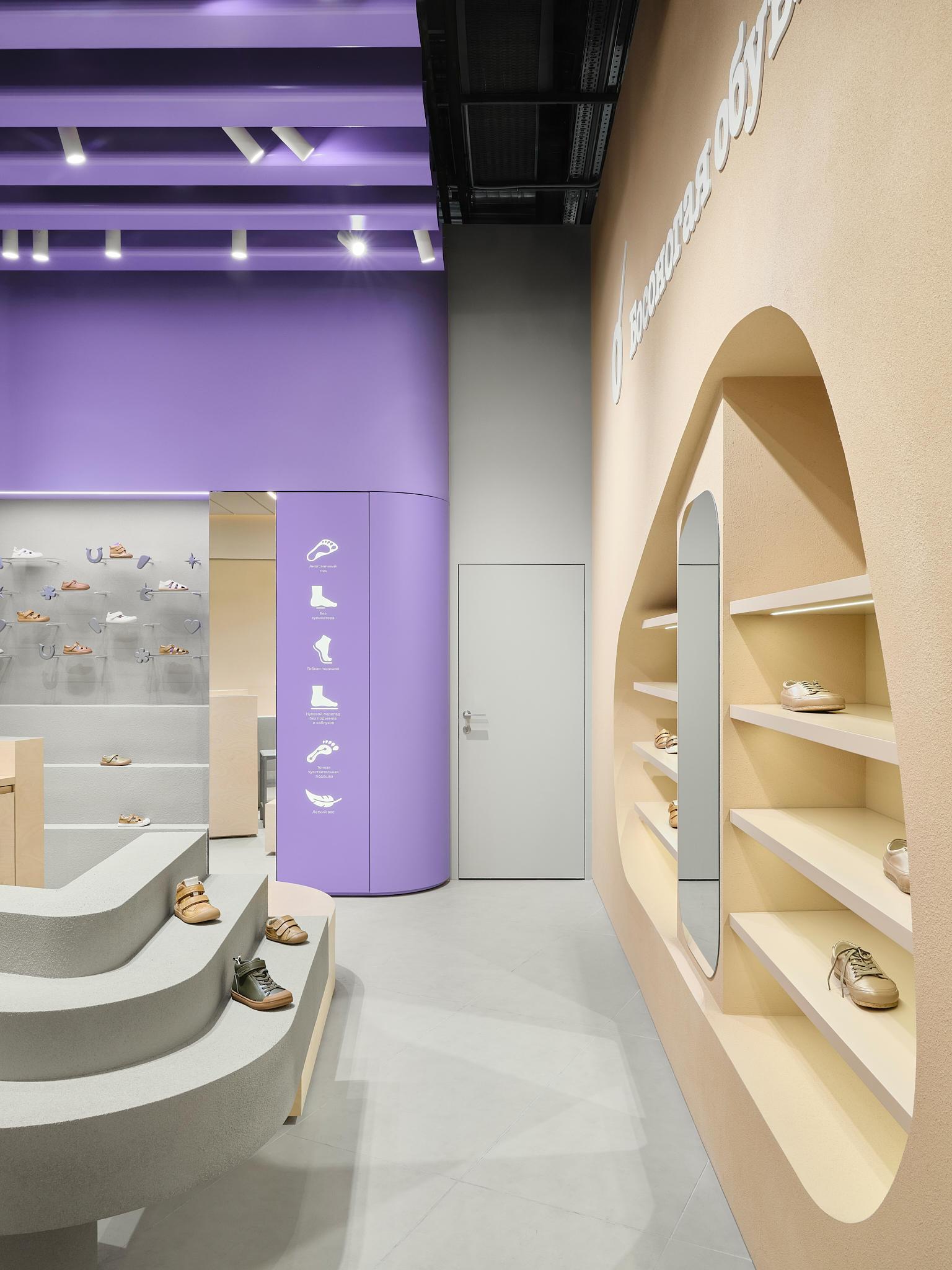
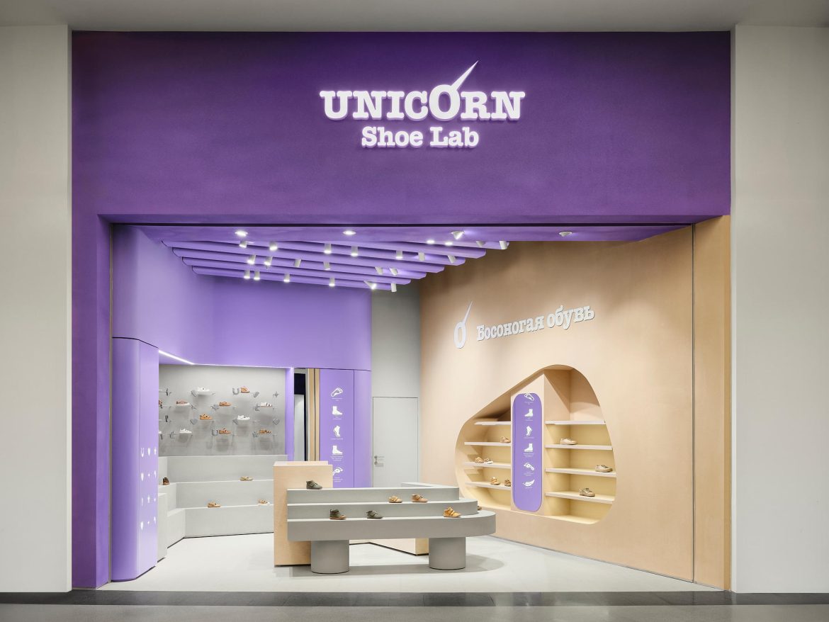
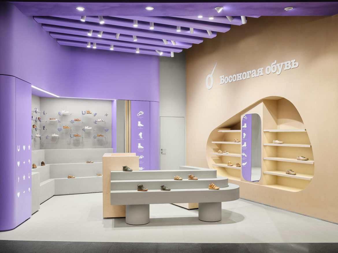
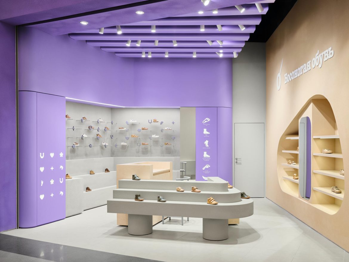
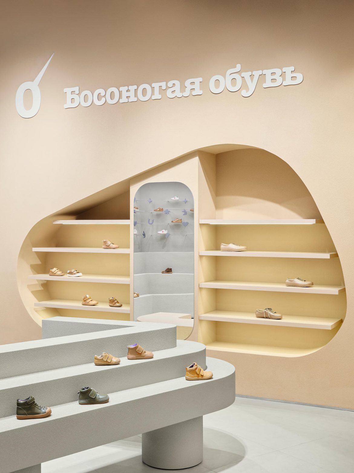
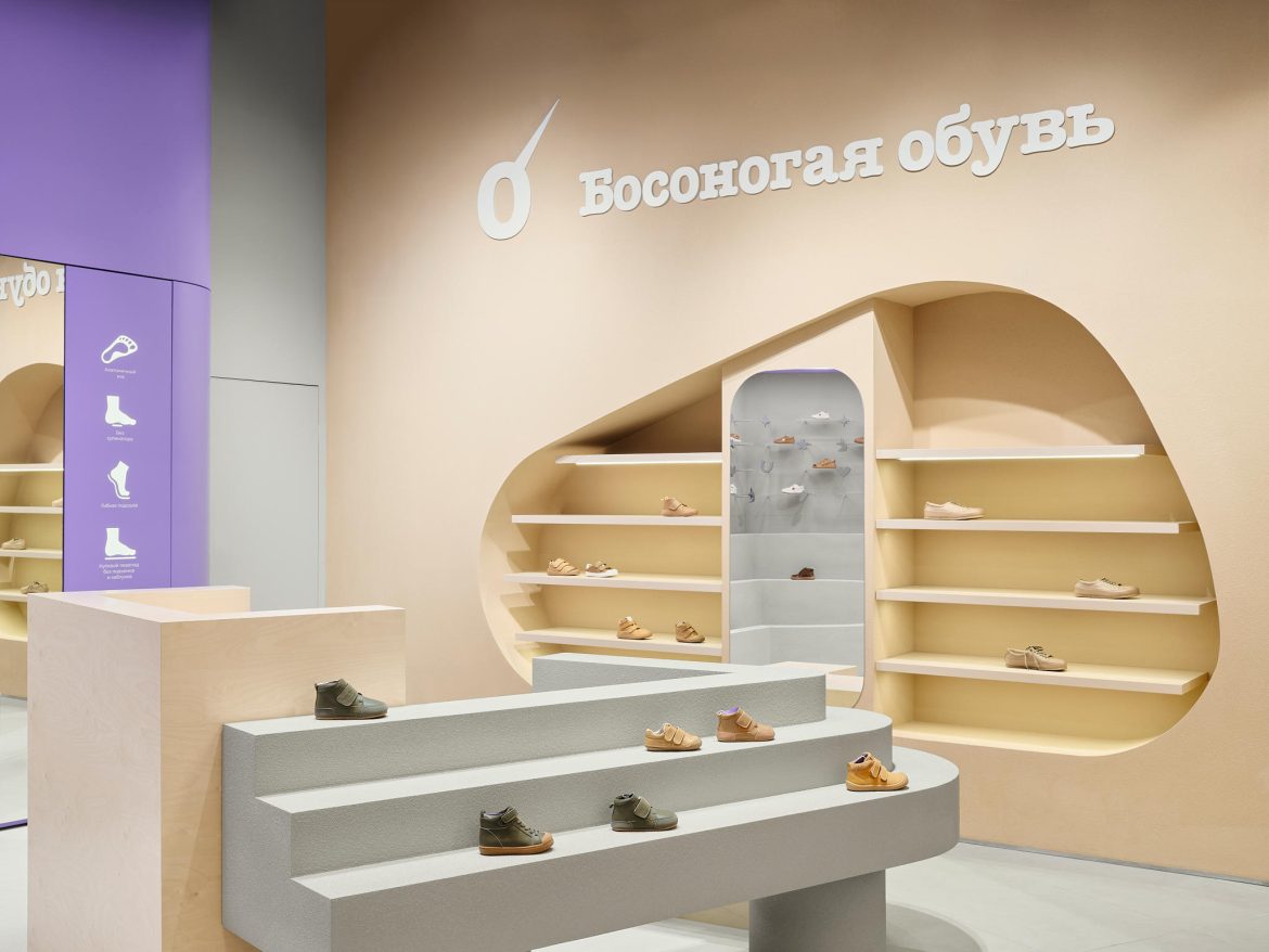
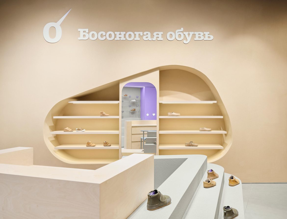
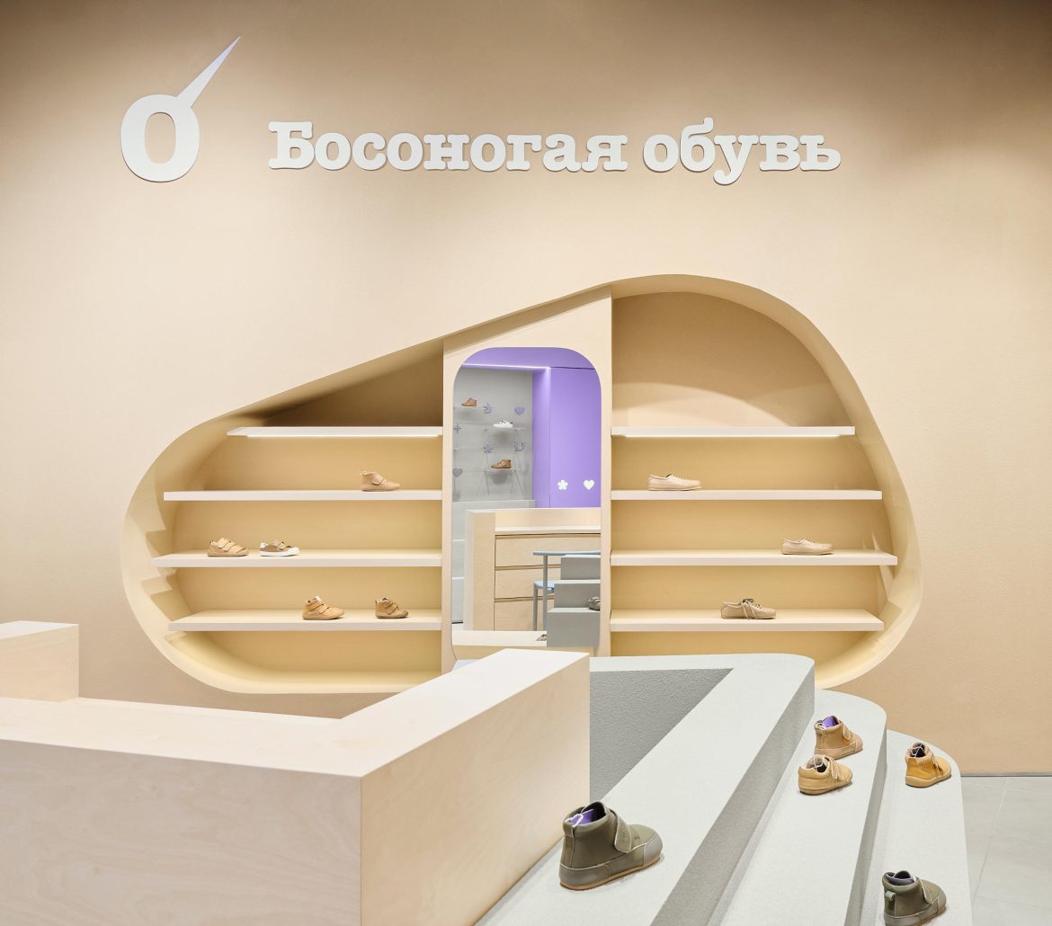
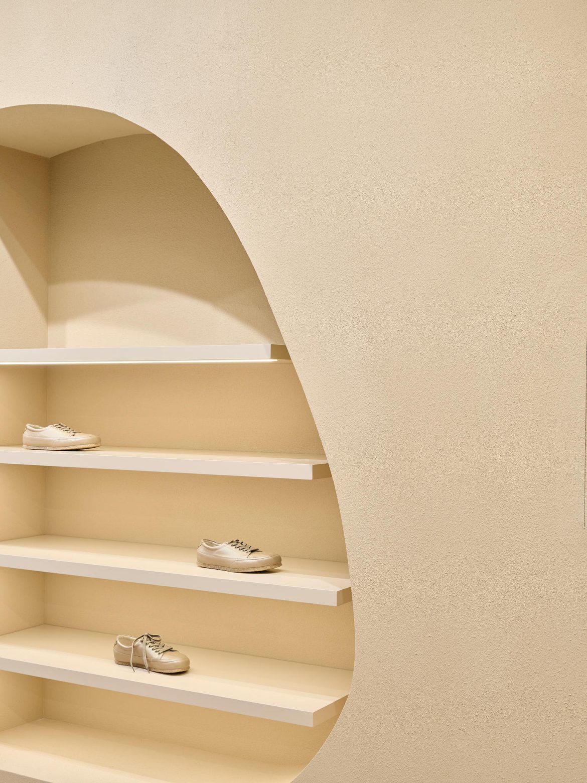
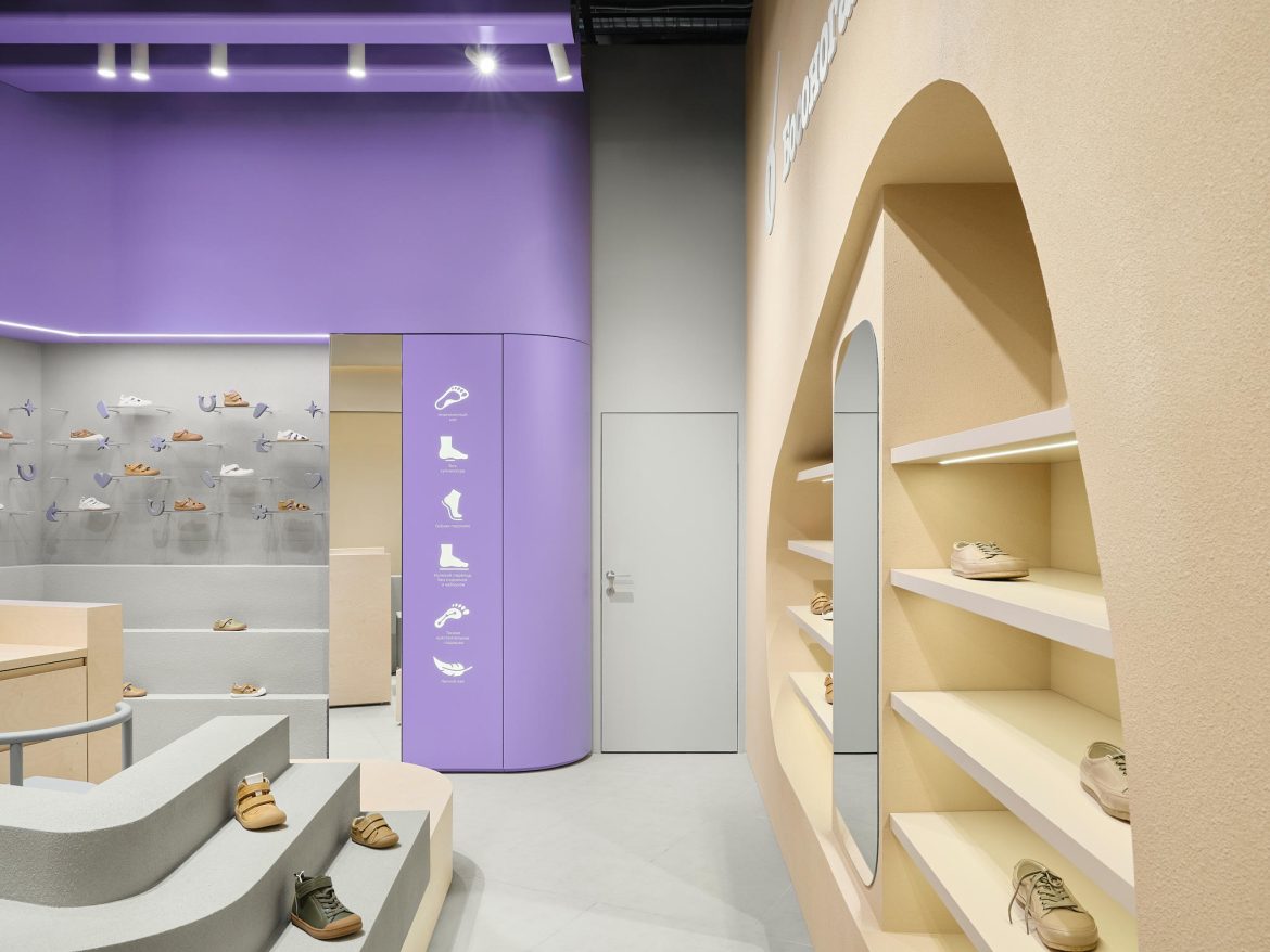
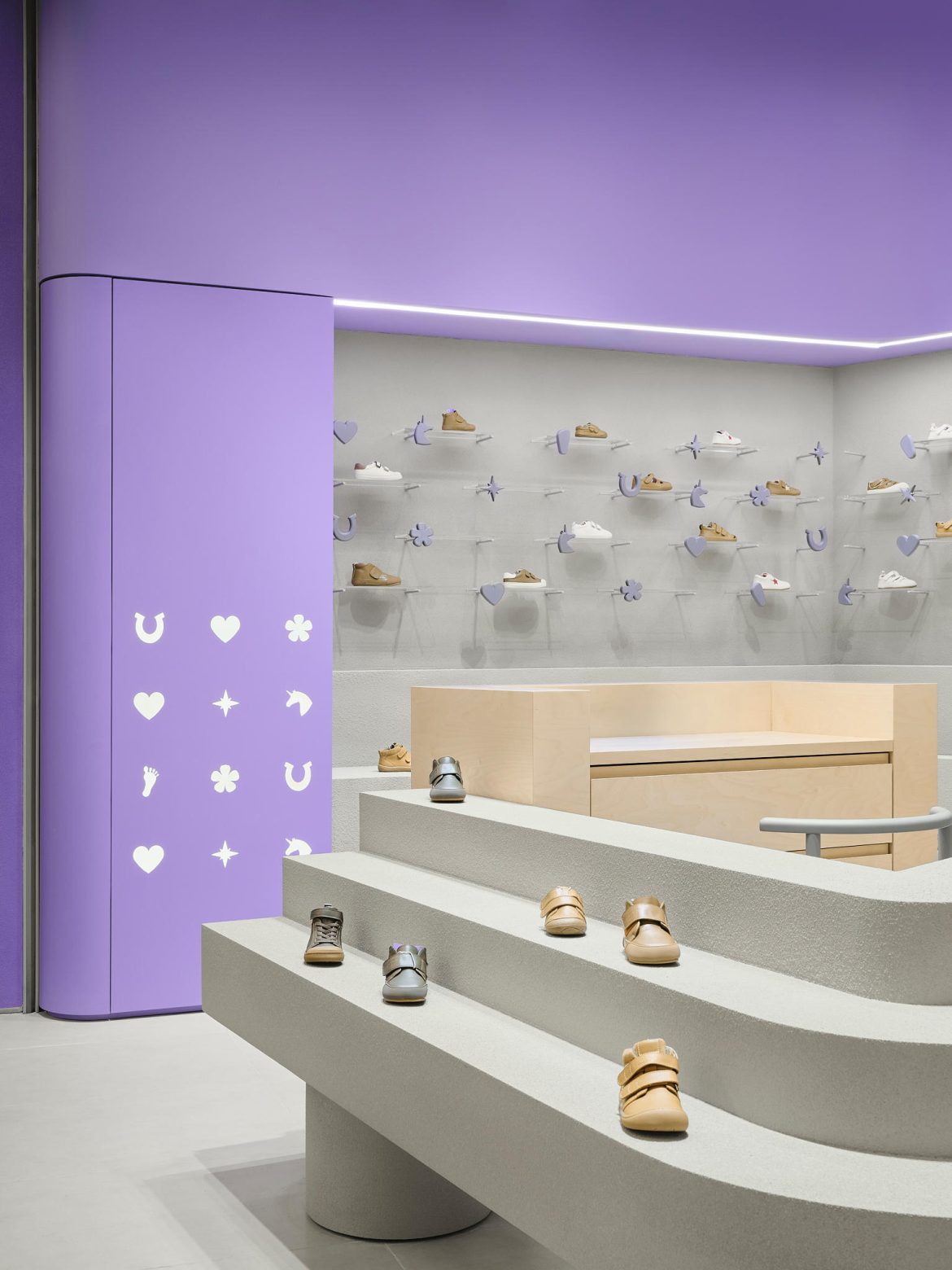
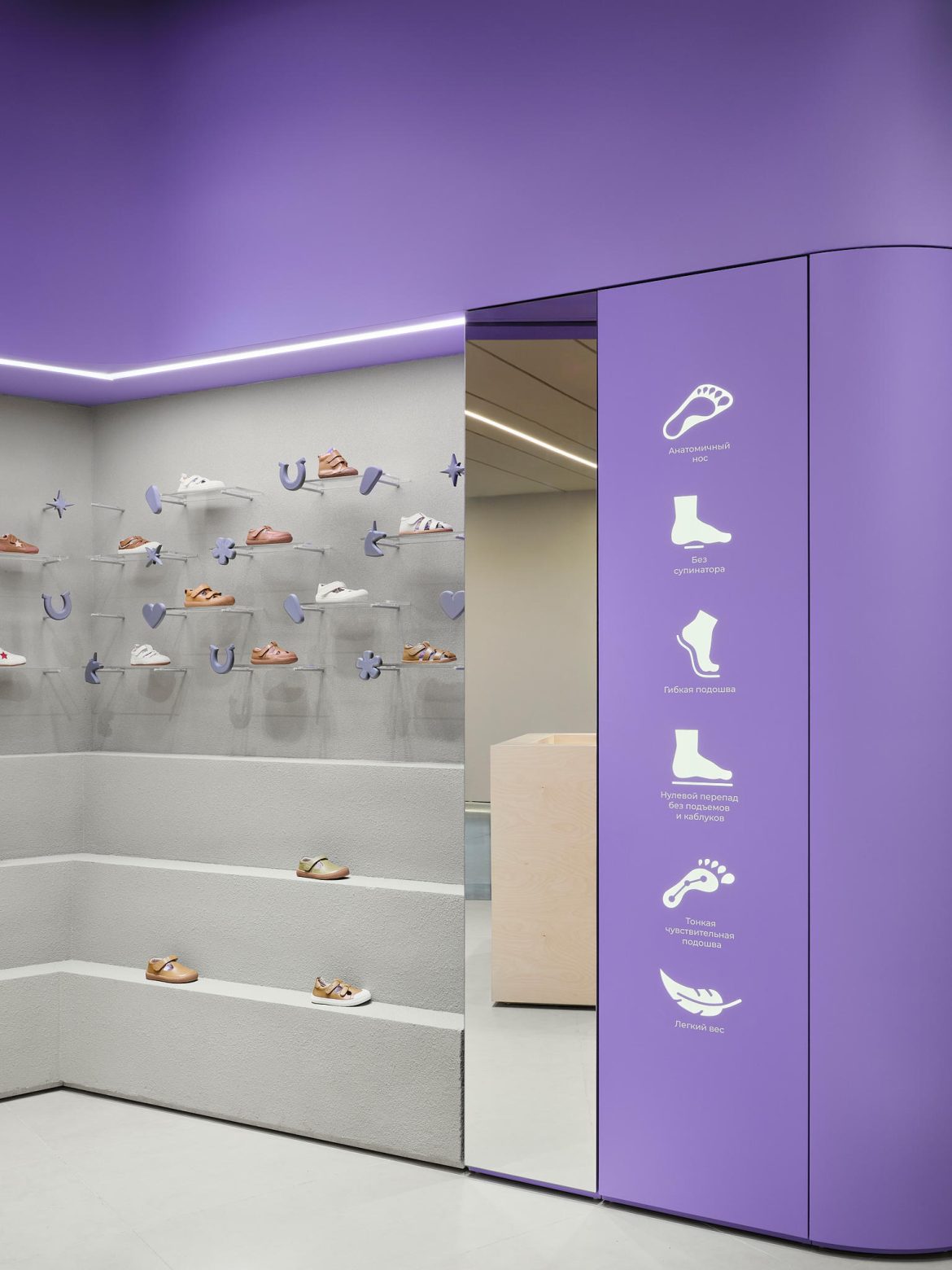
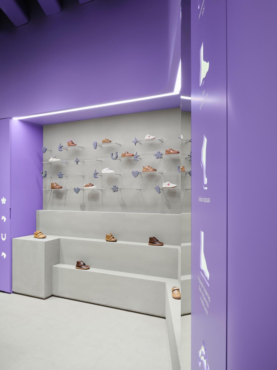
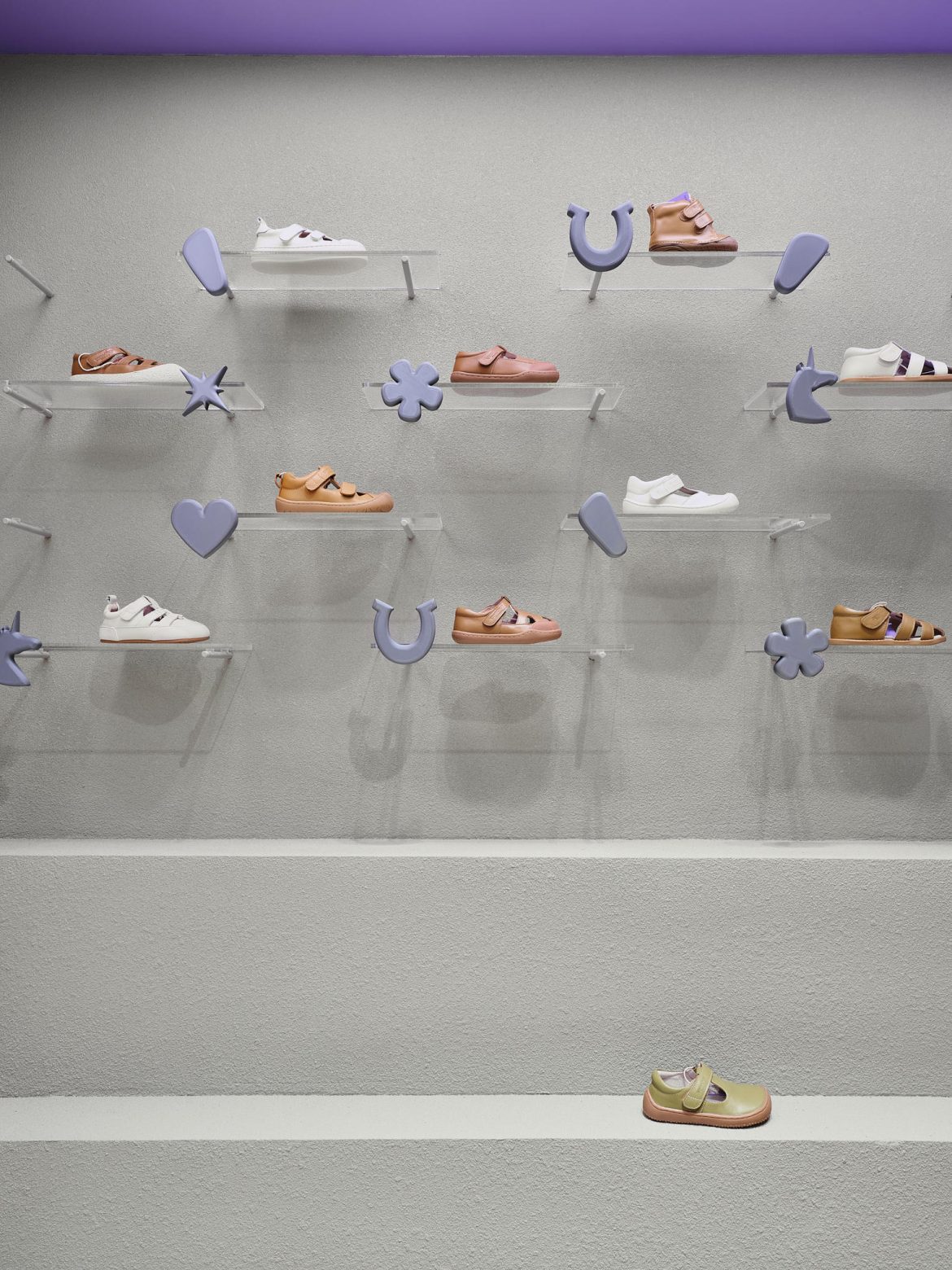
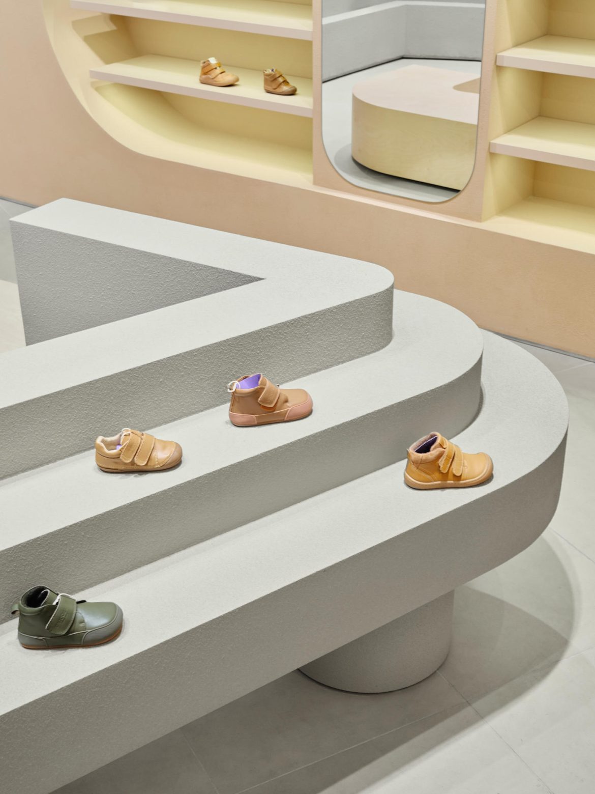
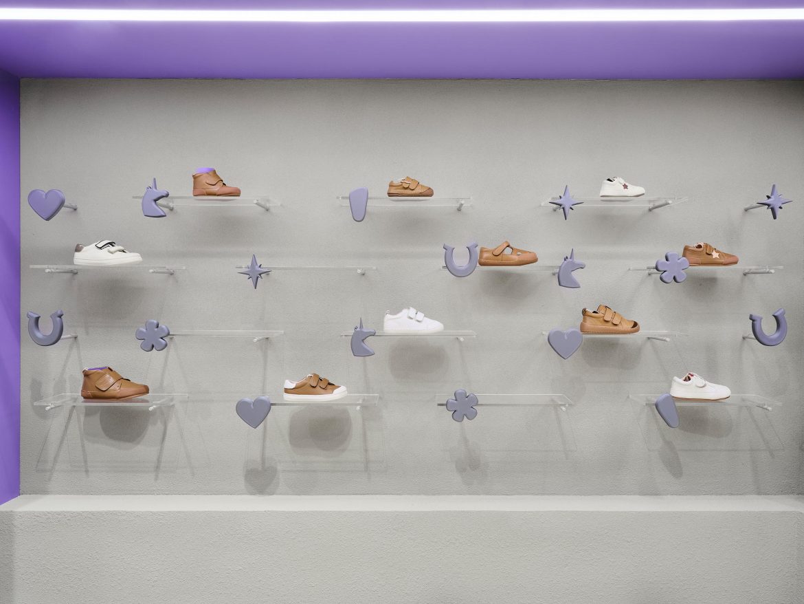
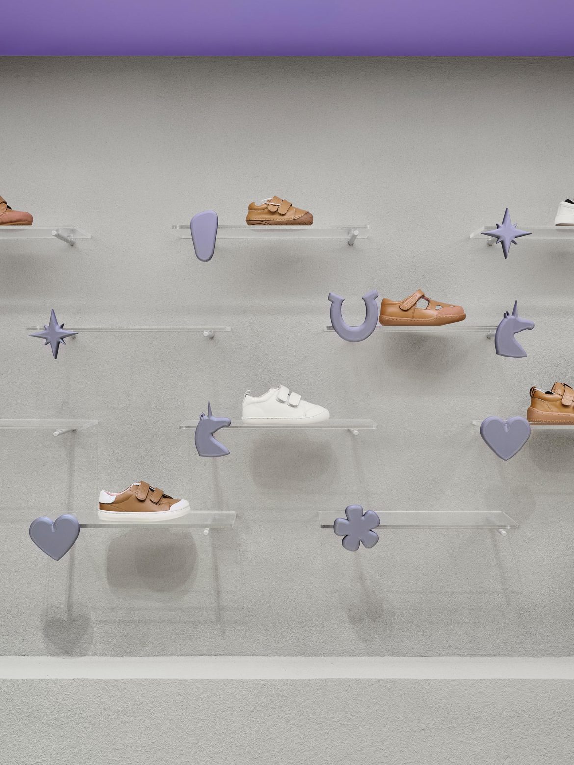
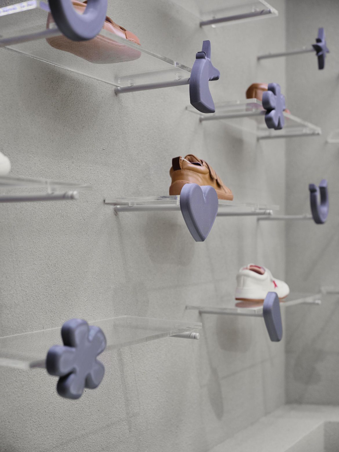
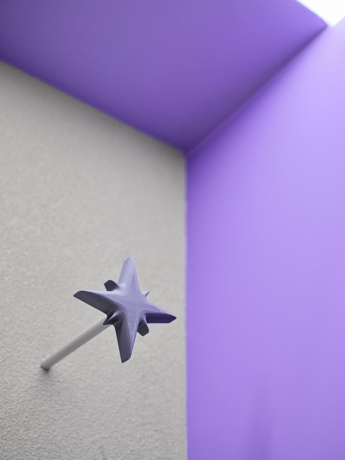
The central motif is the foot — a symbol of the product — expressed literally in a wall niche and echoed in decor, furniture, and 3D-printed figures on shelves. Every element is intentional and meaningful. Brand identity is further emphasized with a large “barefoot shoes” sign and graphic elements reflecting the product.


YOU MIGHT ALSO LIKE
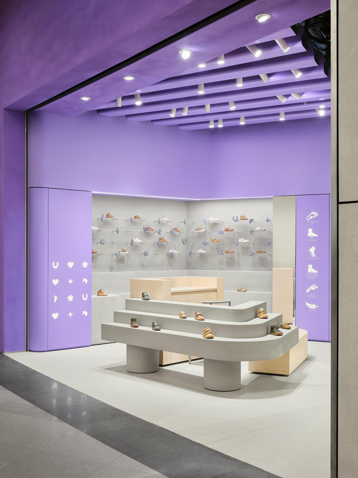
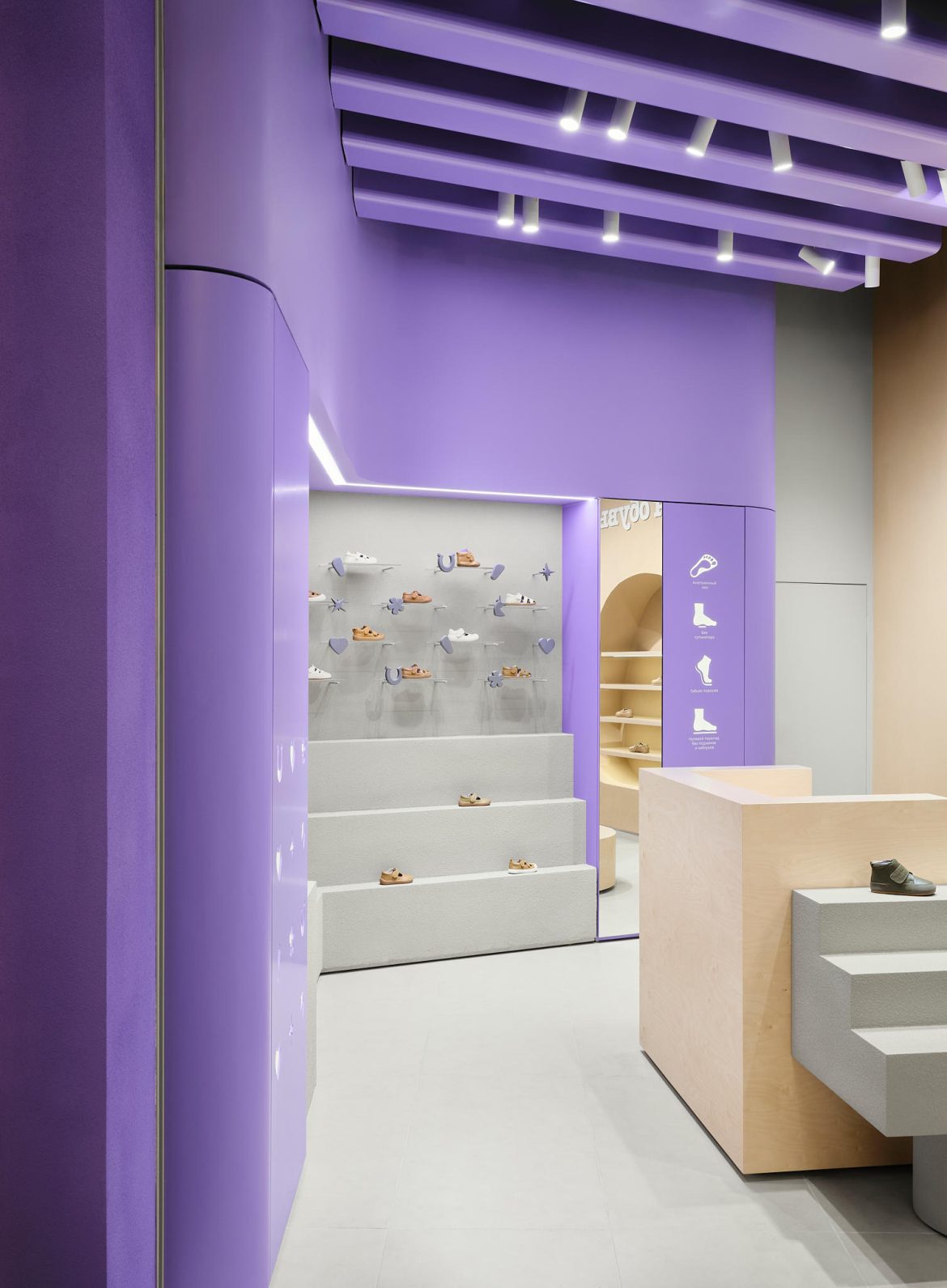
The layout consists of key zones: a children’s area with bright acrylic shelves, an adult footwear zone in foot-shaped niches, and a central island combining the cash desk, main display, and fitting area. Seasonal key models are displayed in the center, visible immediately through the open entrance without glazing.
Color and light were carefully considered. The base palette includes a lilac accent provided by the client, light plywood, and warm gray. The shift from cold gray to warm tones created a comfortable, inviting atmosphere, balancing a modern, expressive interior with a cozy feel suitable for both parents and children.
The result is a cohesive and memorable interior that not only fulfills functional requirements but also communicates the brand’s values.


