Project name: HOLLYSHOP
Interior design: Sinitsa Buro
Chief Architect: Varvara Serebrova
Architects: Serafima Demidova, Anastasia Petrina
Location: Saint Petersburg
Area: 360 m2
Year: 2025
Project description from design firms
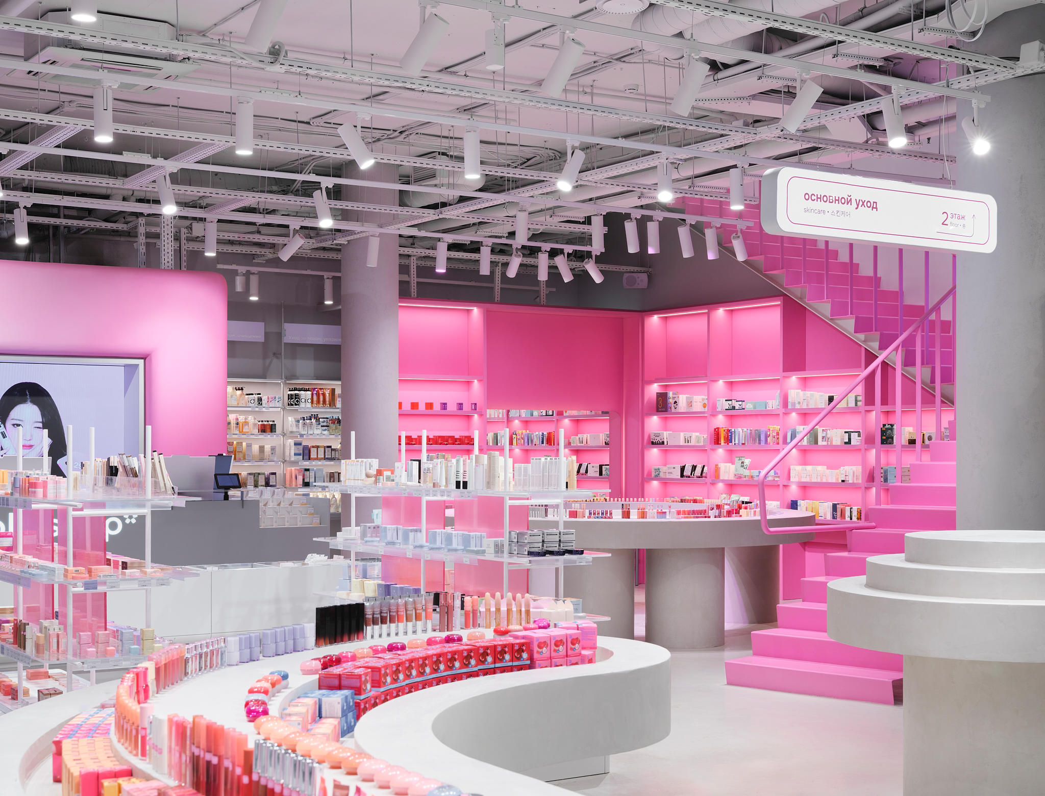
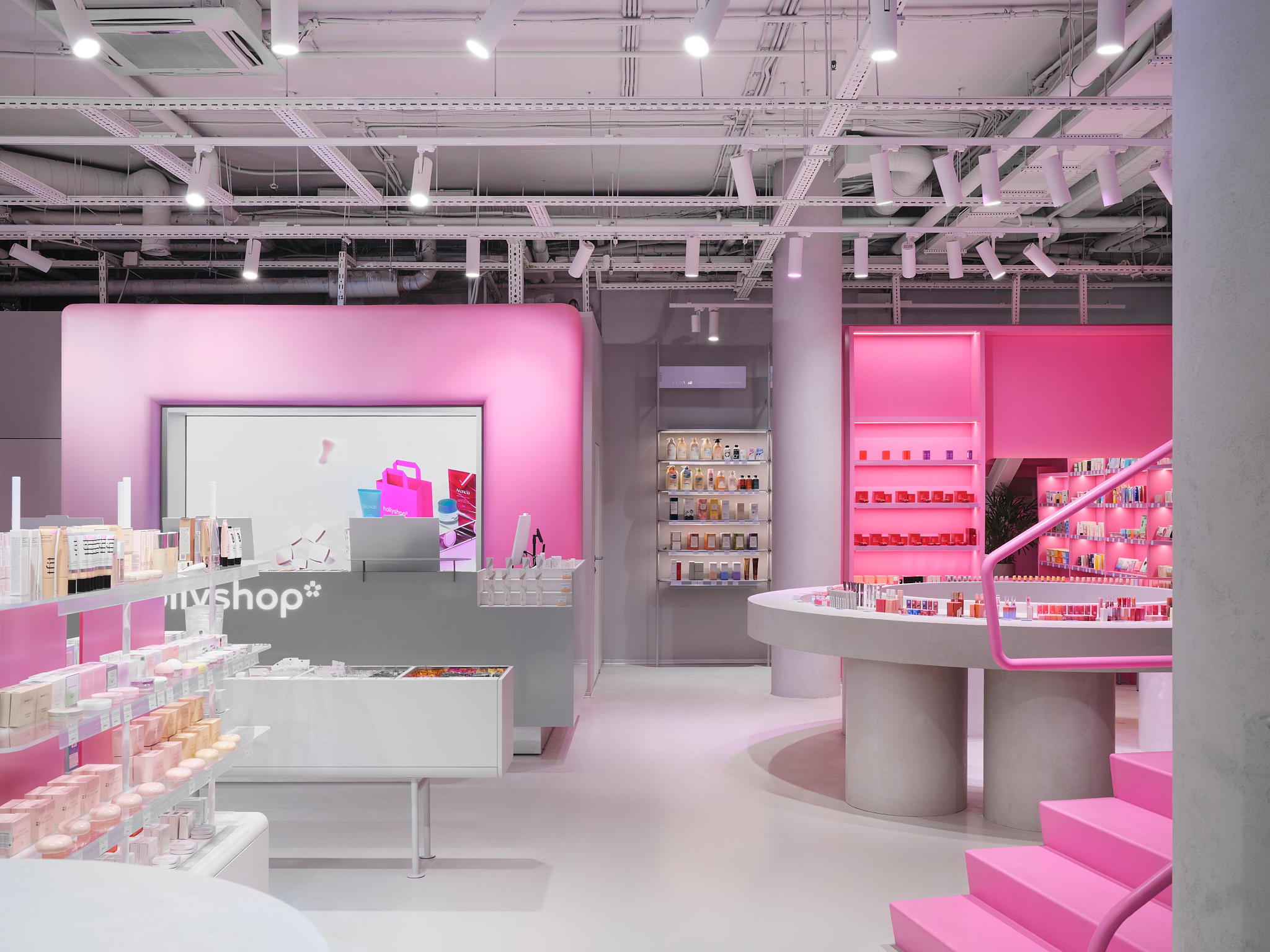
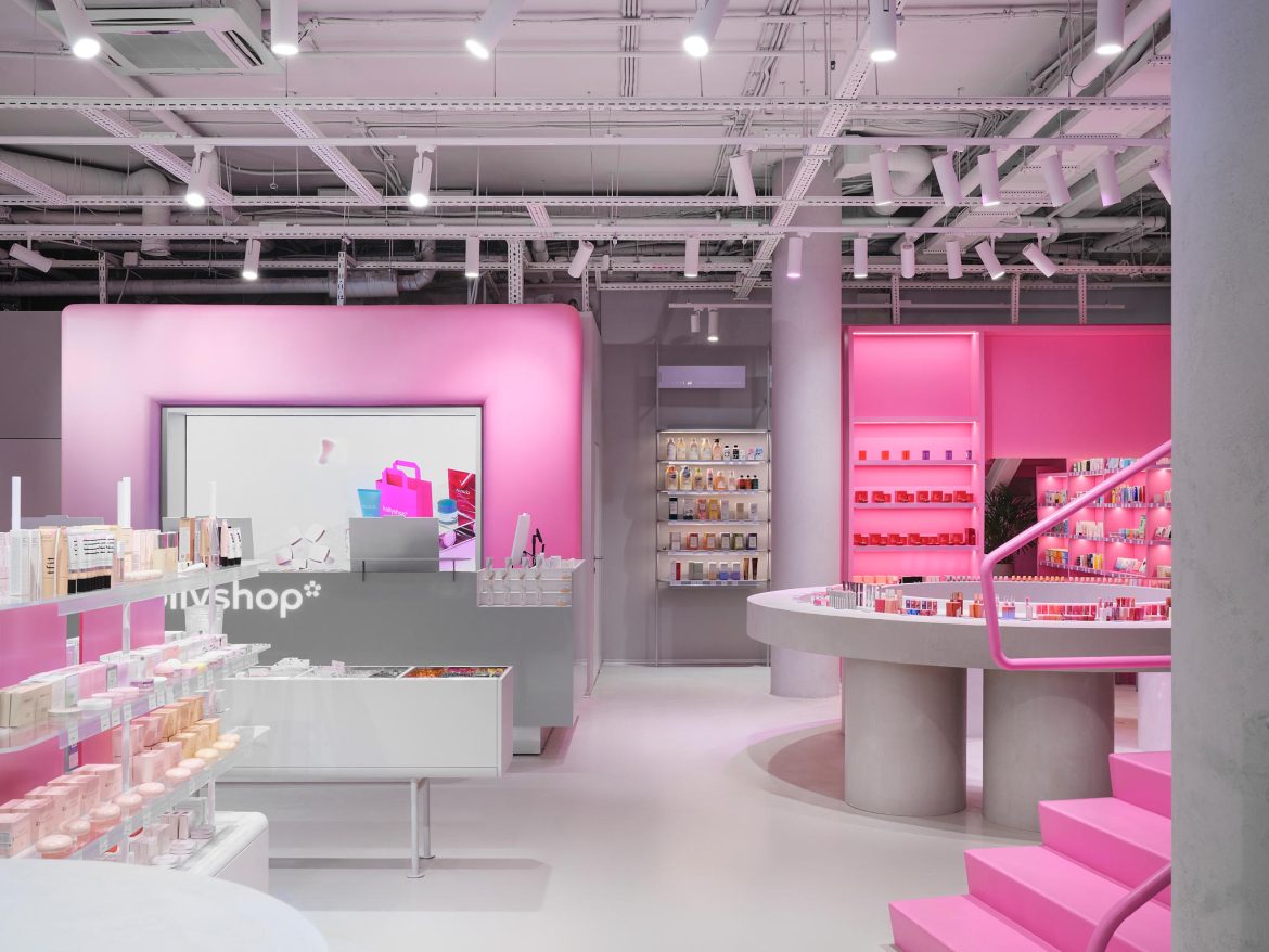
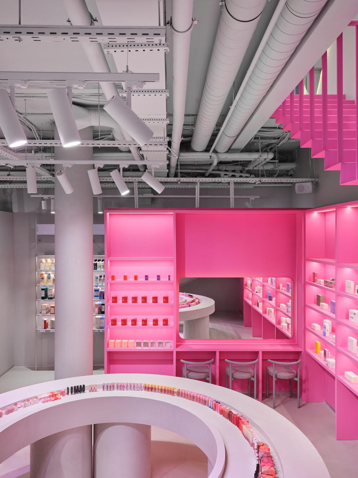
The project is the third Hollyshop Shop in Saint Petersburg, located at 84 Bolshoy Prospect P.S. This two-story, 360 m² space was developed as an expansion and scaling of the brand’s existing retail concept. The project followed the opening of the first two stores — the flagship on Kotelnicheskaya Embankment and the second on Suschevskaya Street in Moscow.
The client aimed to create a vibrant, memorable space with a clear wow factor — one that attracts attention from the street and immediately sets an emotional tone inside. A key challenge was not only to design an impressive interior but also to maximize the potential of the two floors and use them as an added advantage.


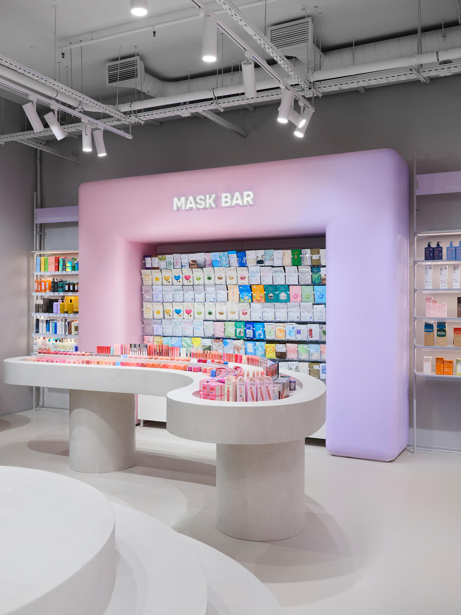
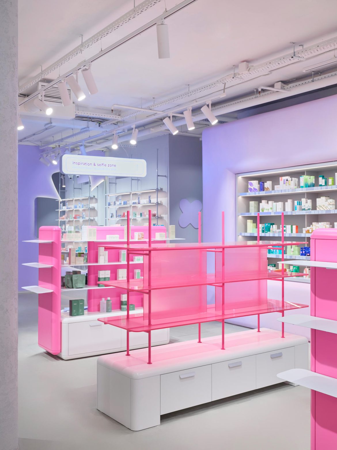
Key objectives included maintaining brand recognition and continuity with previous stores, enhancing the cosmetic experience through testing and interaction, creating a comfortable environment for both shopping and spending time, integrating modern beauty tools such as a skin analysis zone, and avoiding visual overload while keeping a balance between vibrancy and convenience.
Korean beauty retail served as a reference, adapted to a more restrained and universal format.
The main idea was to combine and rethink the best solutions from the first two Hollyshop stores, creating a larger but cohesive and balanced space.


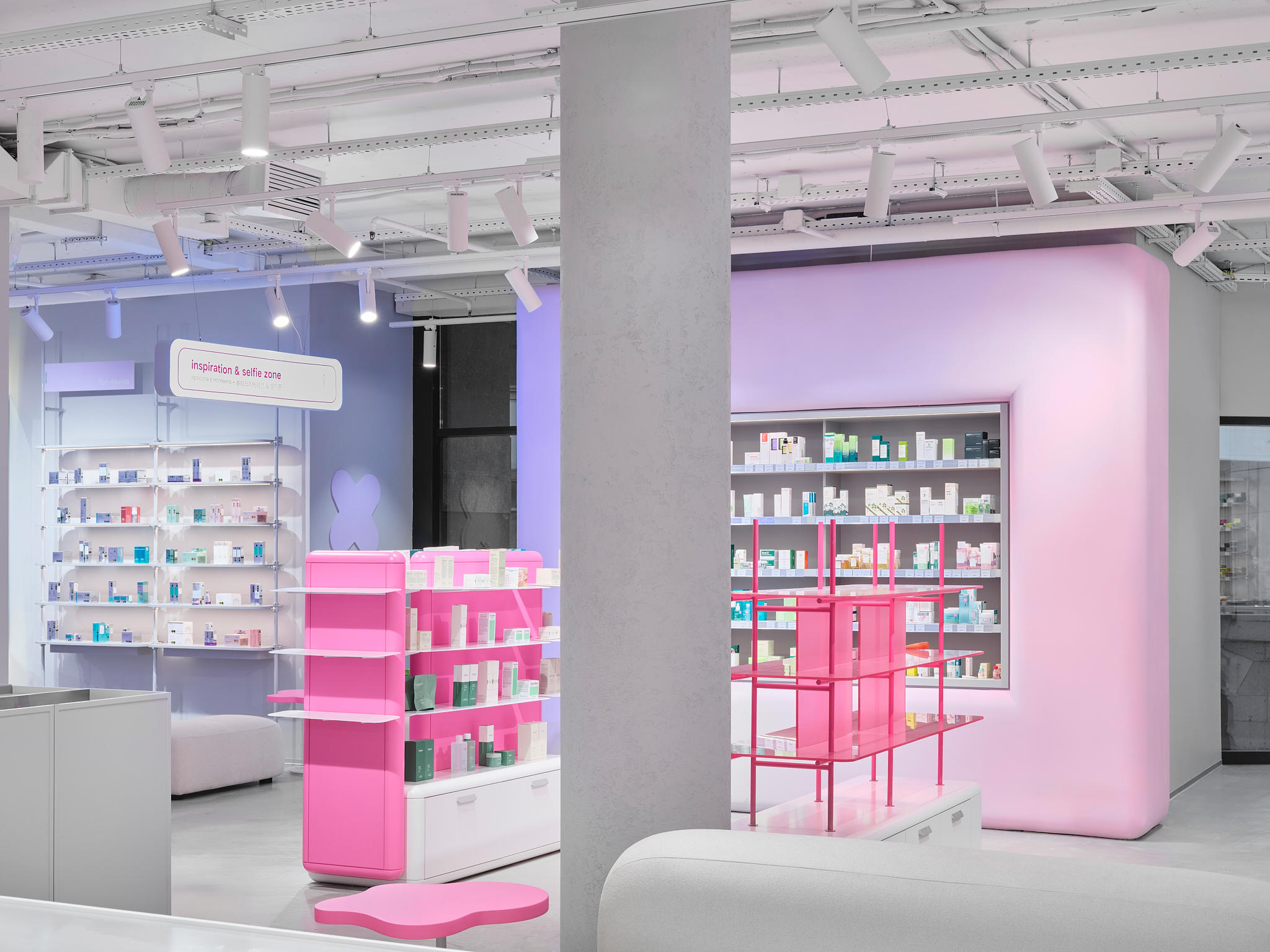
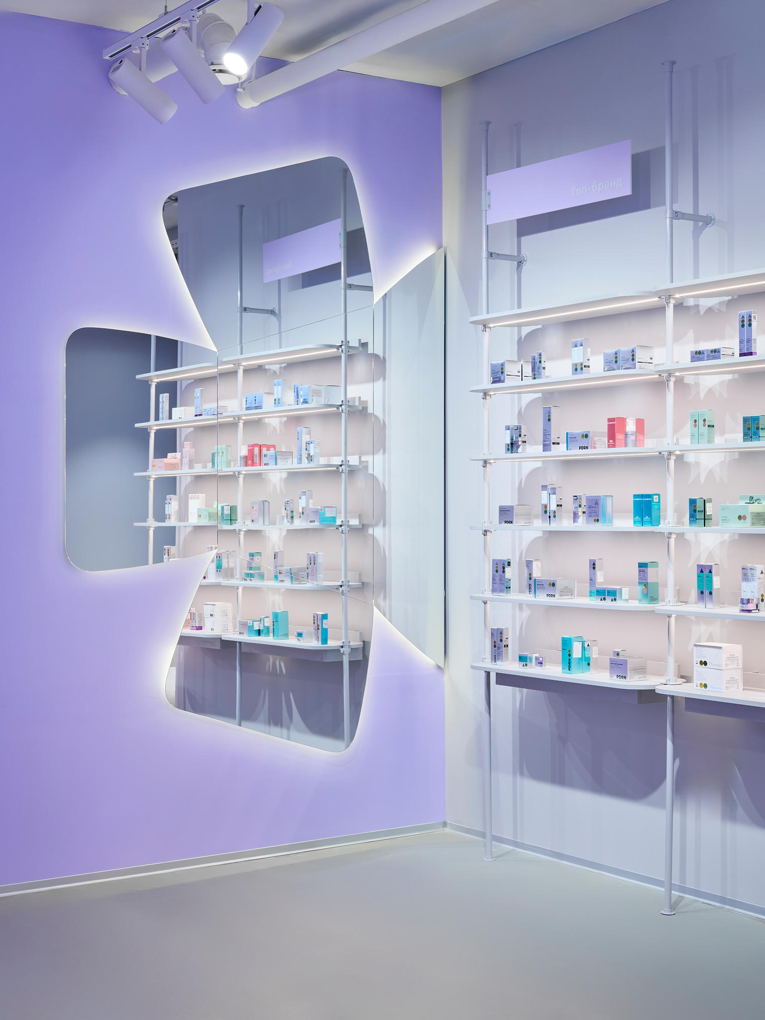
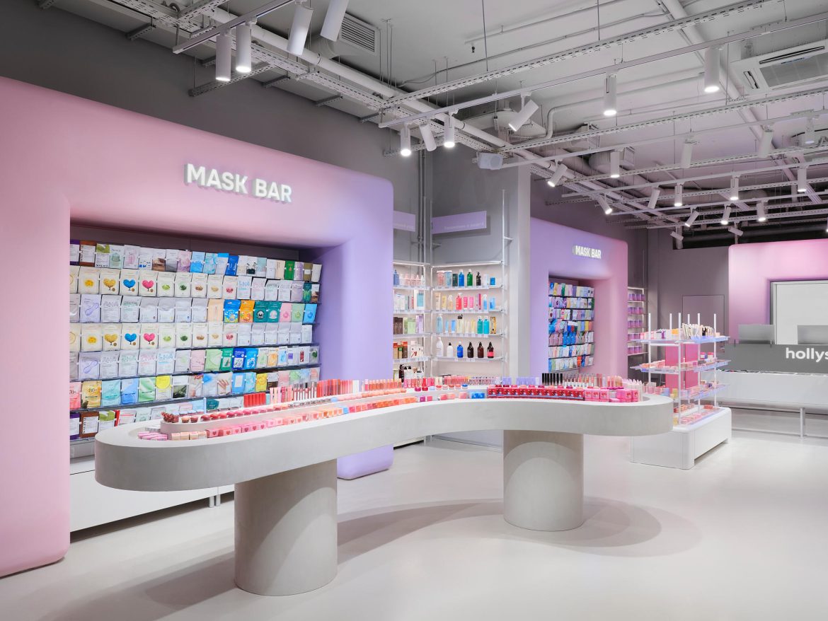
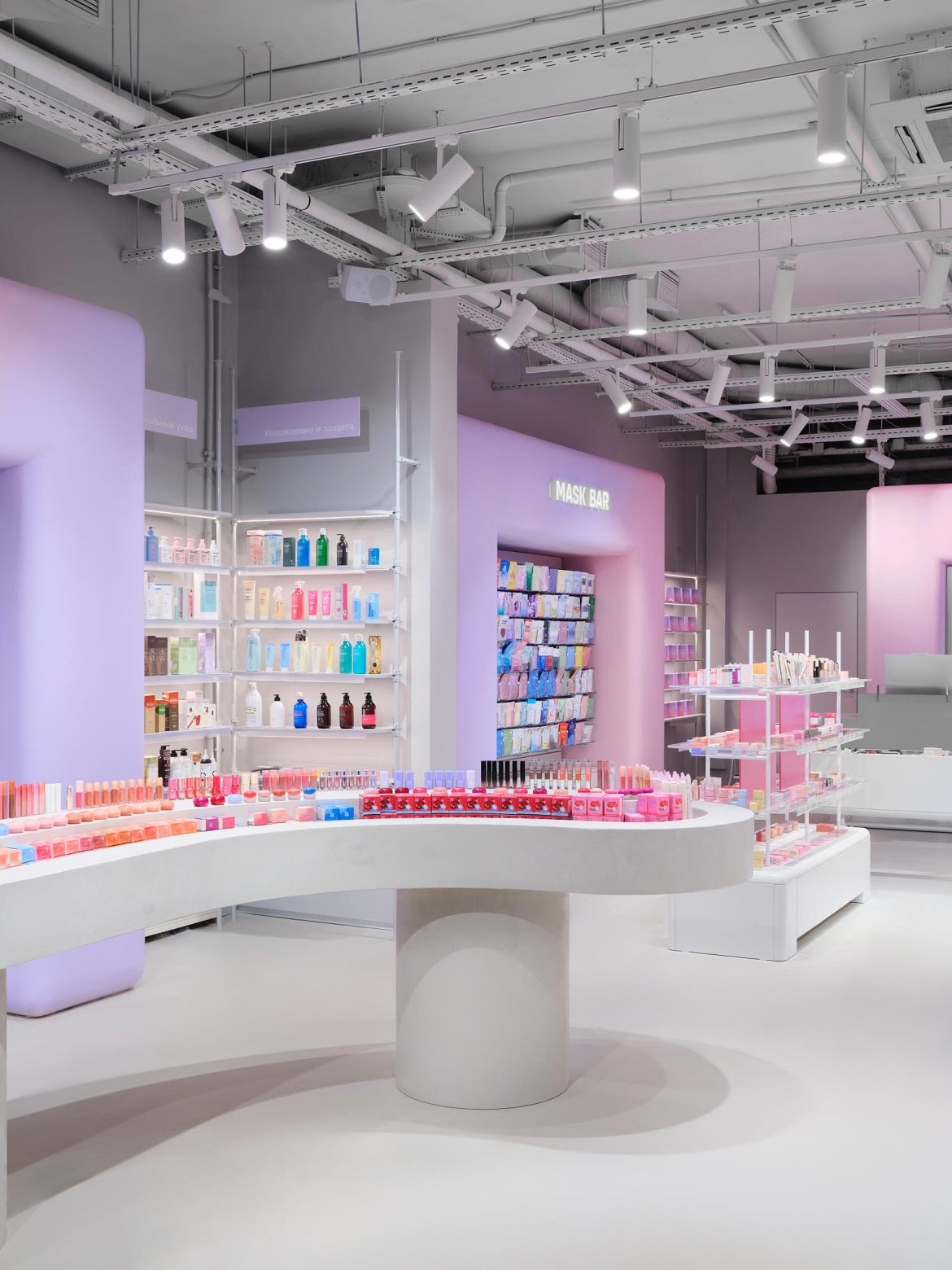
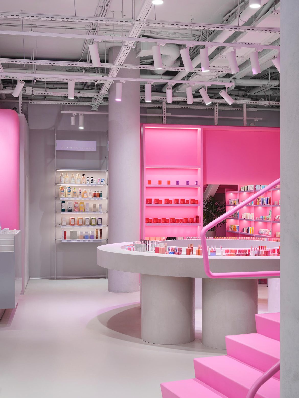
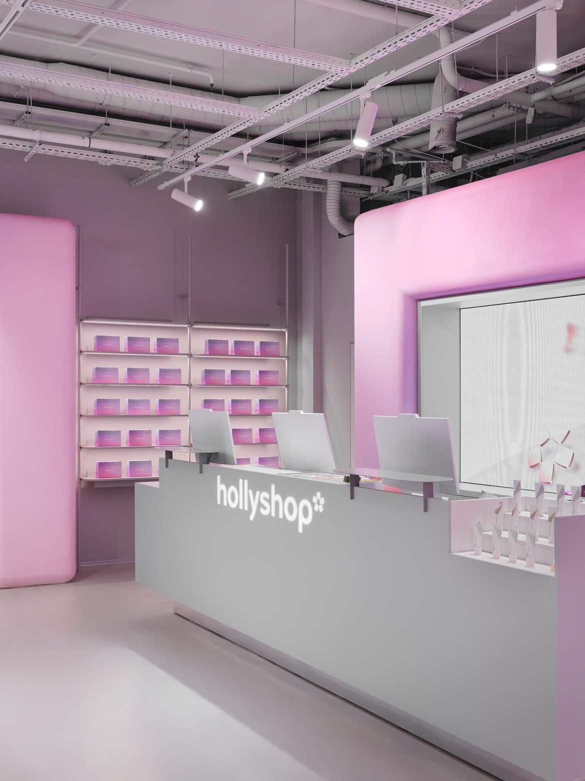
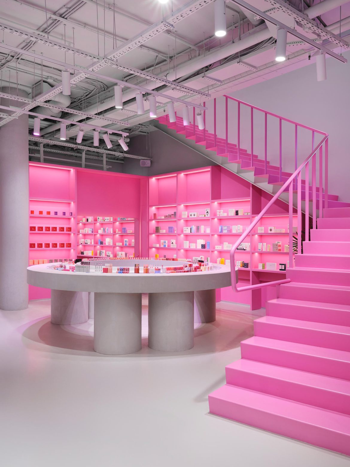
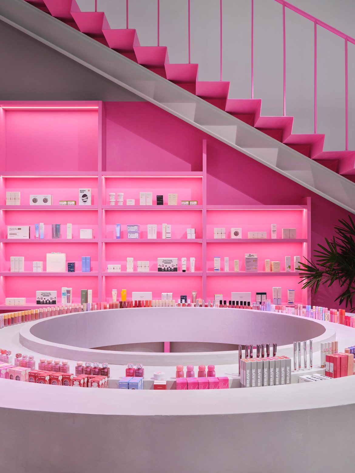
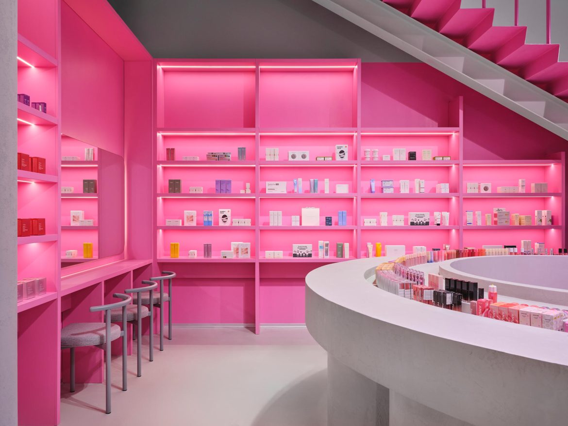
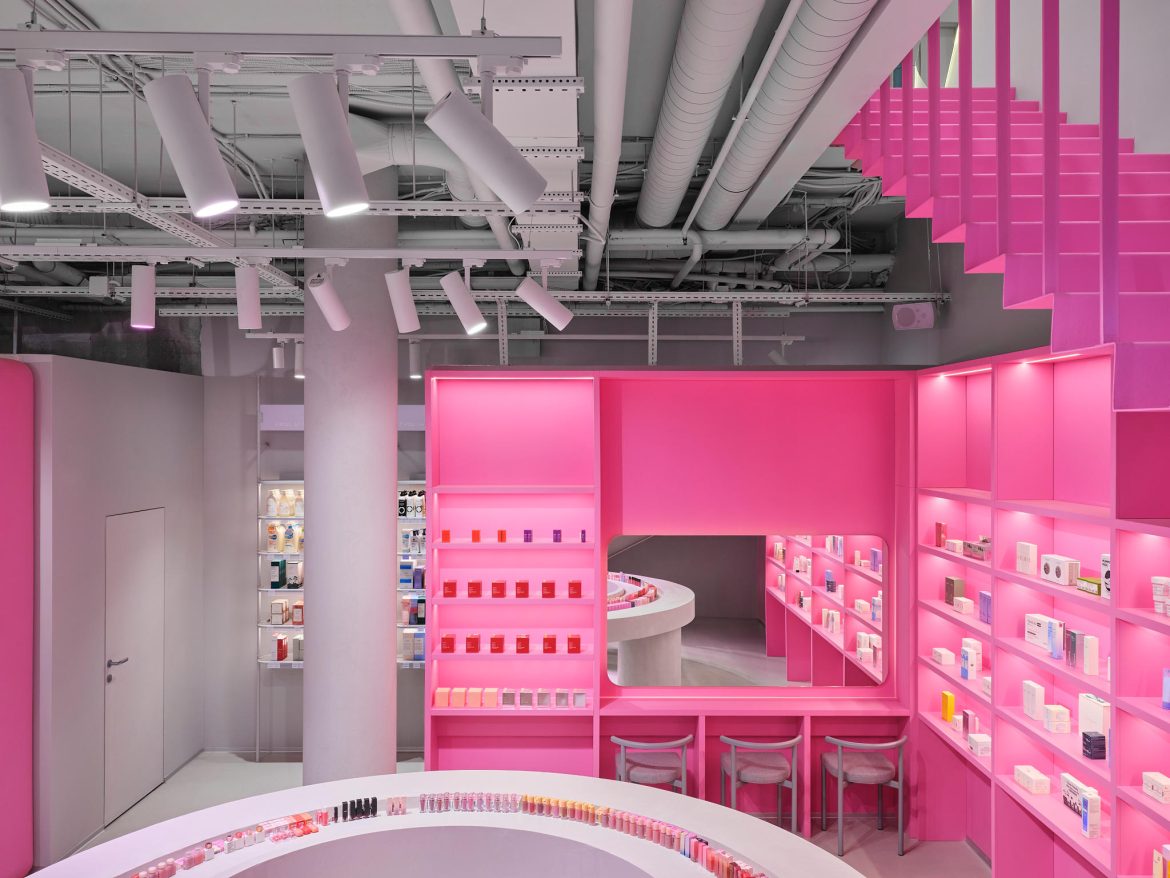
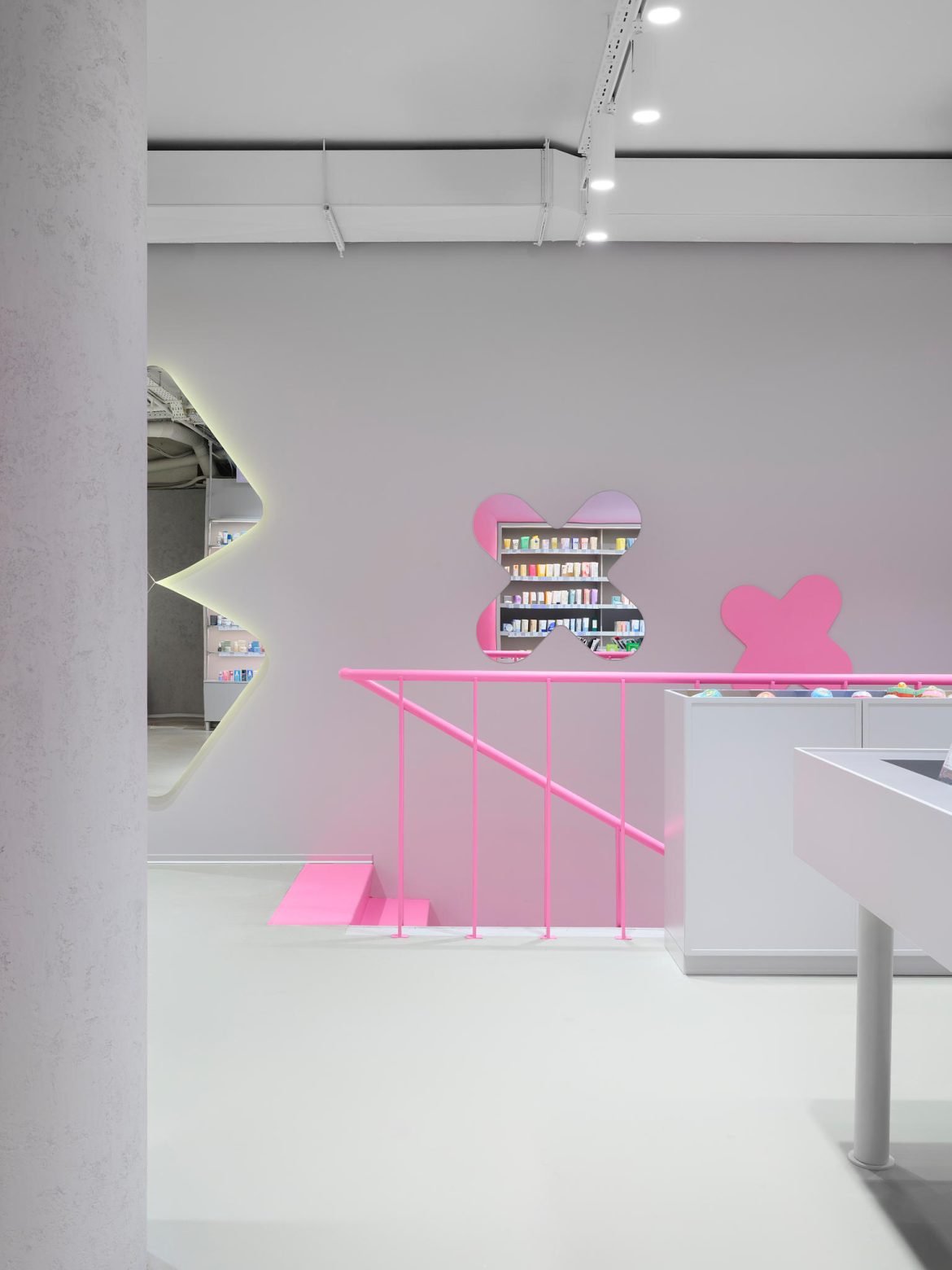
The concept merges two experiences: on one hand, a bright, emotional, playful experience that engages and leaves a lasting impression; on the other, calm, logical architecture that is easy to navigate and comfortable to be in.
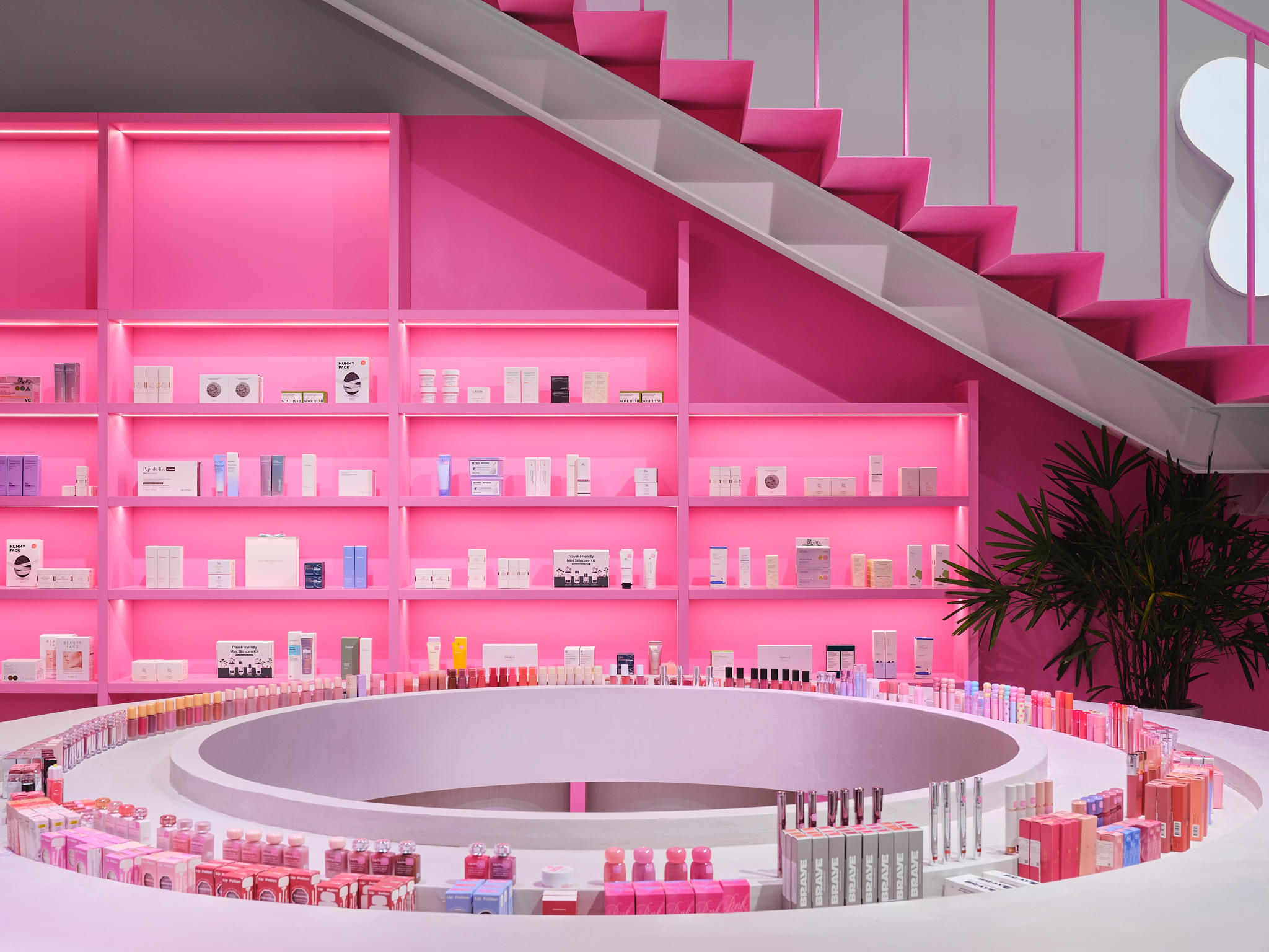
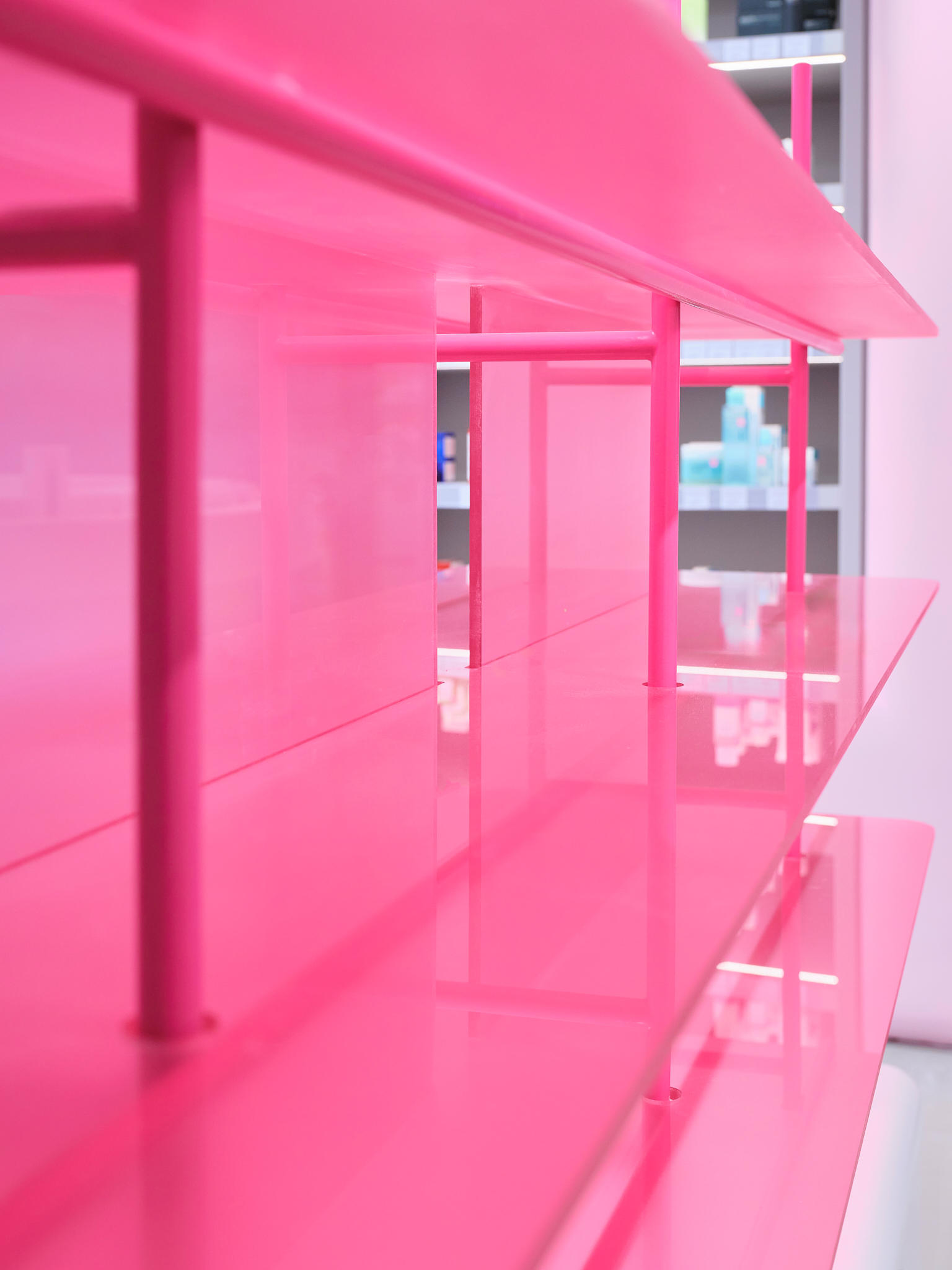
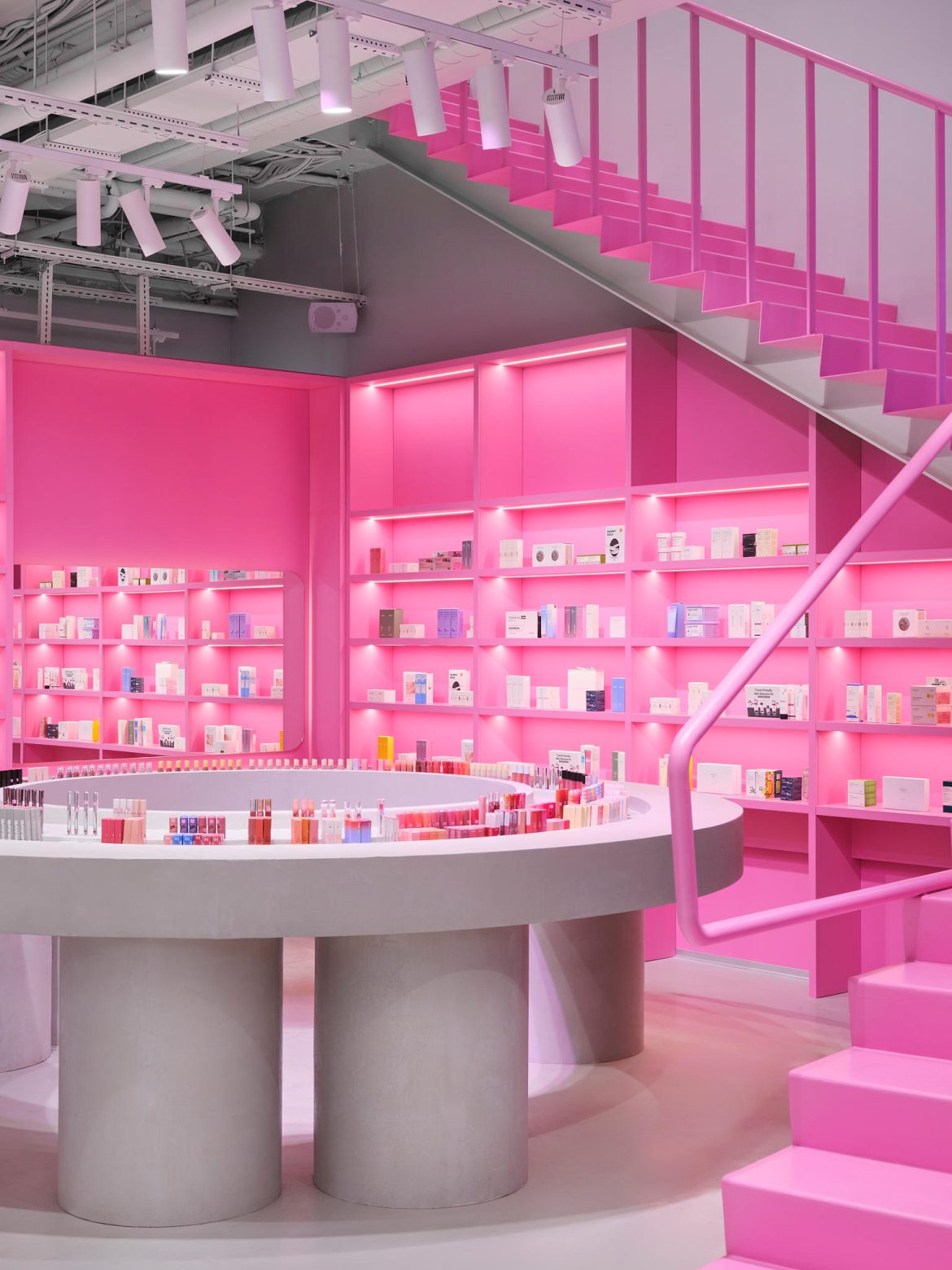
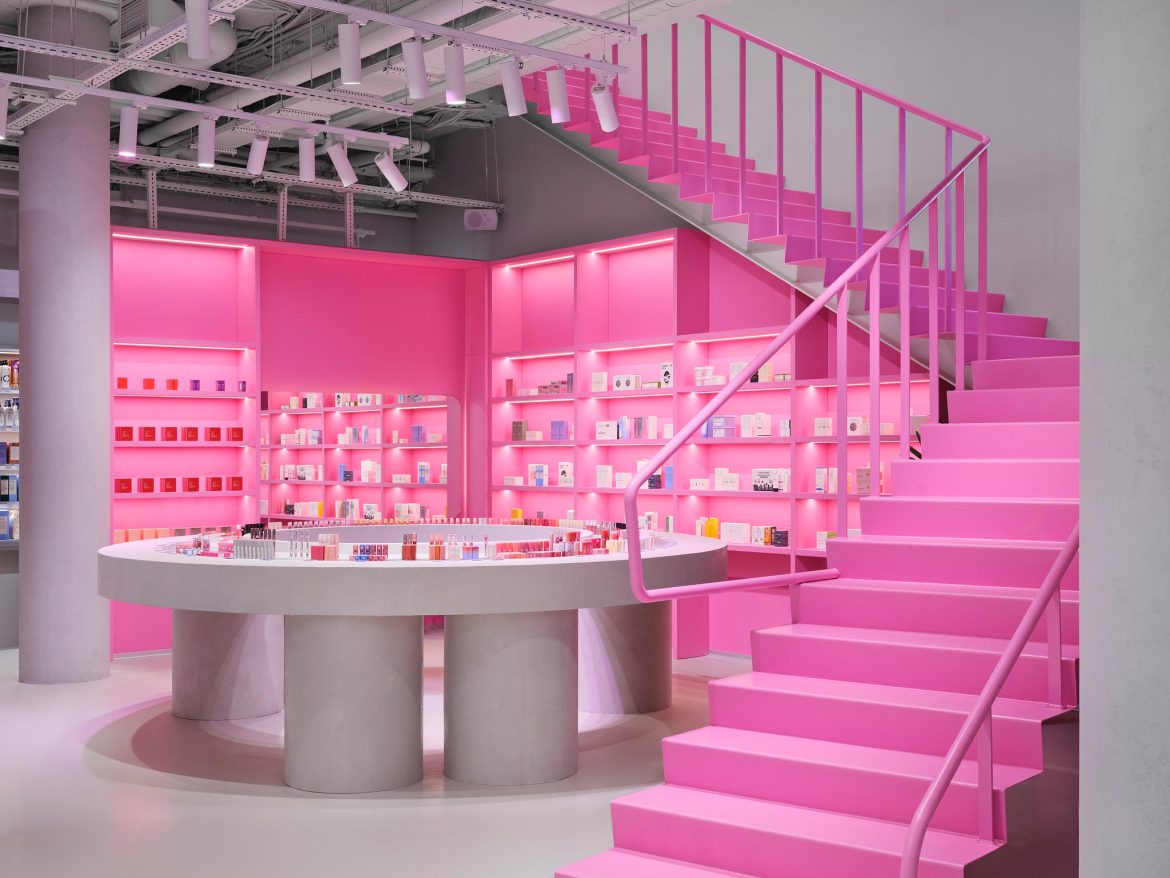
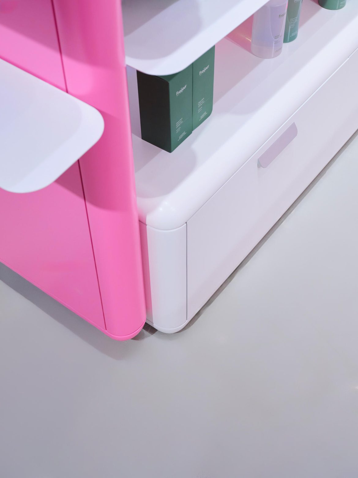
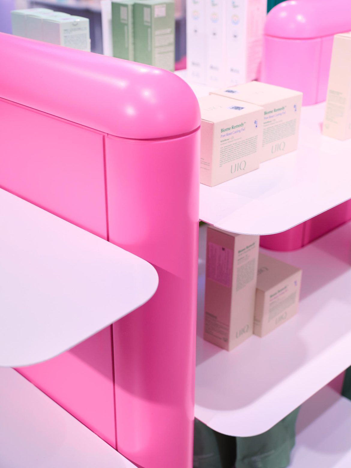
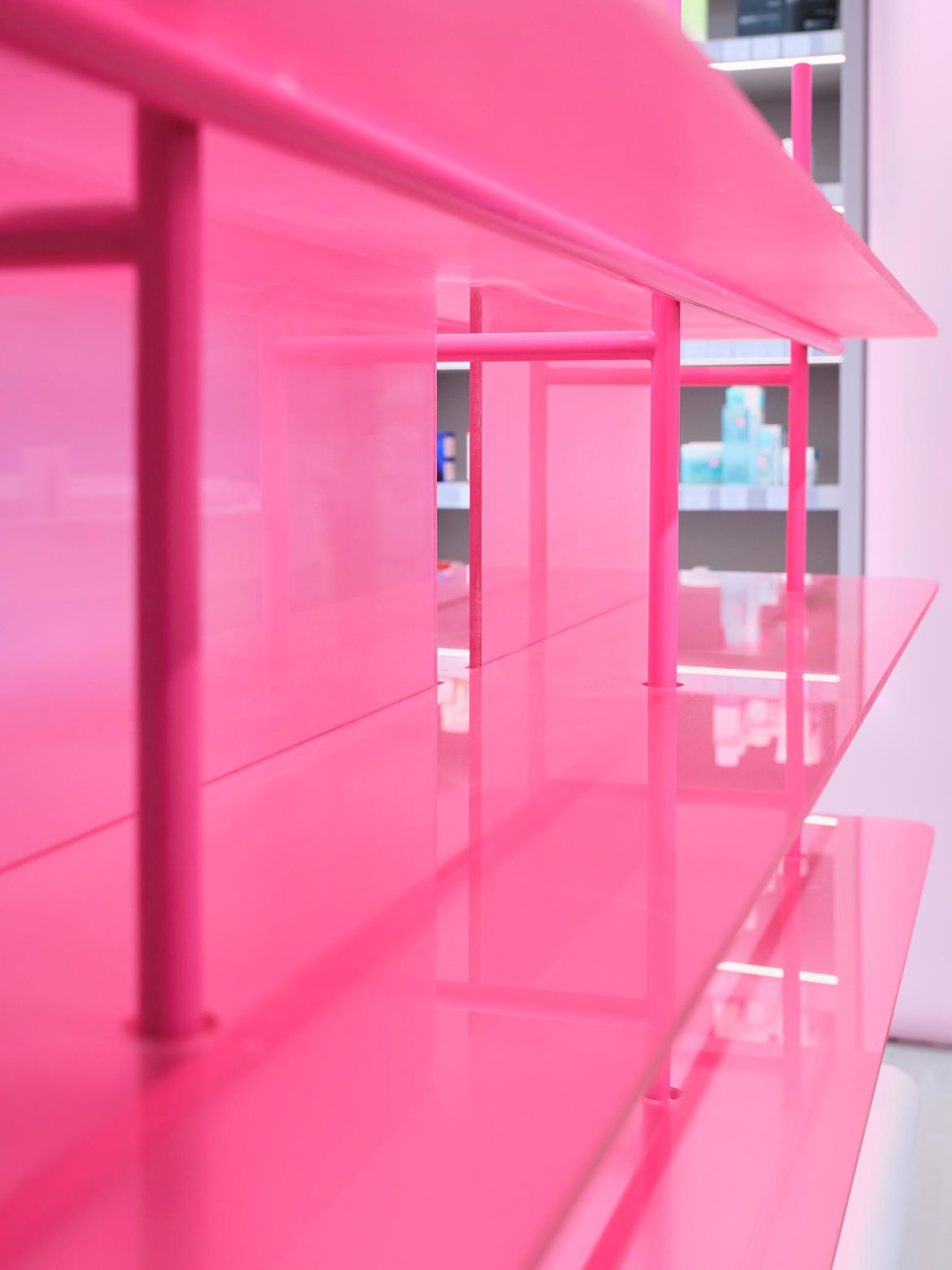
We based the design on the dynamic horizontal shelving “snake” from the flagship store and combined it with a softer color palette and delicate features from the second space.
Spatial planning played a key role: an open layout without rigid corridors, clear sightlines, and functional distribution across levels. The result is an interior that is visually attractive and intuitively understandable, allowing visitors to freely move, test products, interact, and spend time comfortably.
Collaboration with the client and team was built on trust and coordination. Being the third joint project, there was a strong mutual understanding and familiarity with the brand’s style.


Key decisions were often left to our team, as the client trusted our professional expertise. Changes were discussed collaboratively and quickly approved. Adjustments were made to layout details, engineering solutions, and individual zones, but the overall concept remained unchanged.
Complex approvals were minimal due to prior experience and transparent communication. All decisions were made promptly, with key moments confirmed through visualizations and prototypes, ensuring efficiency and project integrity.
The primary goal was to create a space where people genuinely feel comfortable. The store was designed not only as a visually appealing object but also as a functional environment, facilitating easy navigation, product testing, and time spent within the space.
This was not a standard project — it became an important experience in scaling a concept, teaching us to approach expansion flexibly, trust the core concept, and maintain a balance between aesthetics and functionality.
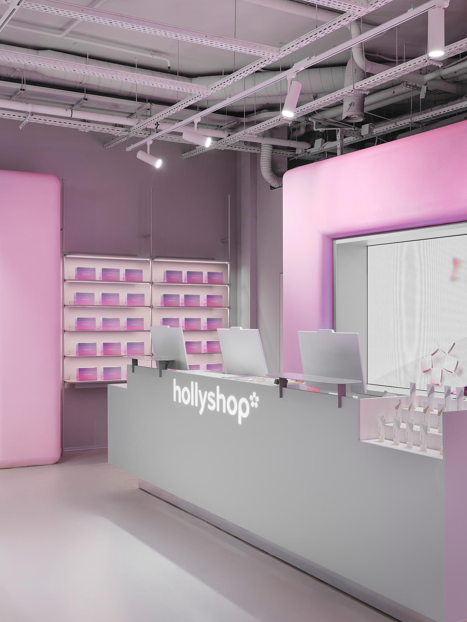
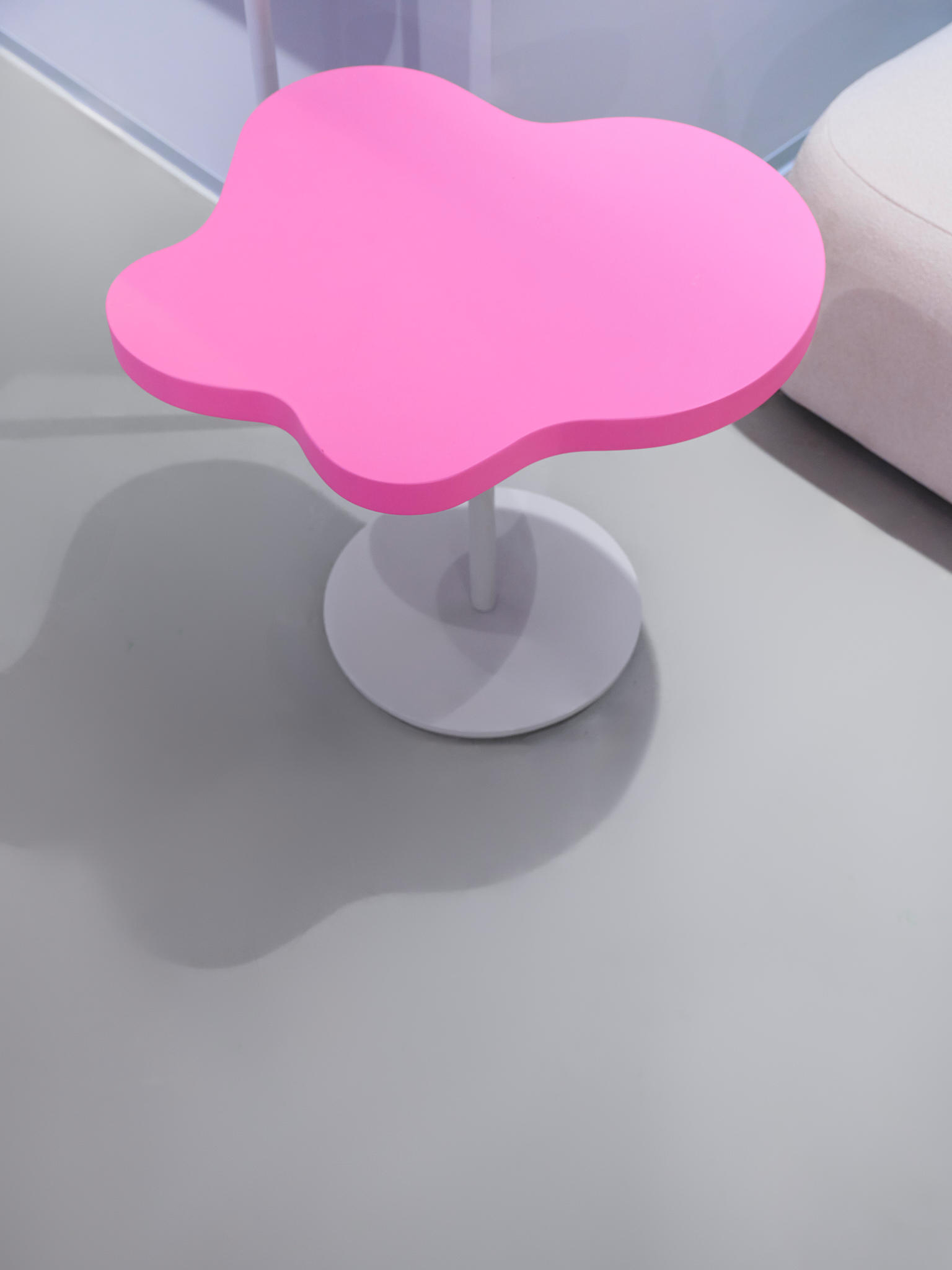
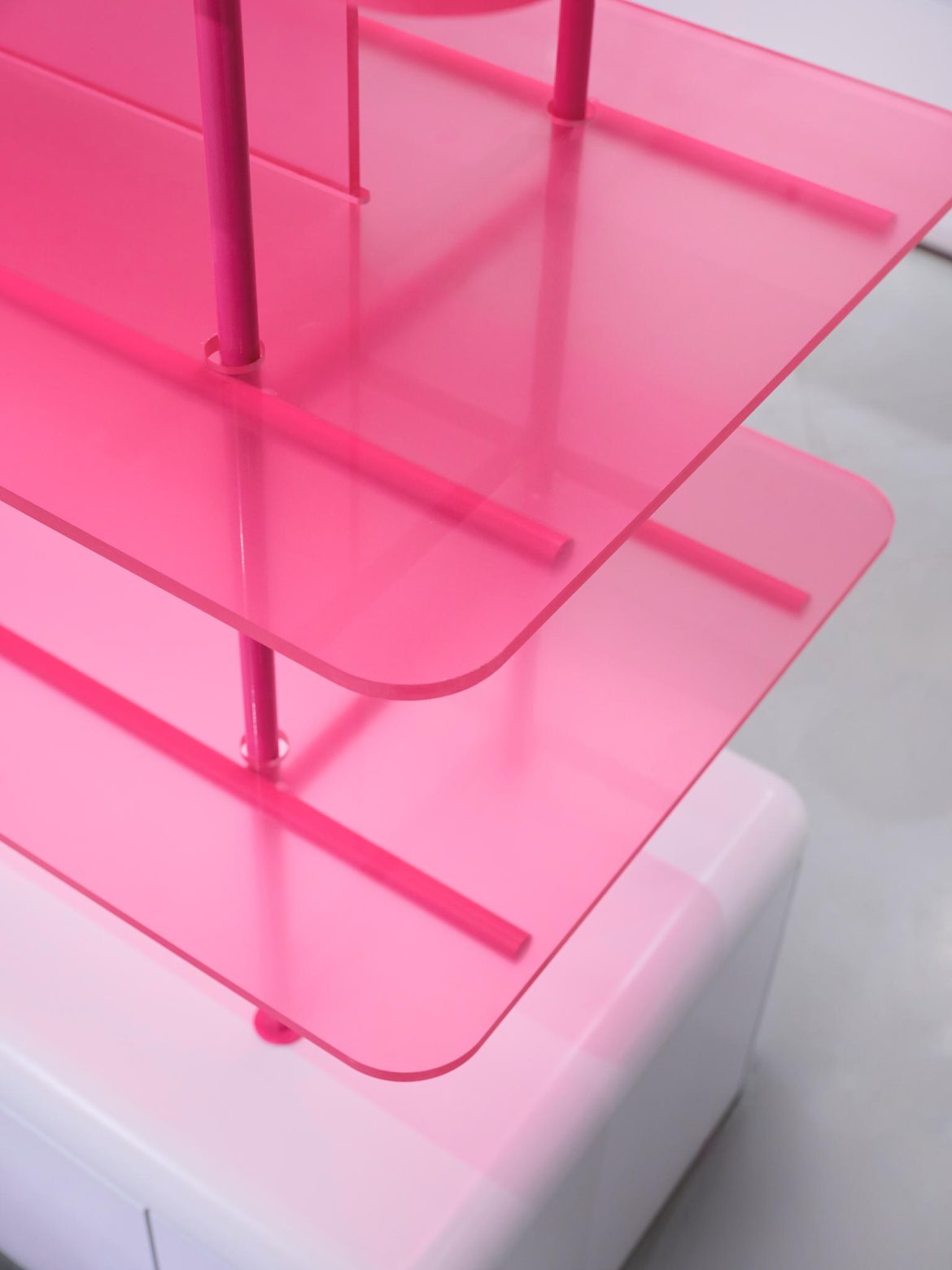
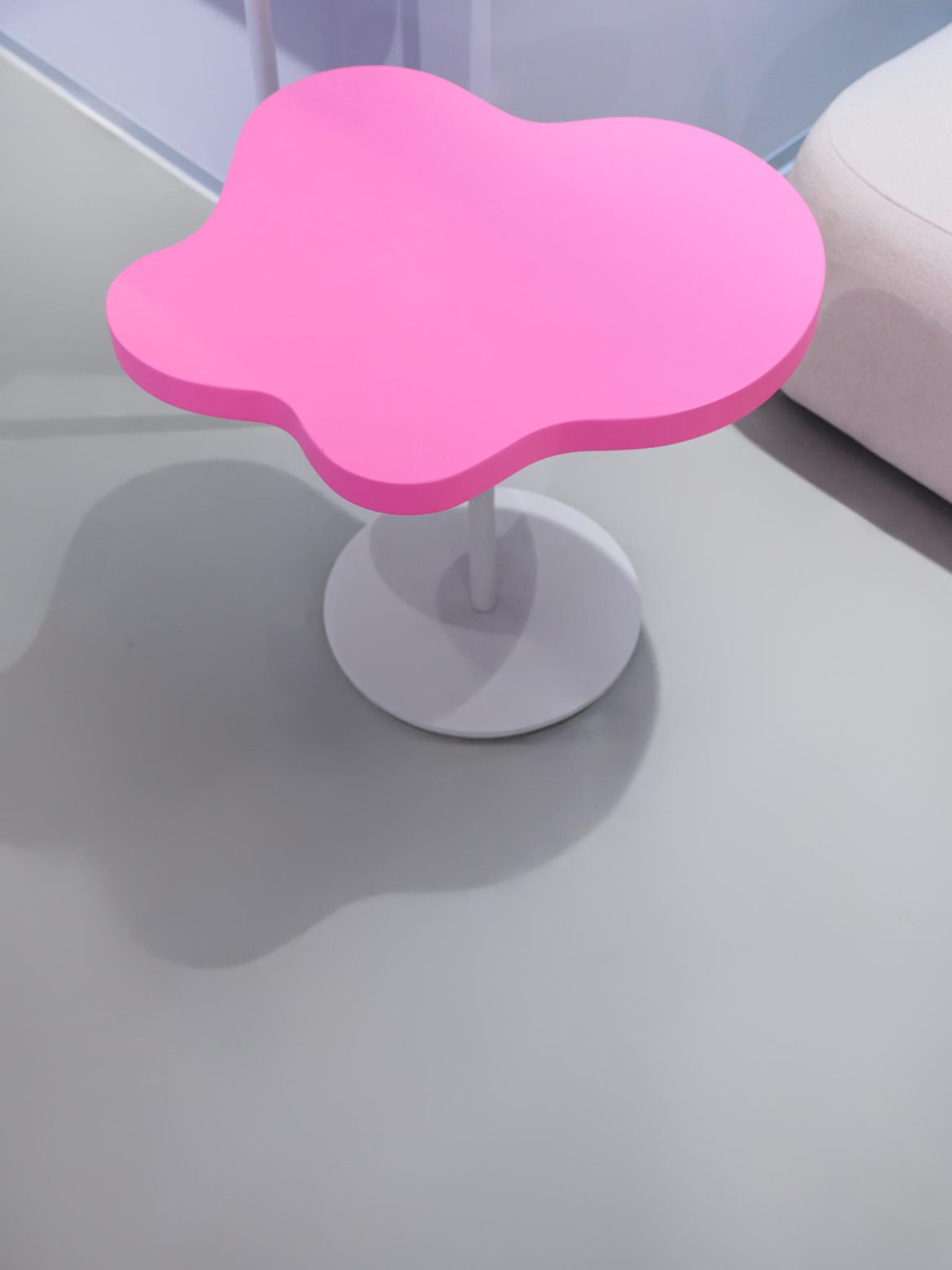
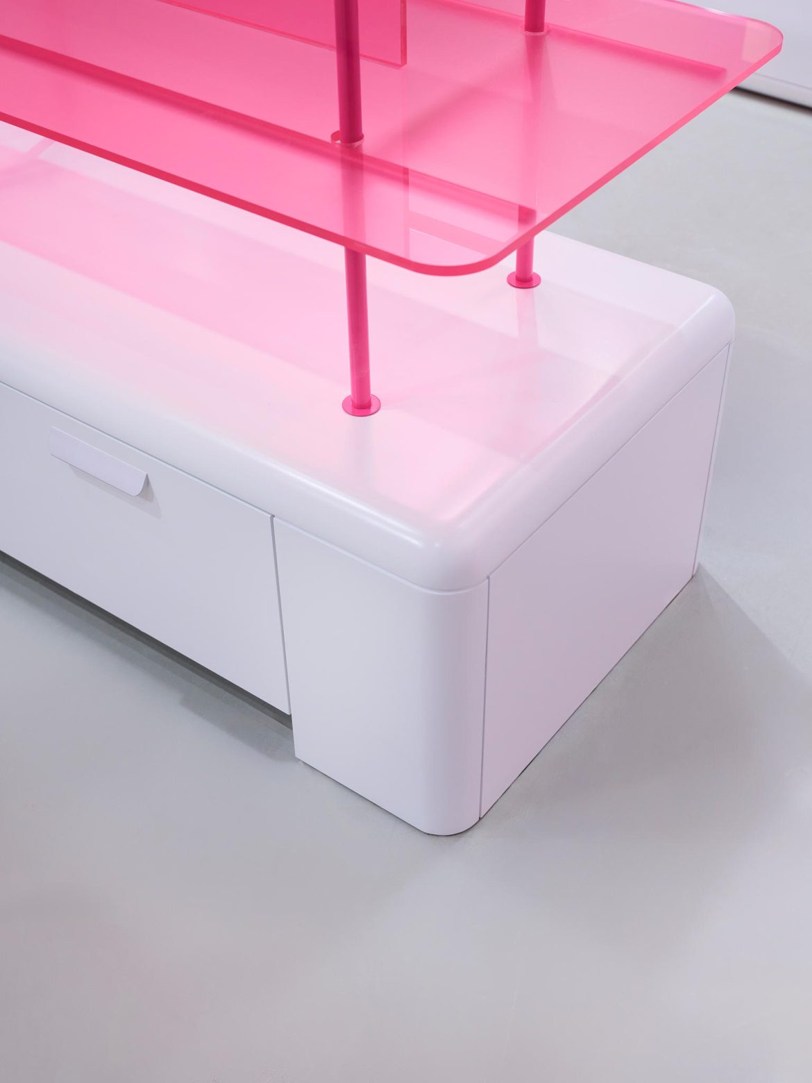
The main focus was on custom-designed furniture, shelving, and decorative elements, forming a cohesive branded environment and supporting an interactive visitor experience.

