Project name: YOUWANNA
Design firm: Sinitsa Space
Design Team: Anastasia Kolchina, Varvara Serebrova, Anastasia Yemelyanova, Tatiana Butrinova, Nastya Petrina
Photo: Dmitry Suvorov, @dimaplenka
Area: 104 m²
Year: 2026
Project description from design firms
We had already designed a corner shop for YOUWANNA inside Tsvetnoy — and that project became the starting point for this new one. The format worked so well that the brand came back to us for a full-scale store: we needed to turn a localized solution into a spatial formula for the brand that could scale across new locations. Today, by our own tracking, this store outsells every other YOUWANNA location — the brand currently operates five stores in total.
The brief: giving the brand a face it didn’t yet have
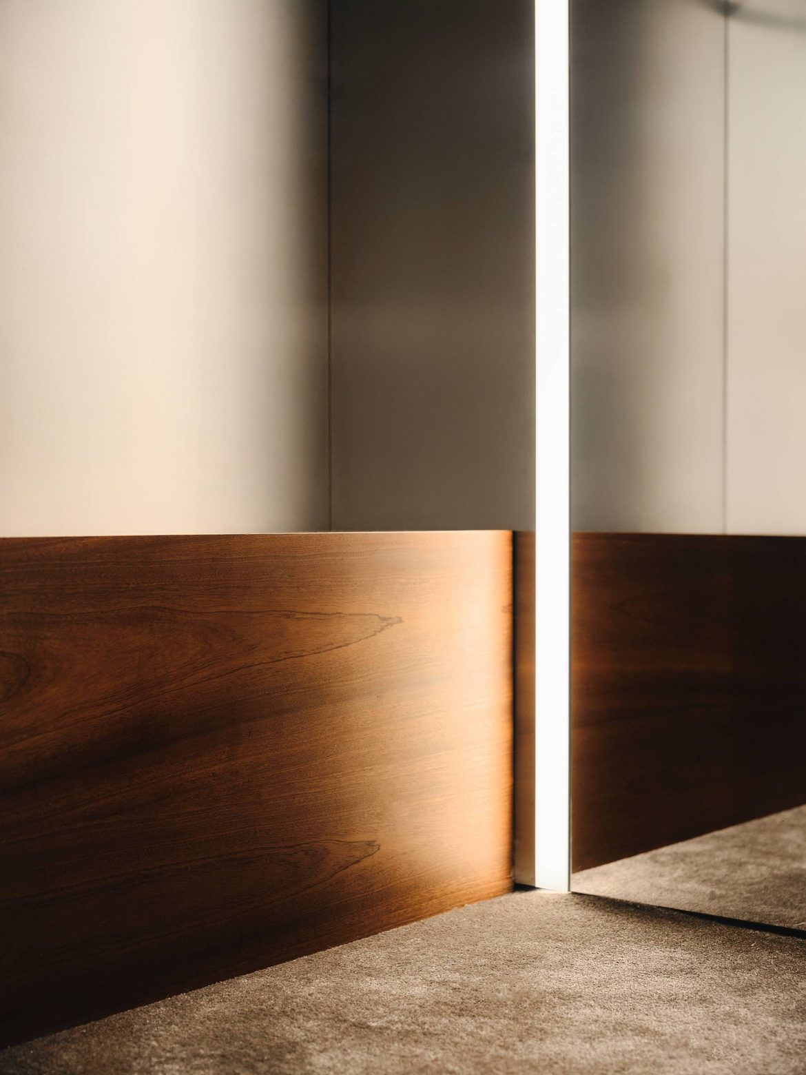
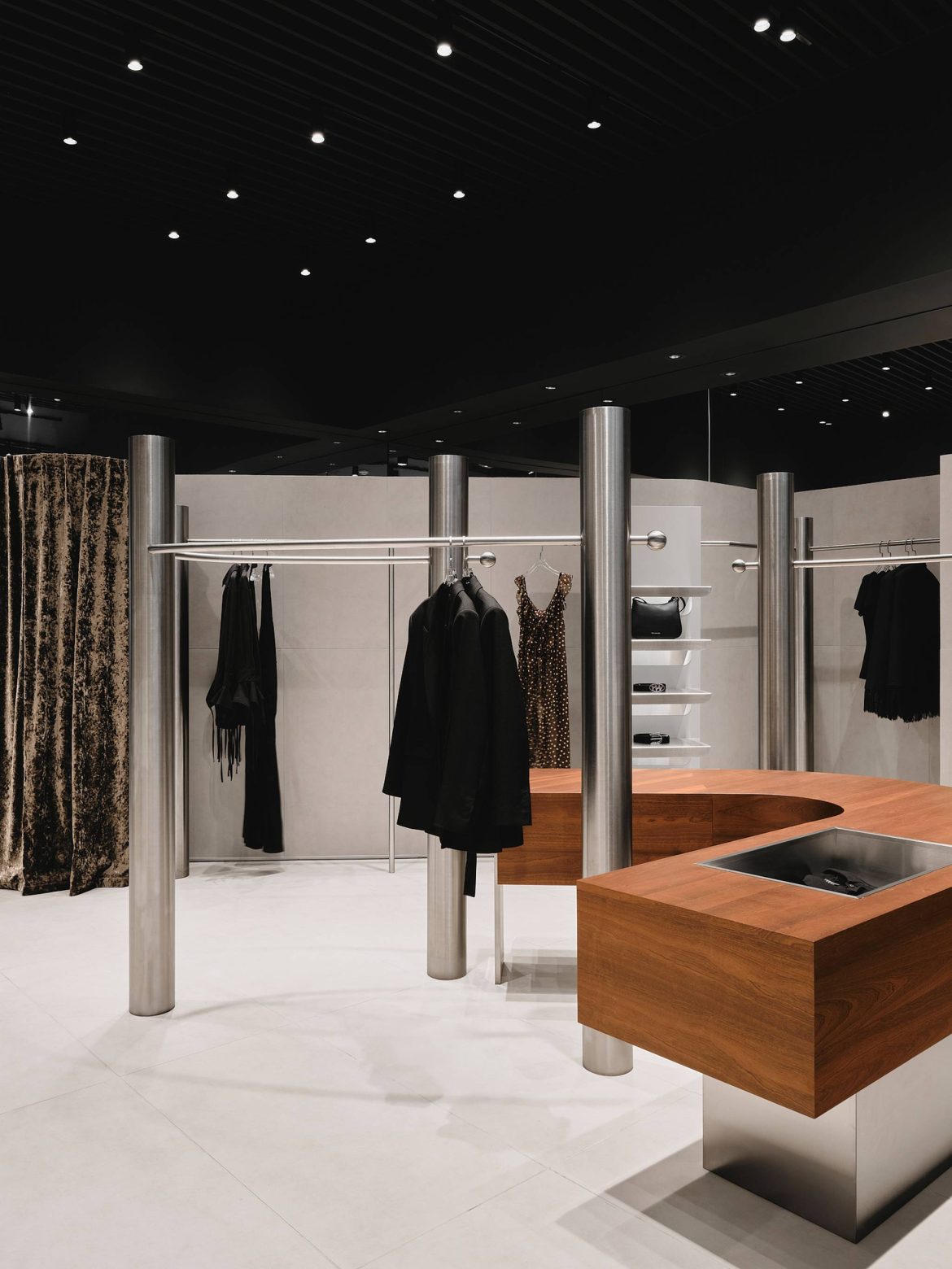
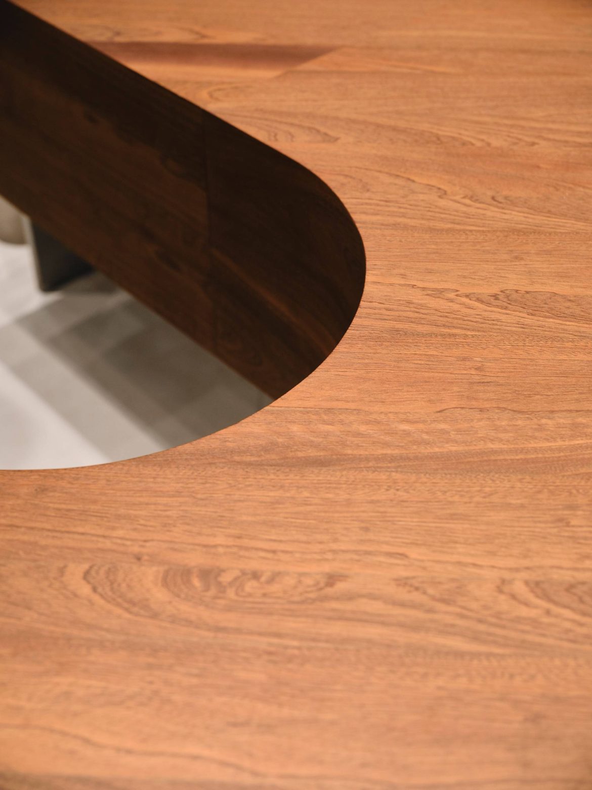
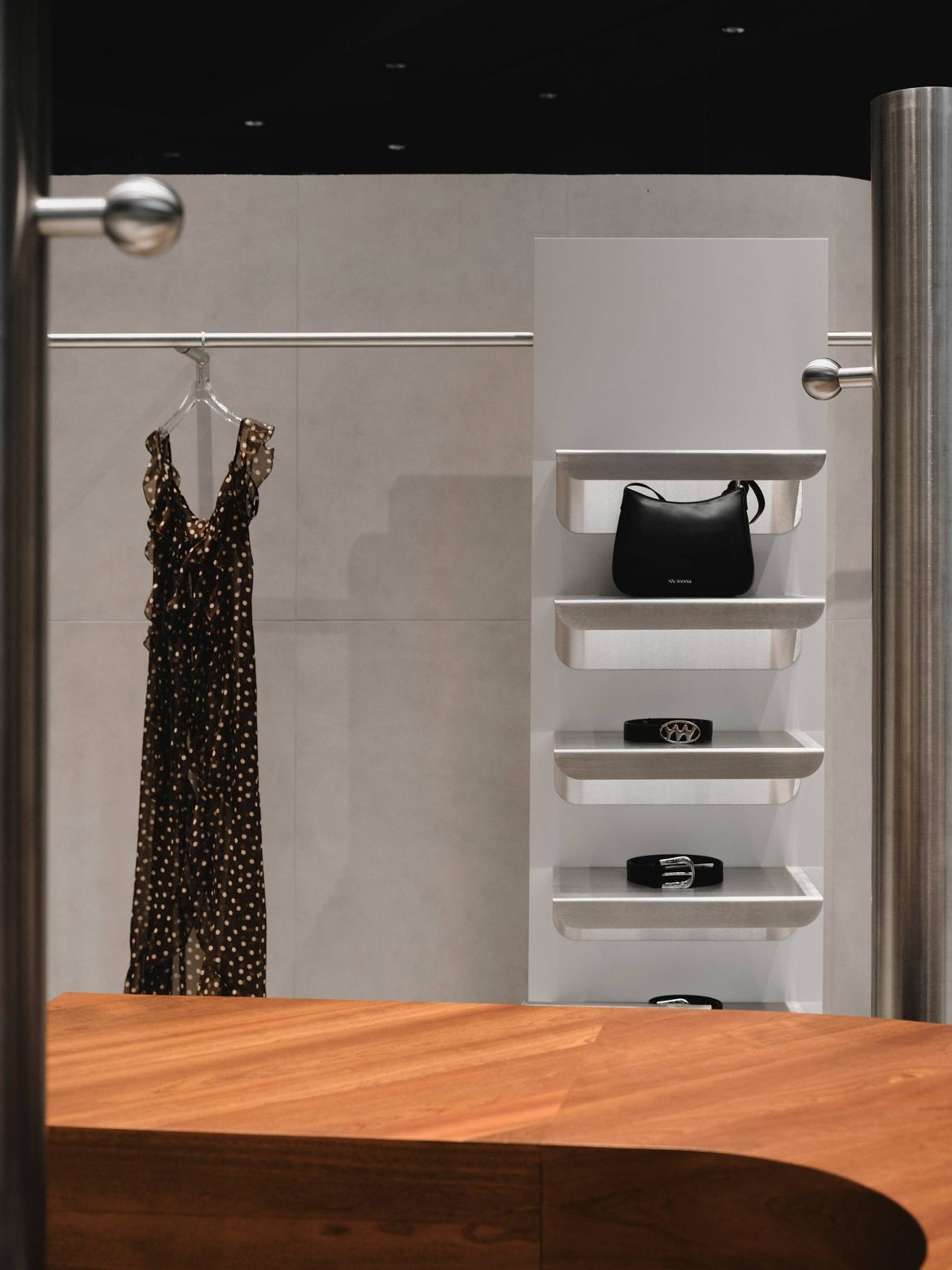
YOUWANNA is a brand for “bold girls” and bold occasions: experimental materials, confident moves, pieces built to draw attention. Before our corner shop in Tsvetnoy, the brand — by its own team’s admission — was still searching for a visual language. The corner shop was the first solution that truly landed, and we deliberately carried several of its ideas into the new store: the fabric textures, the carpet, the veneer in the furniture (though we revised the grain and texture for this project), and the columns’ shape, which later reappeared in the rail design.
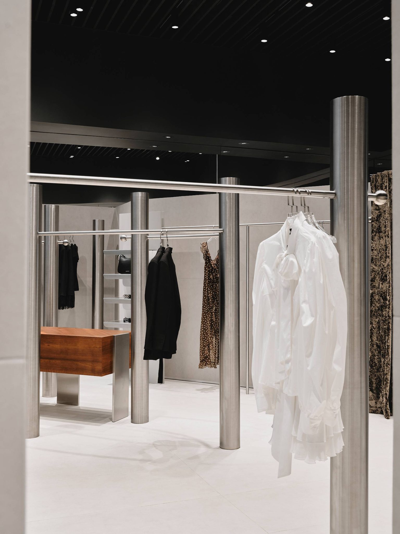
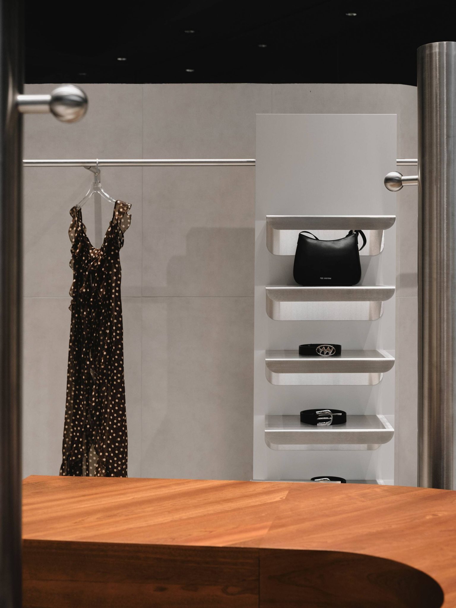
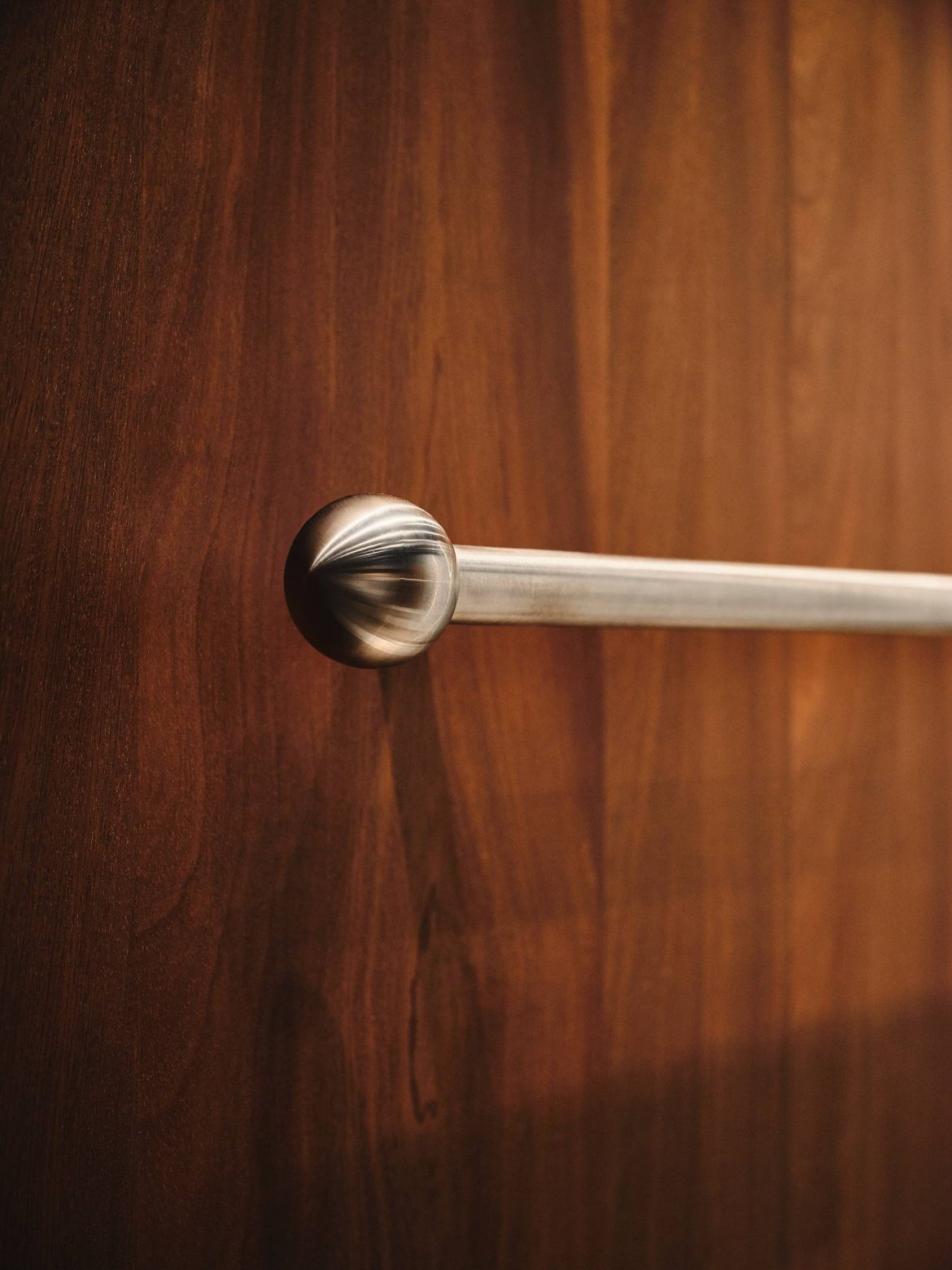
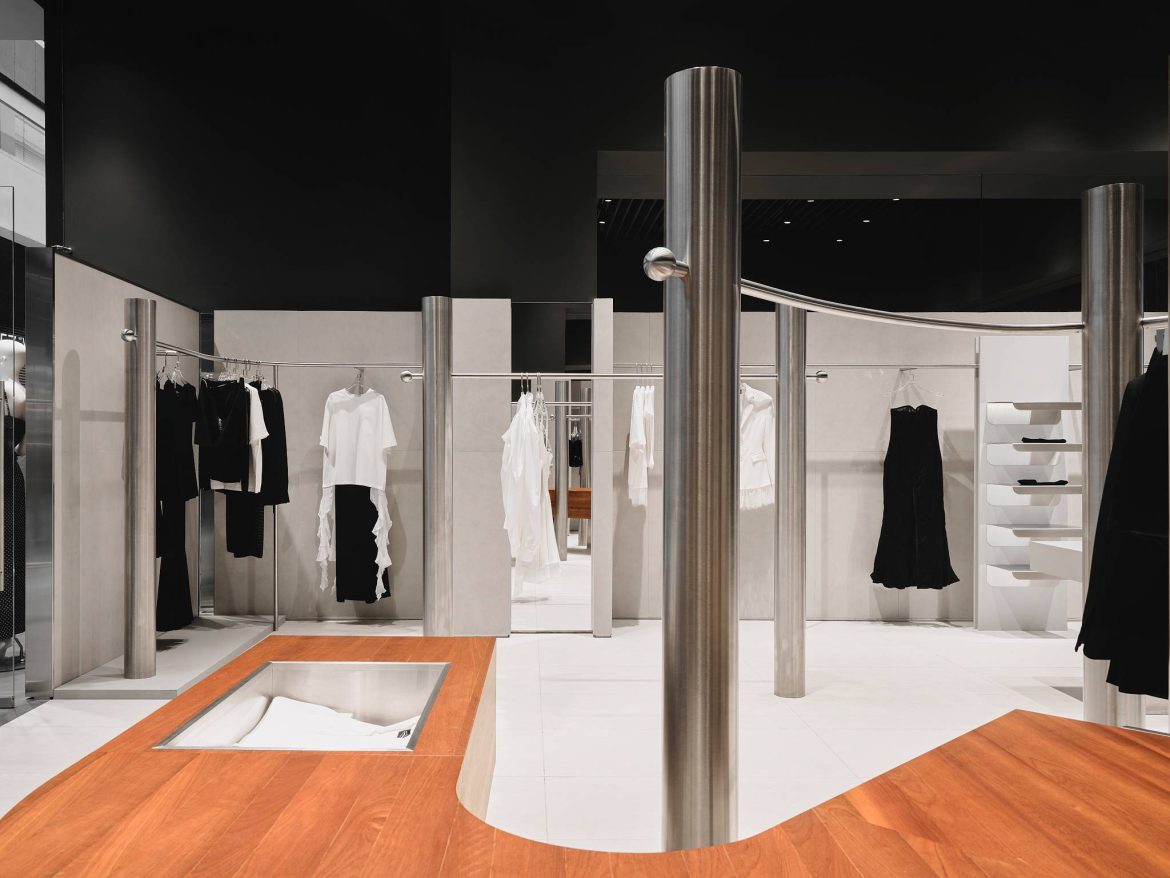
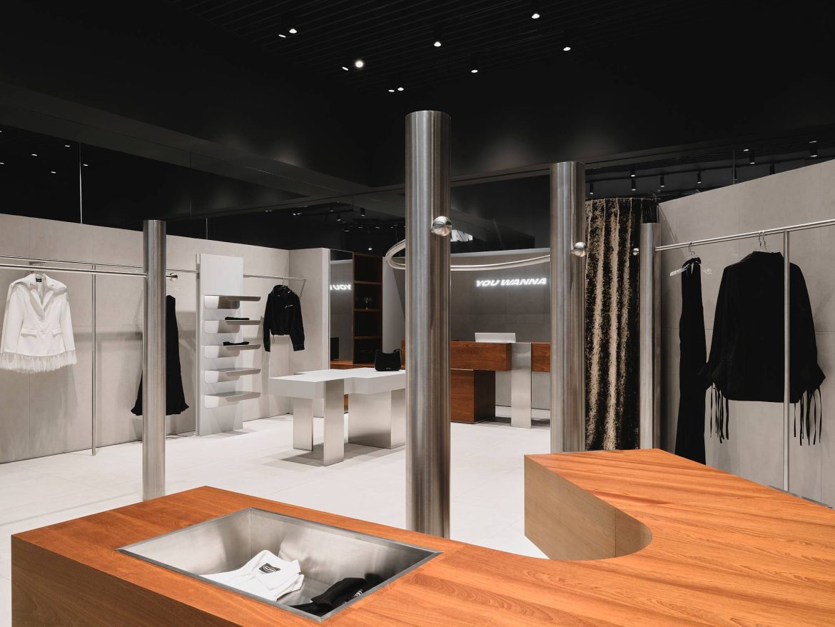
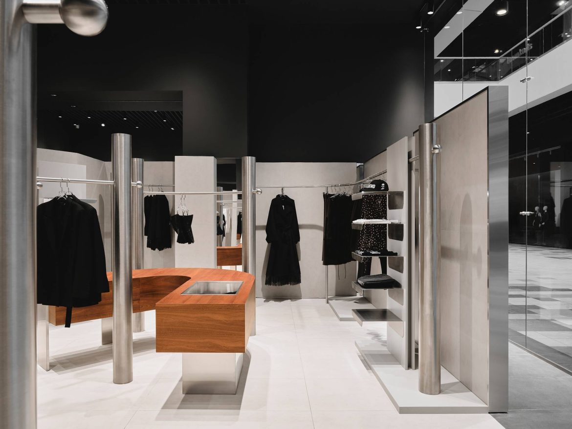
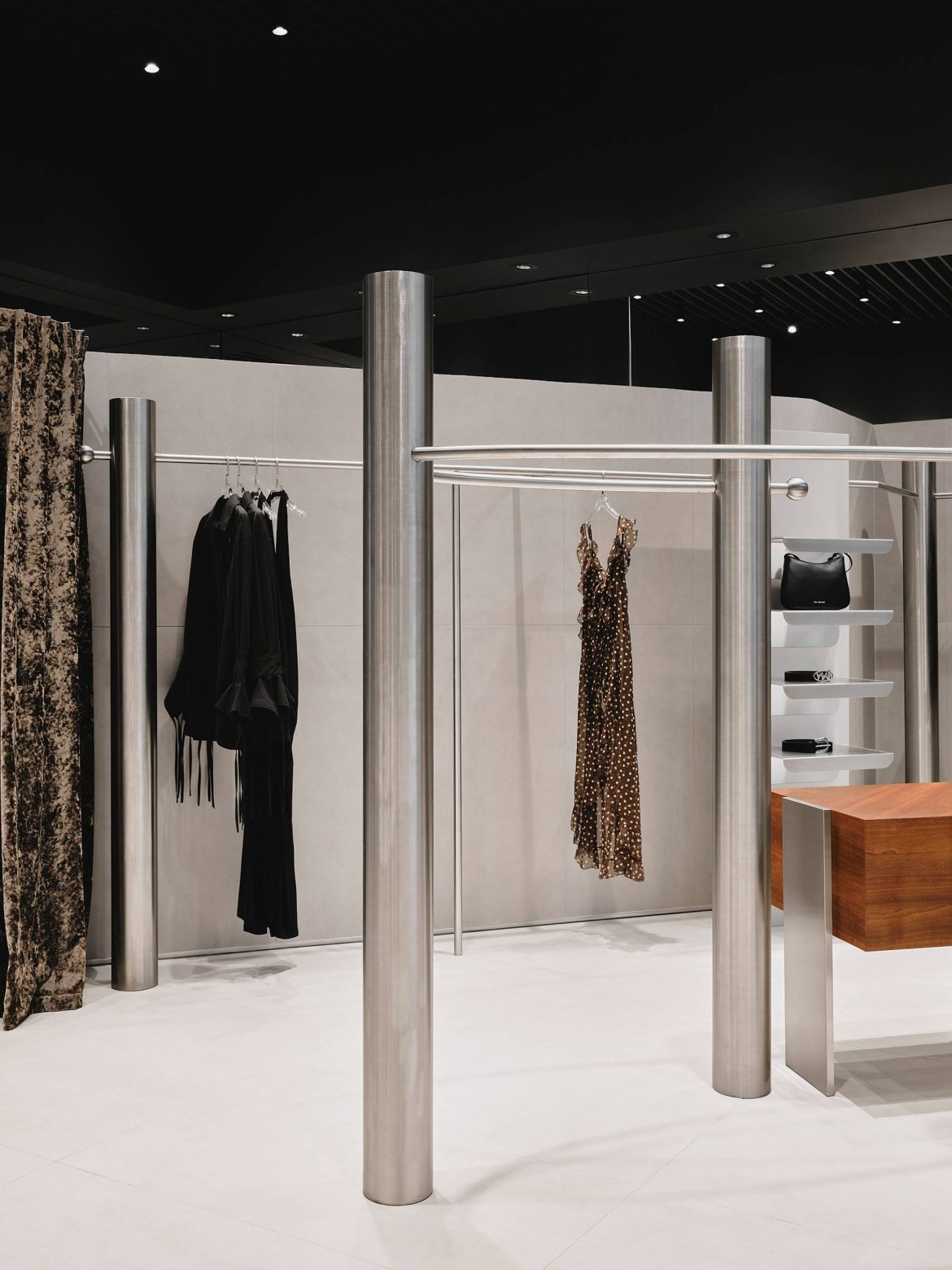
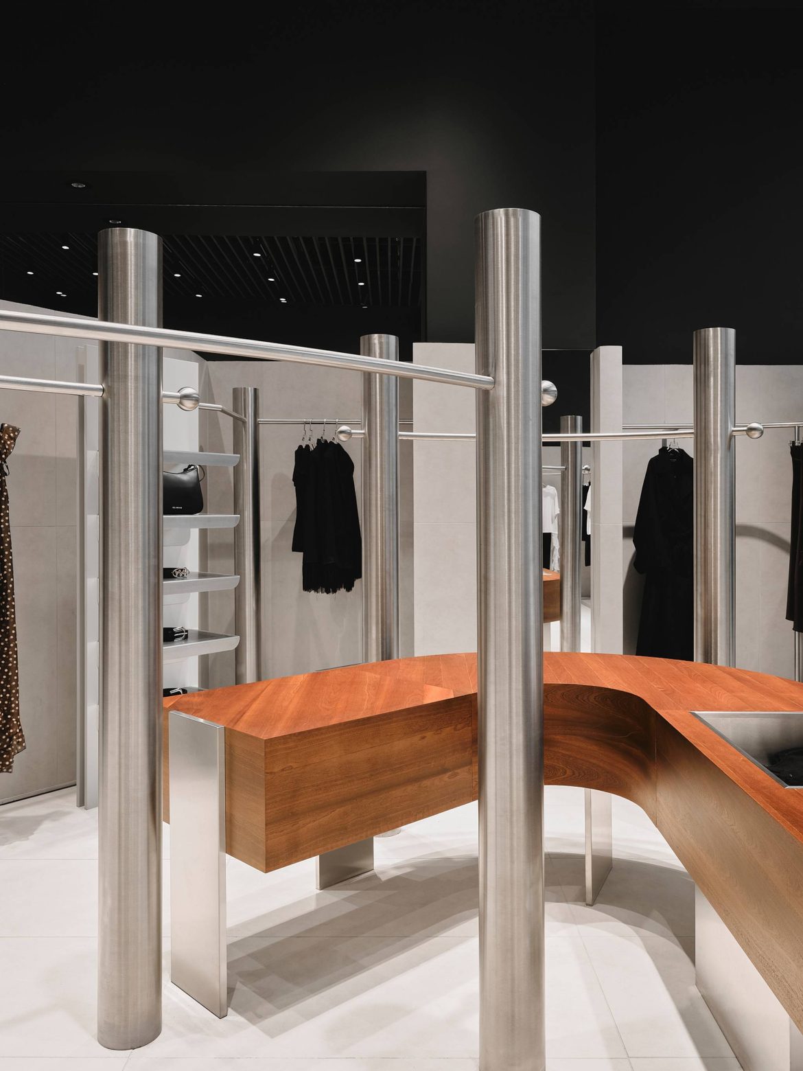
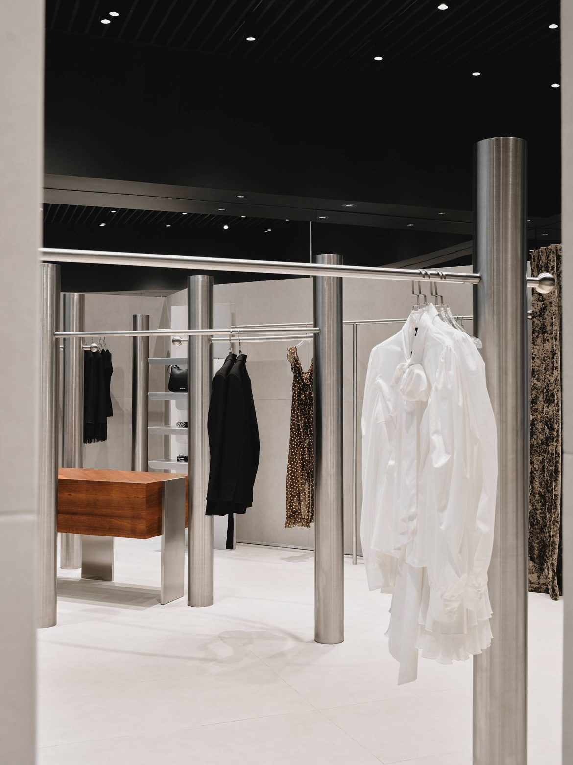
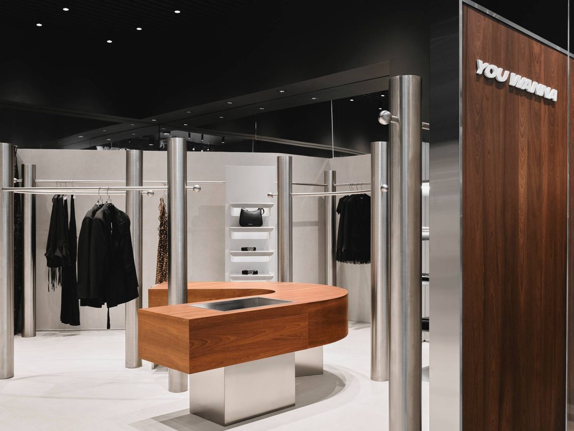
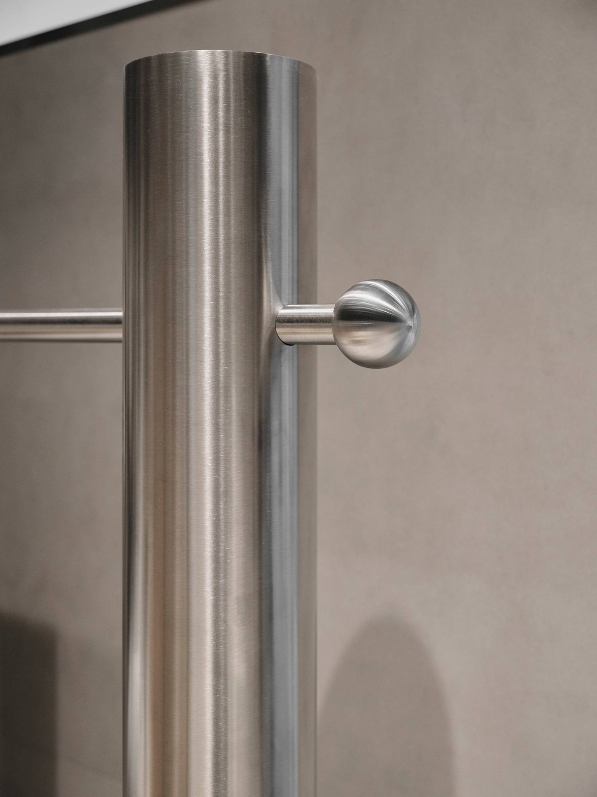
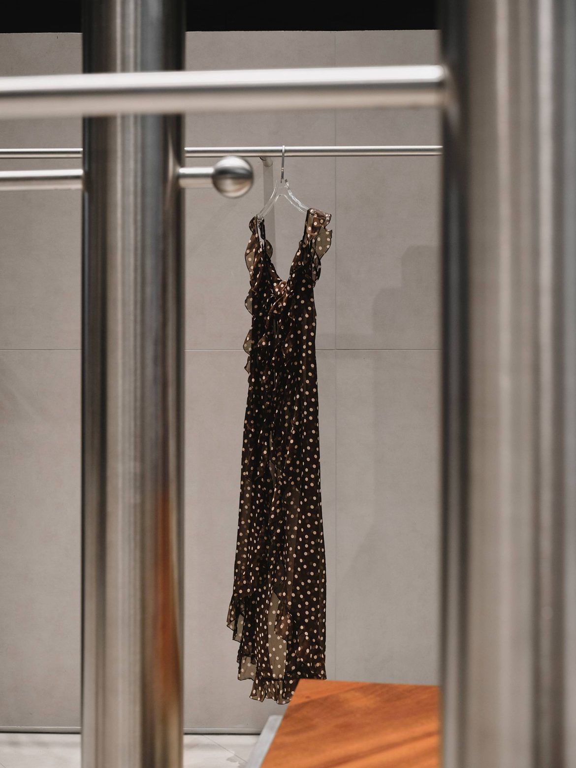
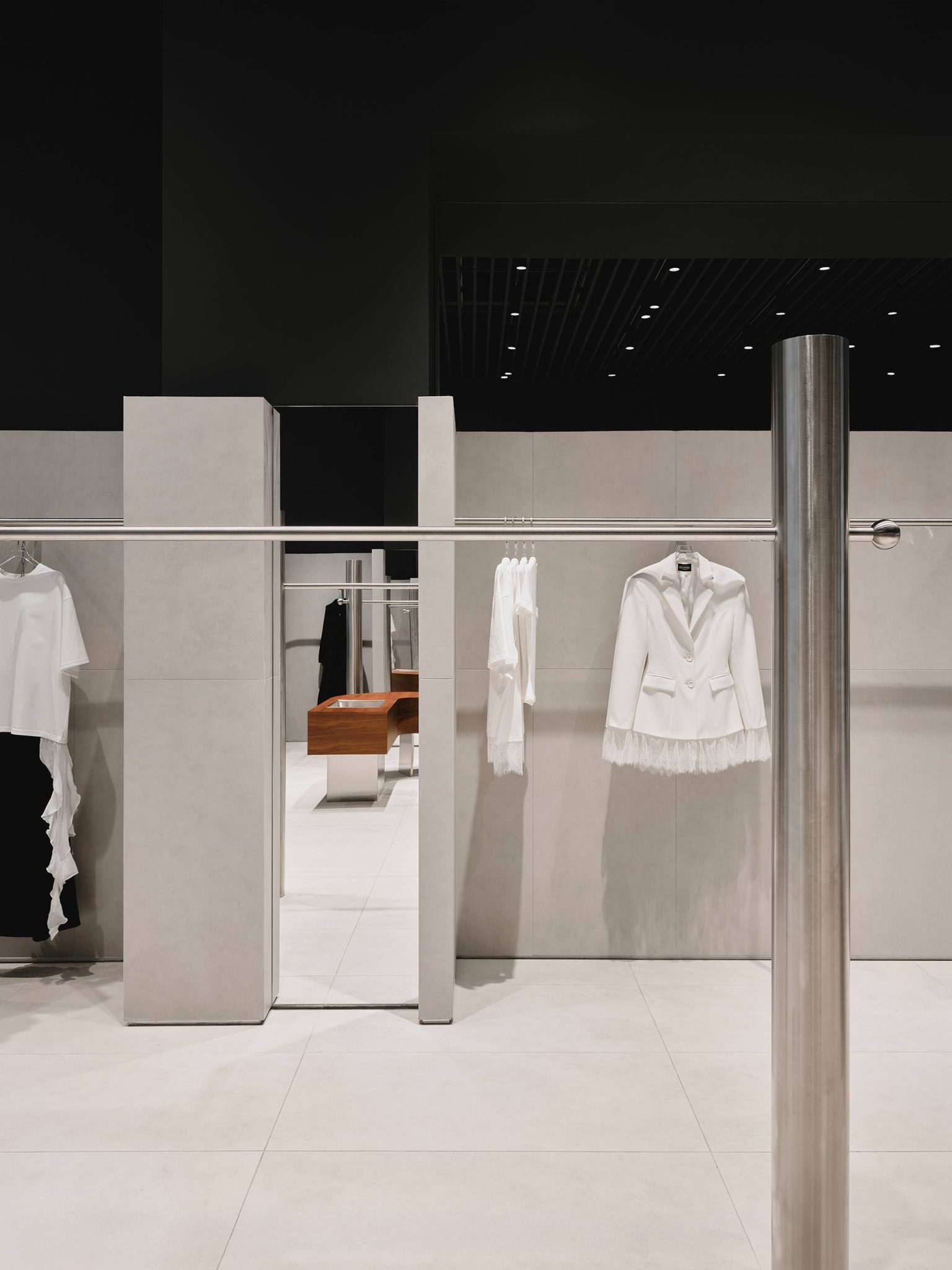
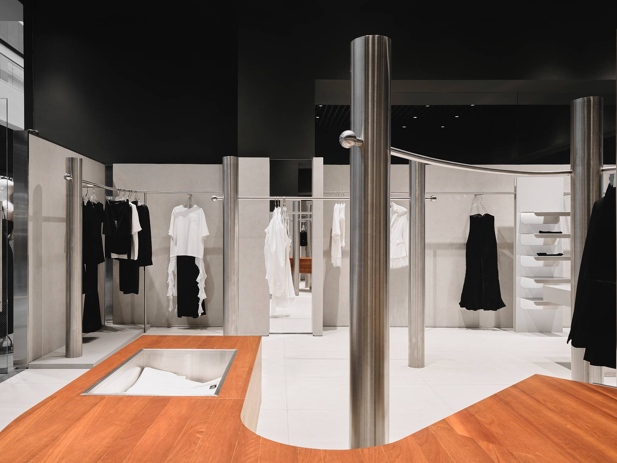
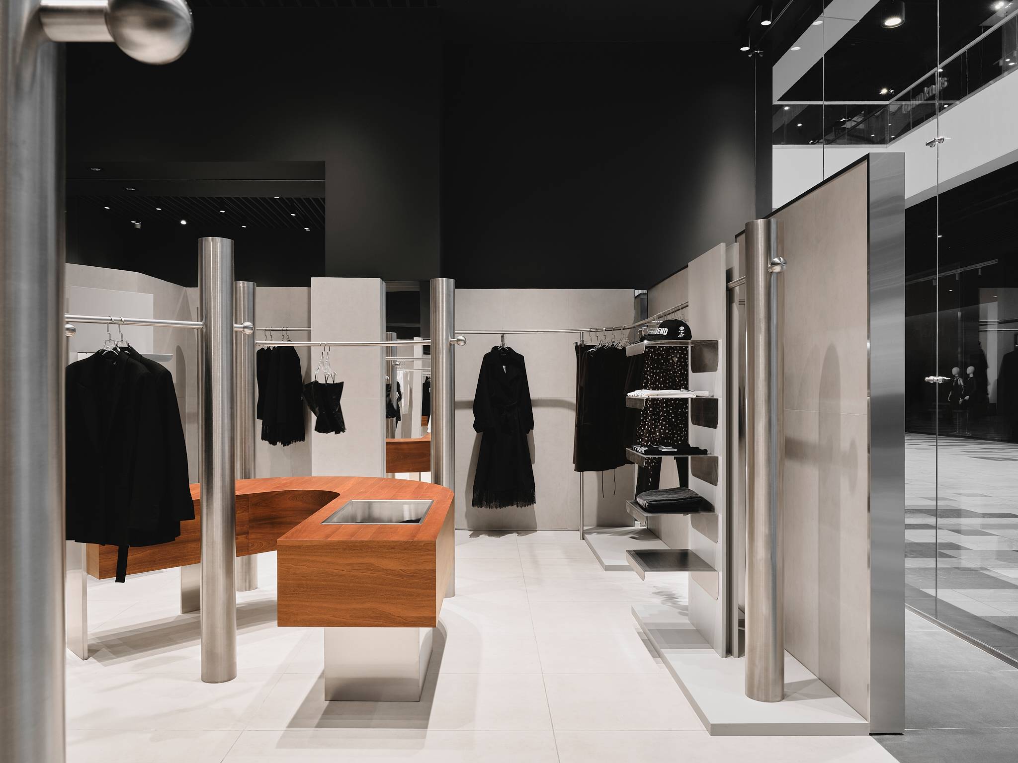
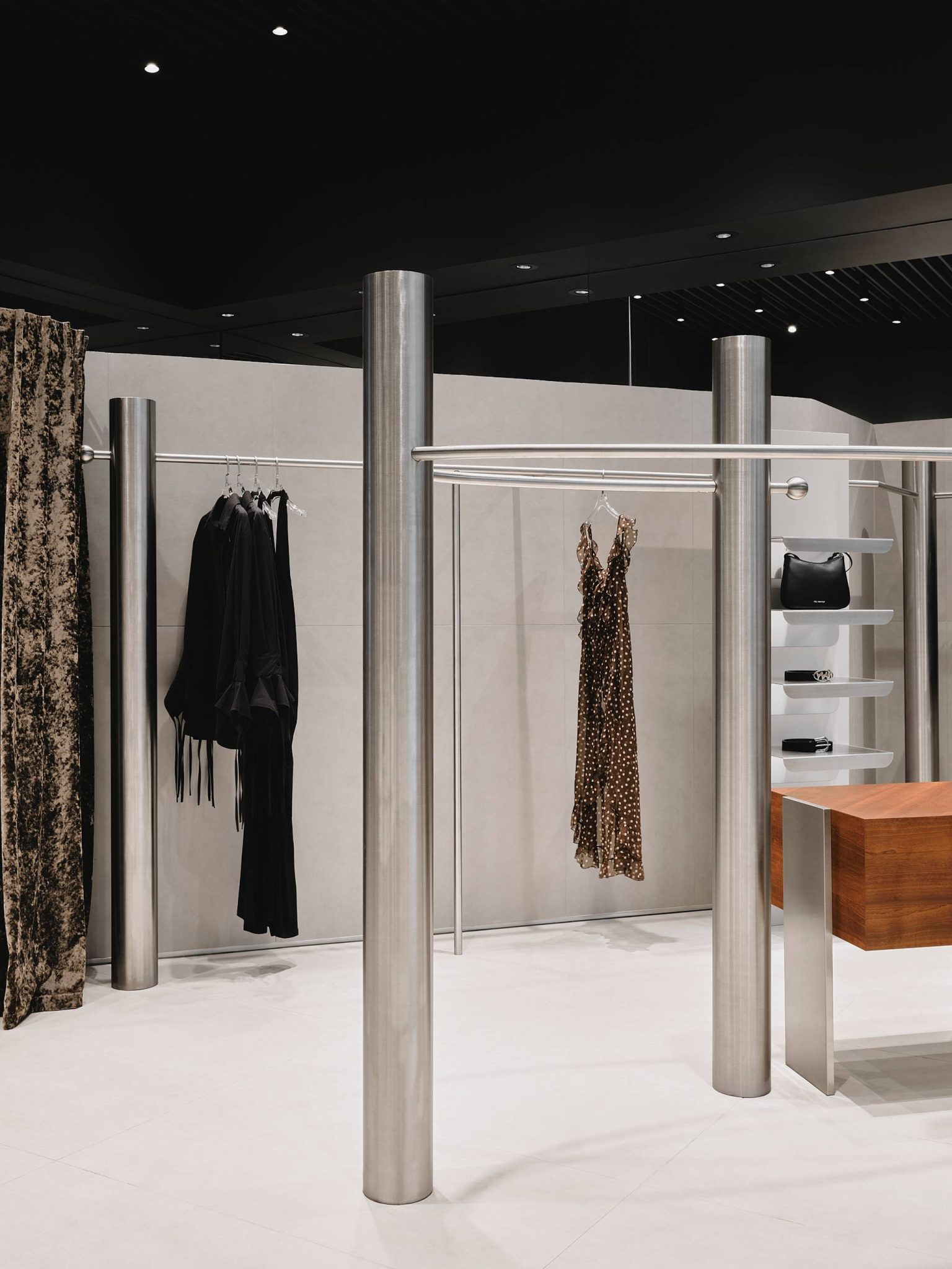
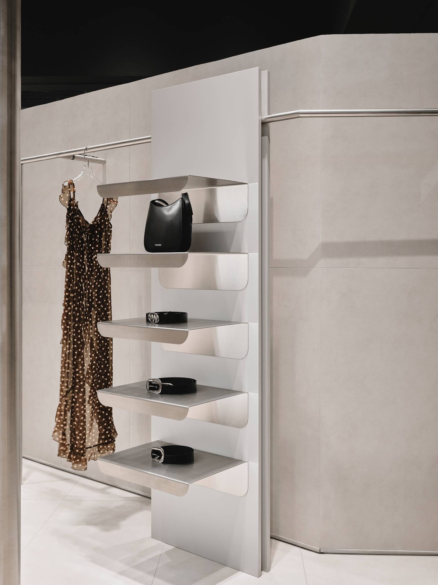
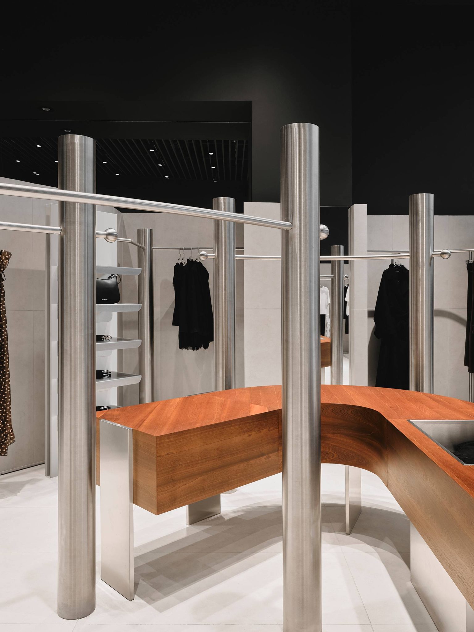
At the same time, we changed the material of the rails themselves. In Tsvetnoy, they were soft, velvet-upholstered columns; here, we used stainless steel tubes — a harder, more sculptural solution that reads differently depending on the angle and pulls its share of attention within the room.
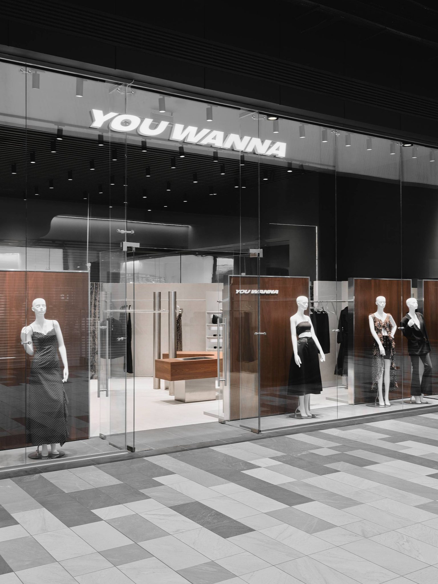
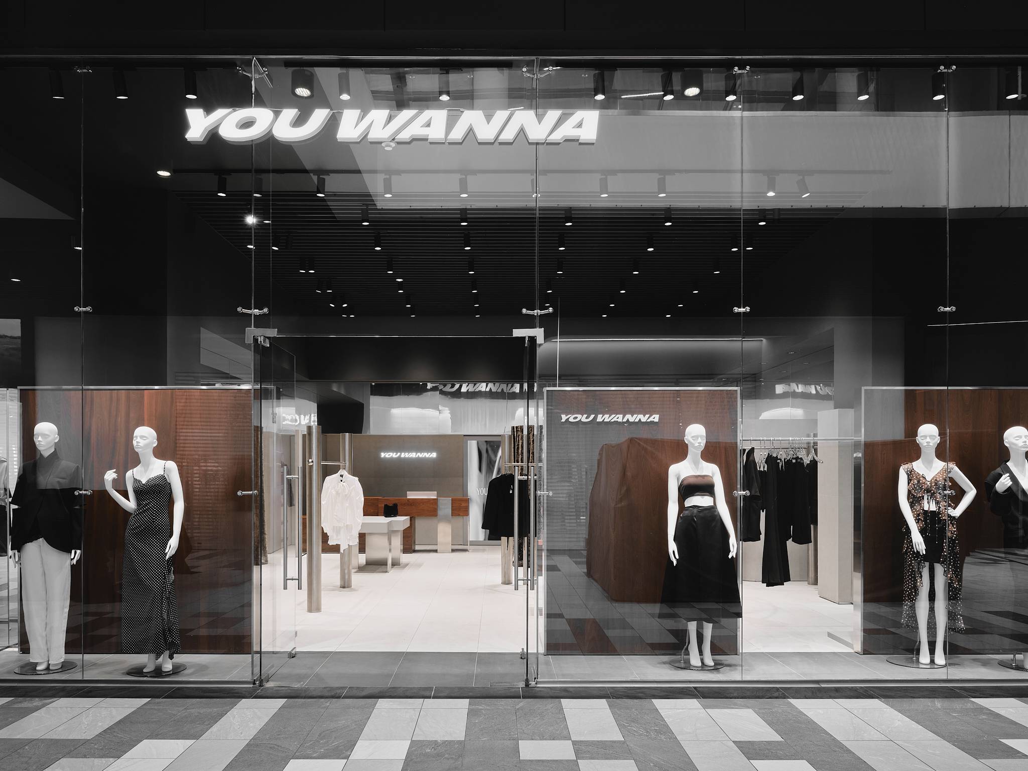
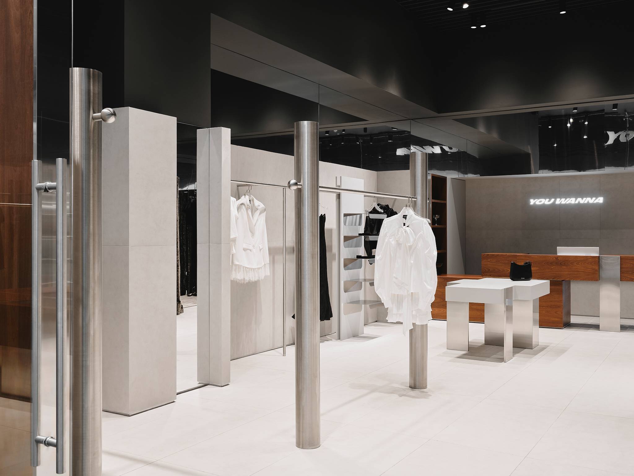
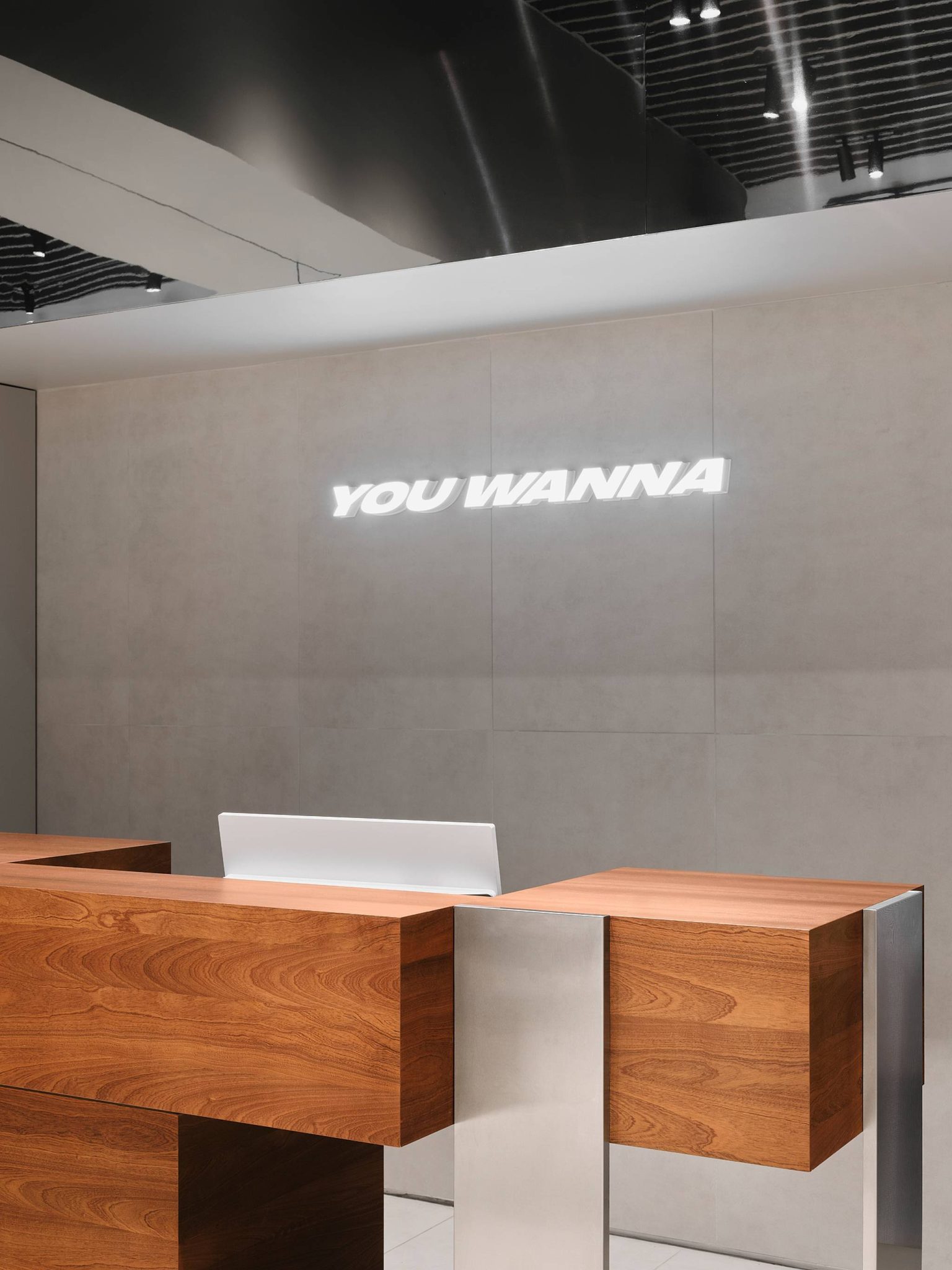
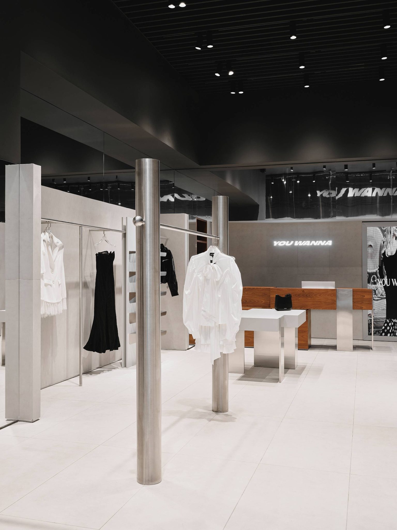
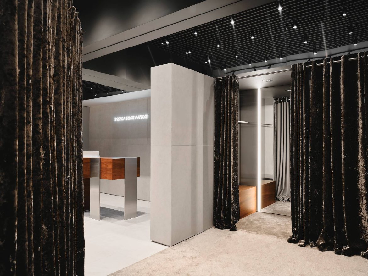
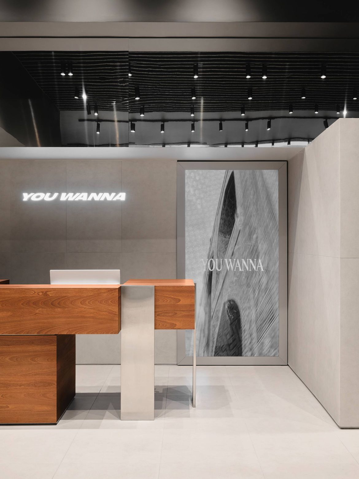
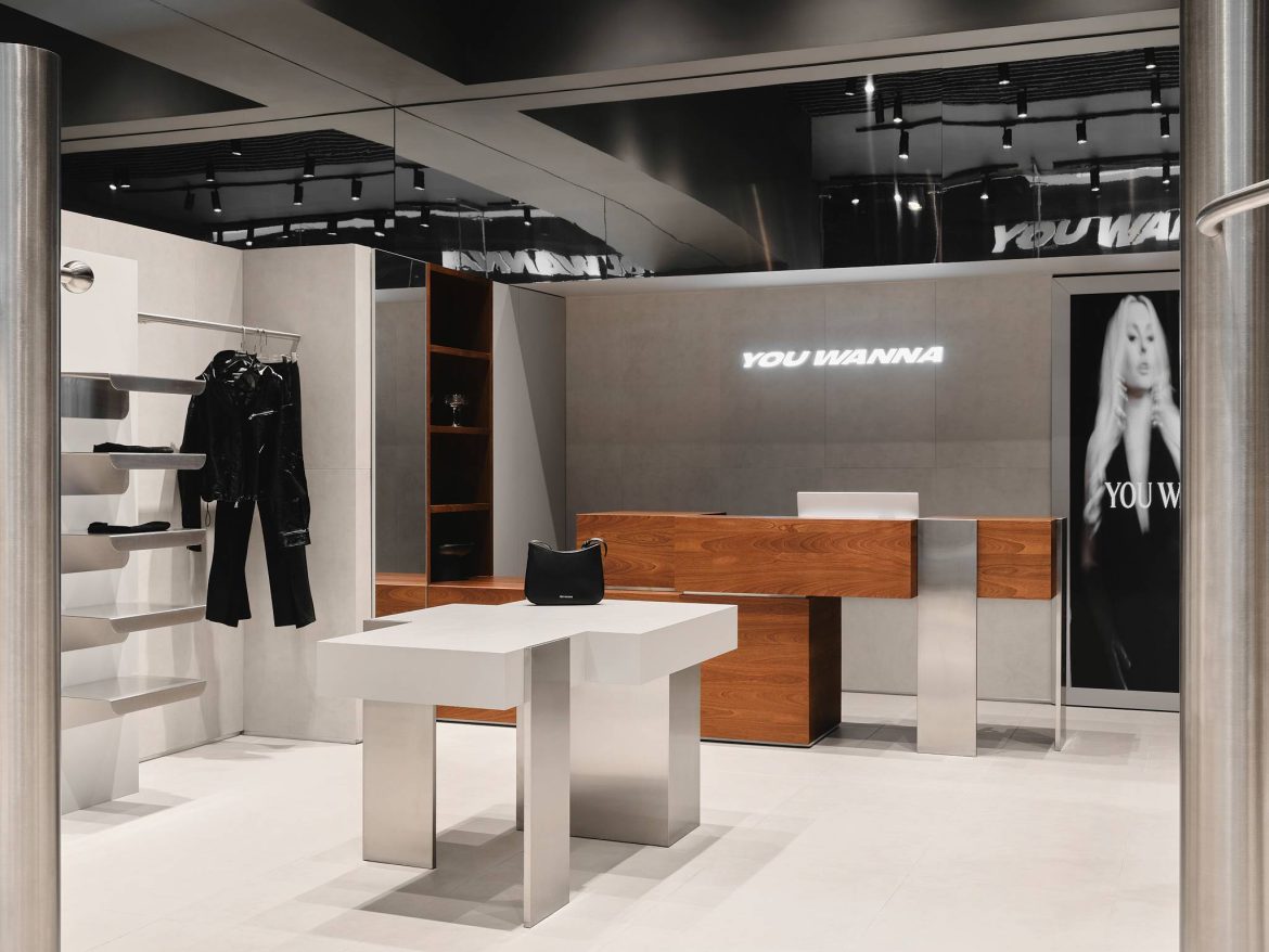
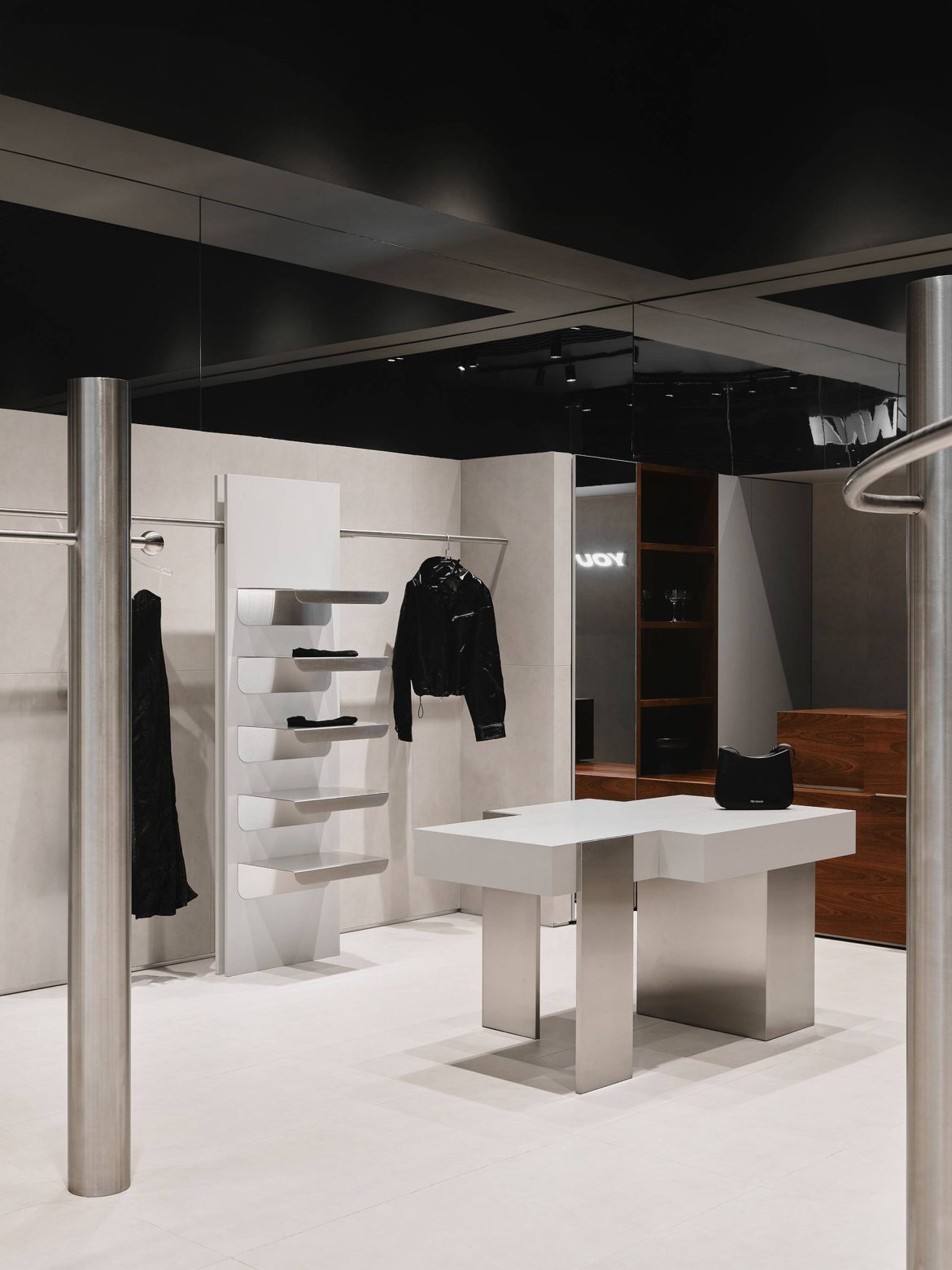
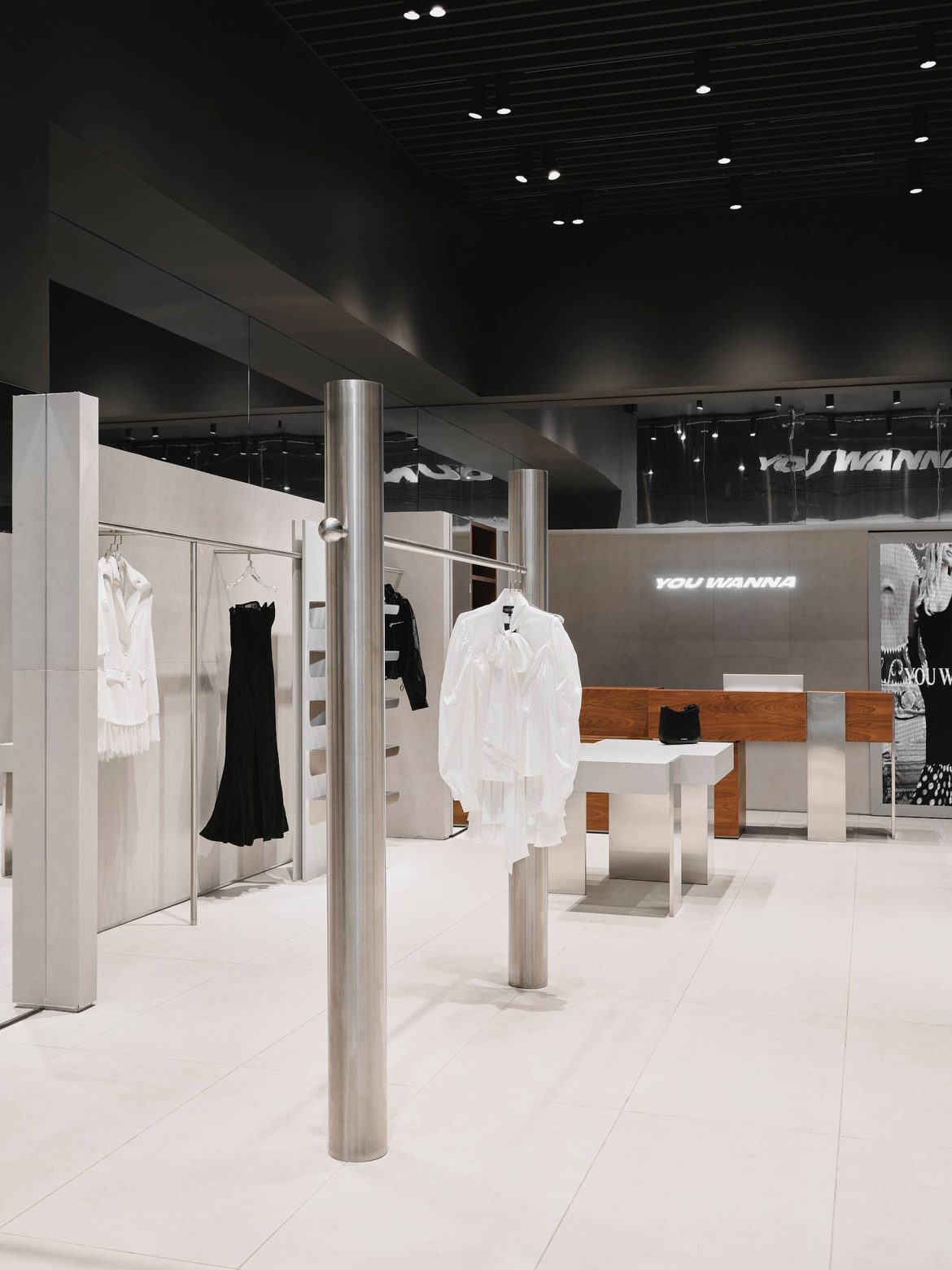
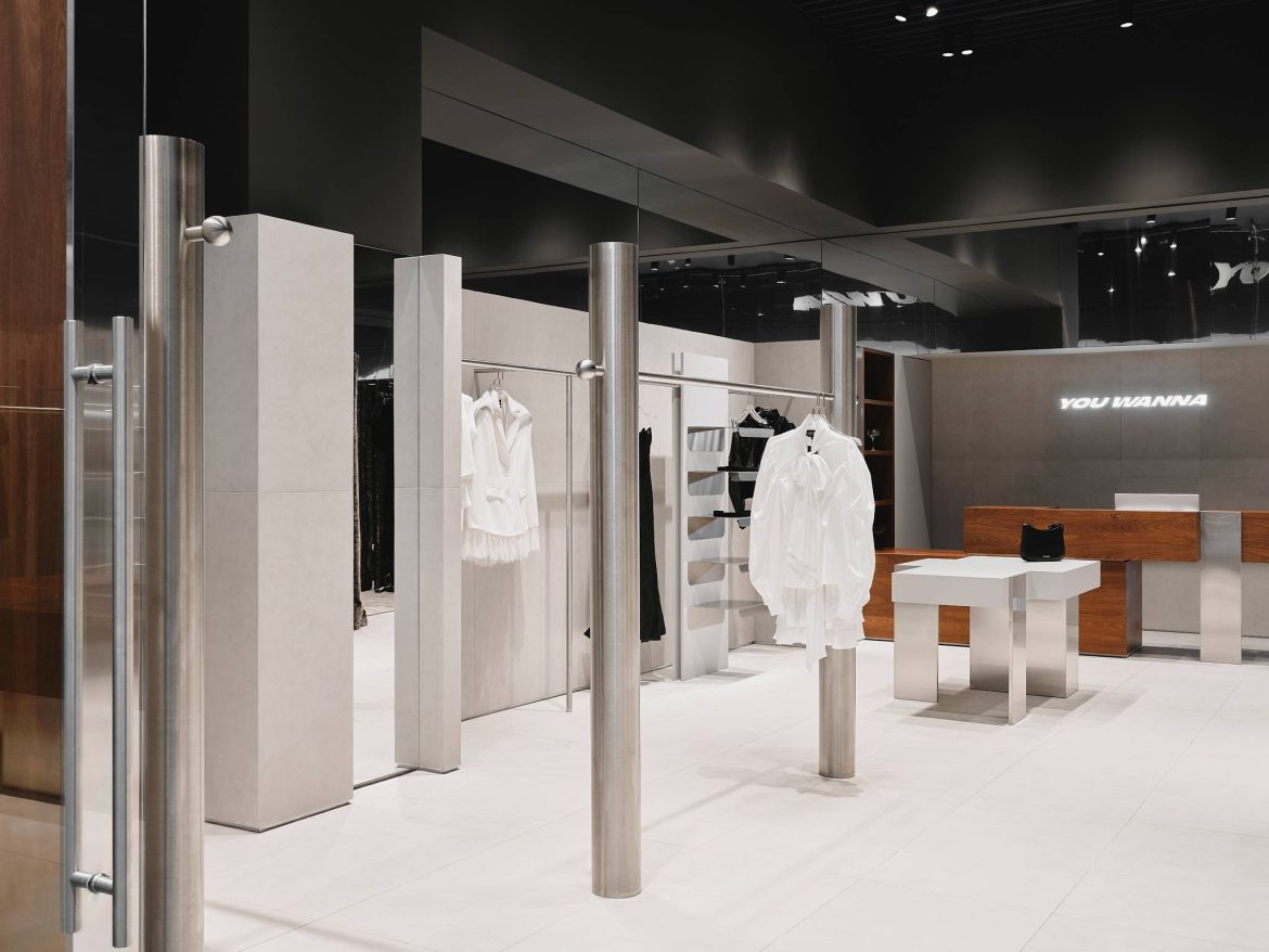
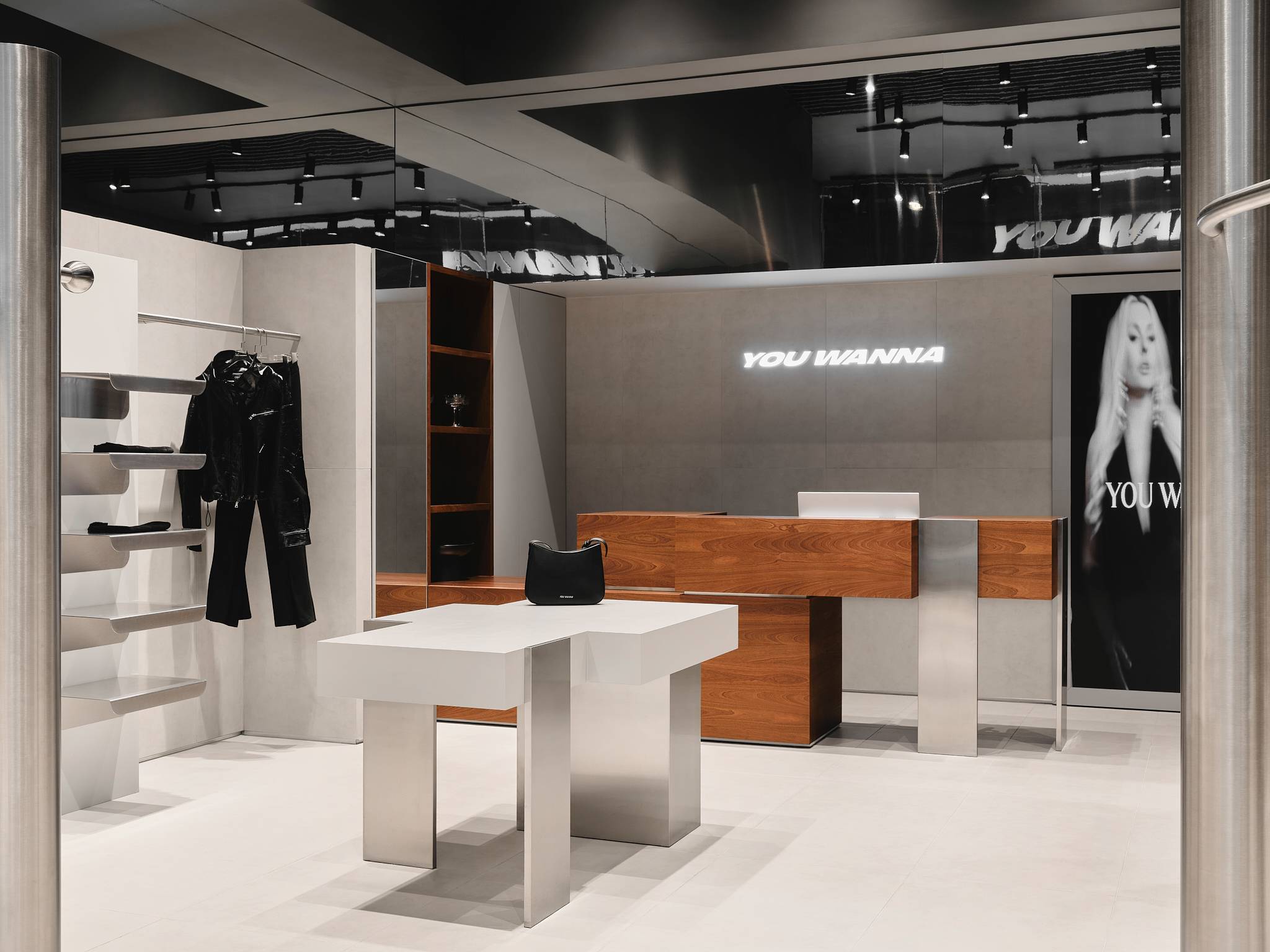
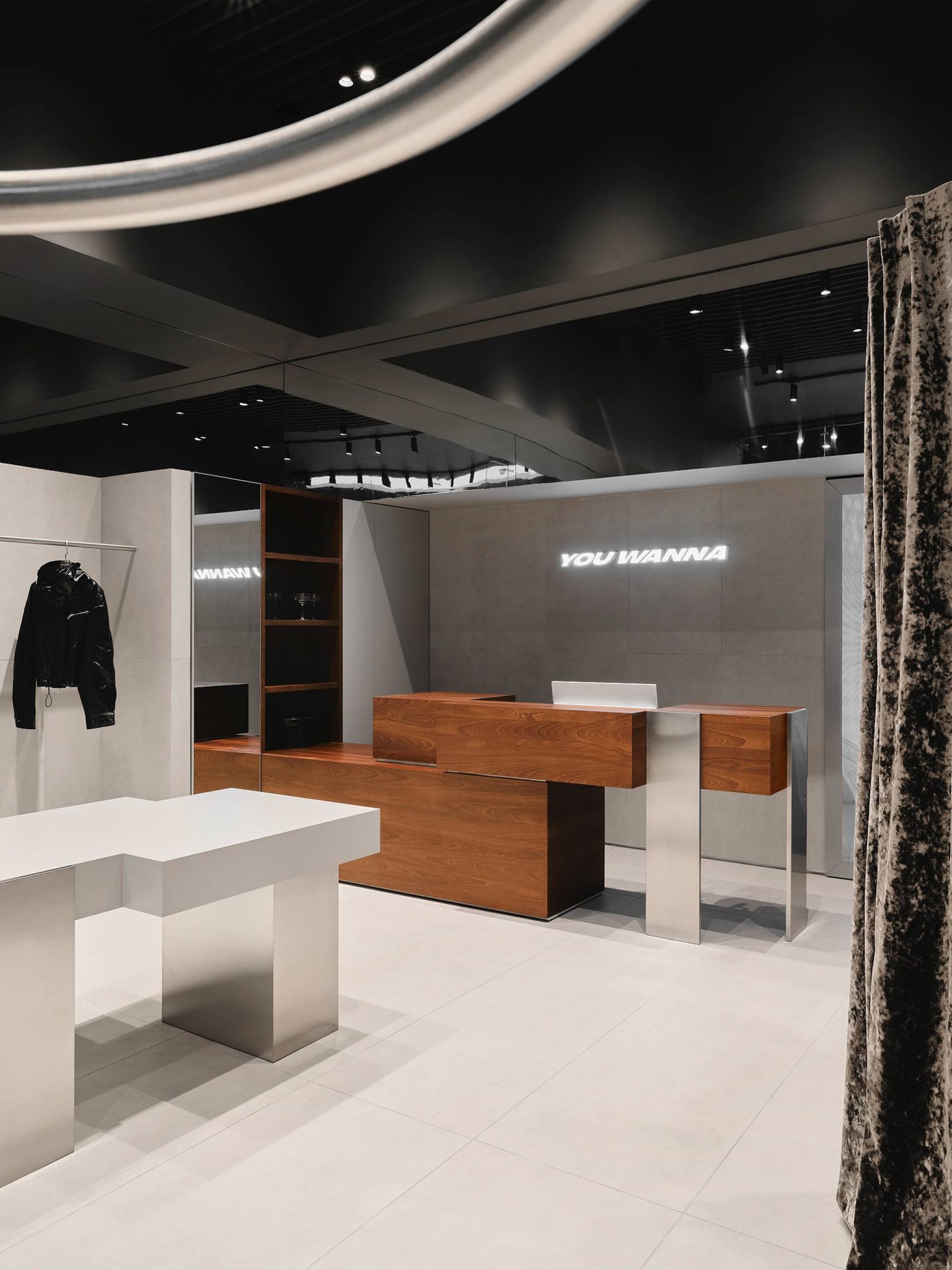
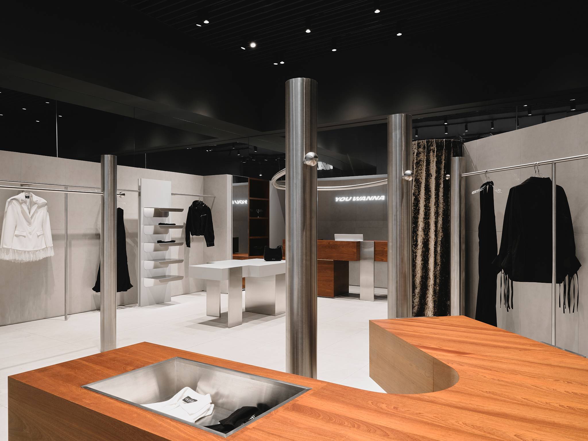
The space is built around the image of a jewelry box: one material and color on the outside, a different one inside. We used mirrors as an illusion device, deepening the sense of space and blurring where it actually ends.
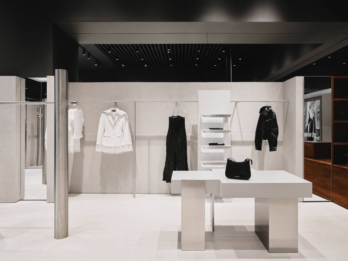
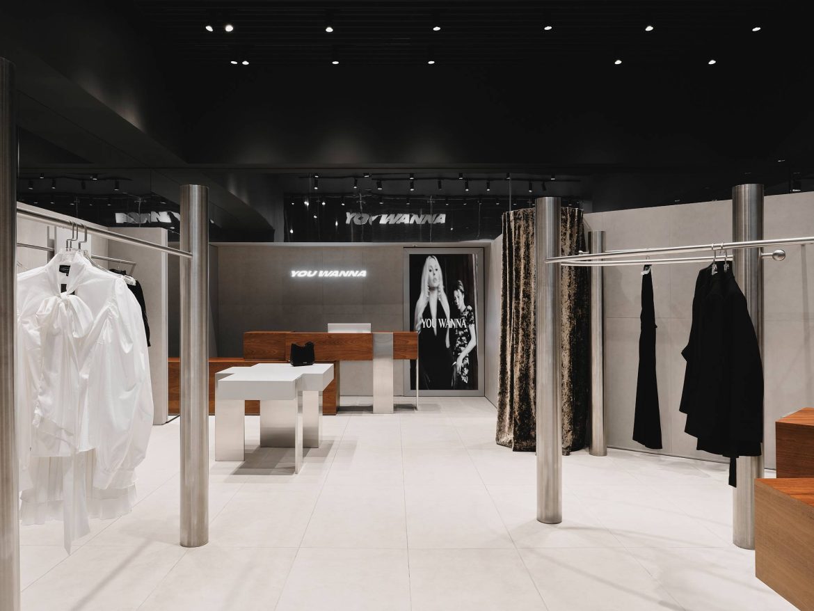
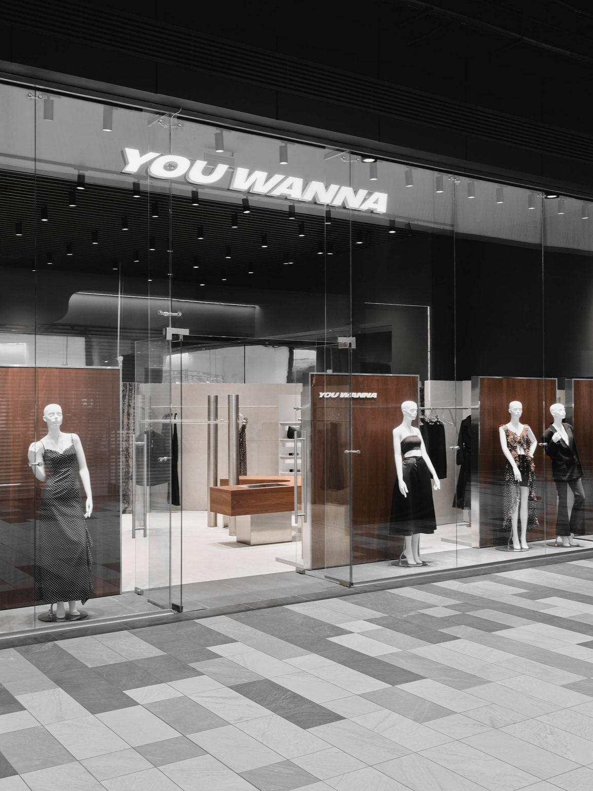
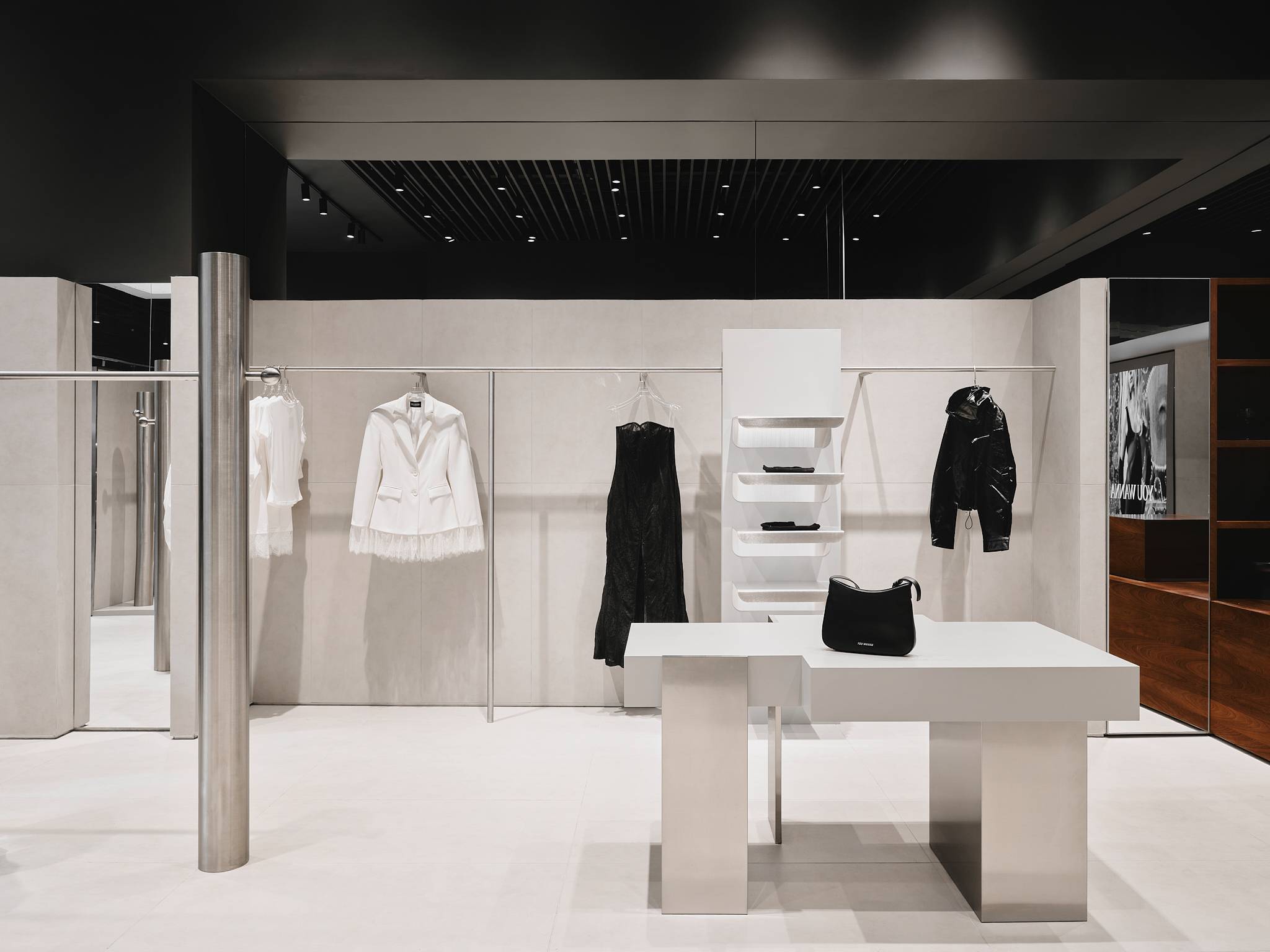
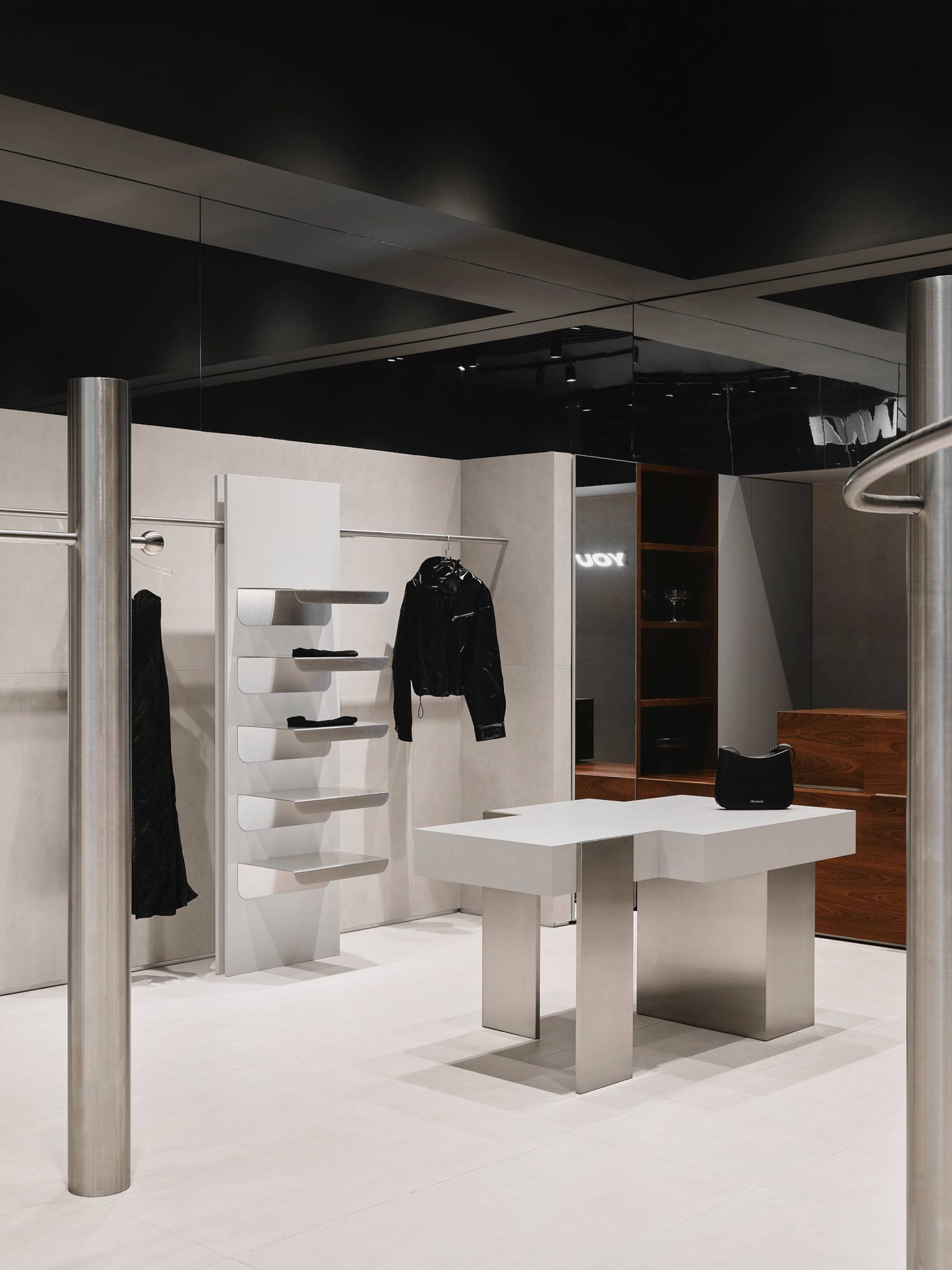
Timeline constraints and a limited ceiling height led us to a solution we’ve started calling, among ourselves, “the fringe”: the space is divided horizontally into two unequal parts. The upper zone reads as a black void — a starry sky punctuated by point light fixtures. The lower zone, by contrast, is deliberately bright and well lit. That contrast between the dark top and the illuminated bottom carries the store’s core emotional effect — the “wow” moment we wanted a first-time visitor to feel walking in.
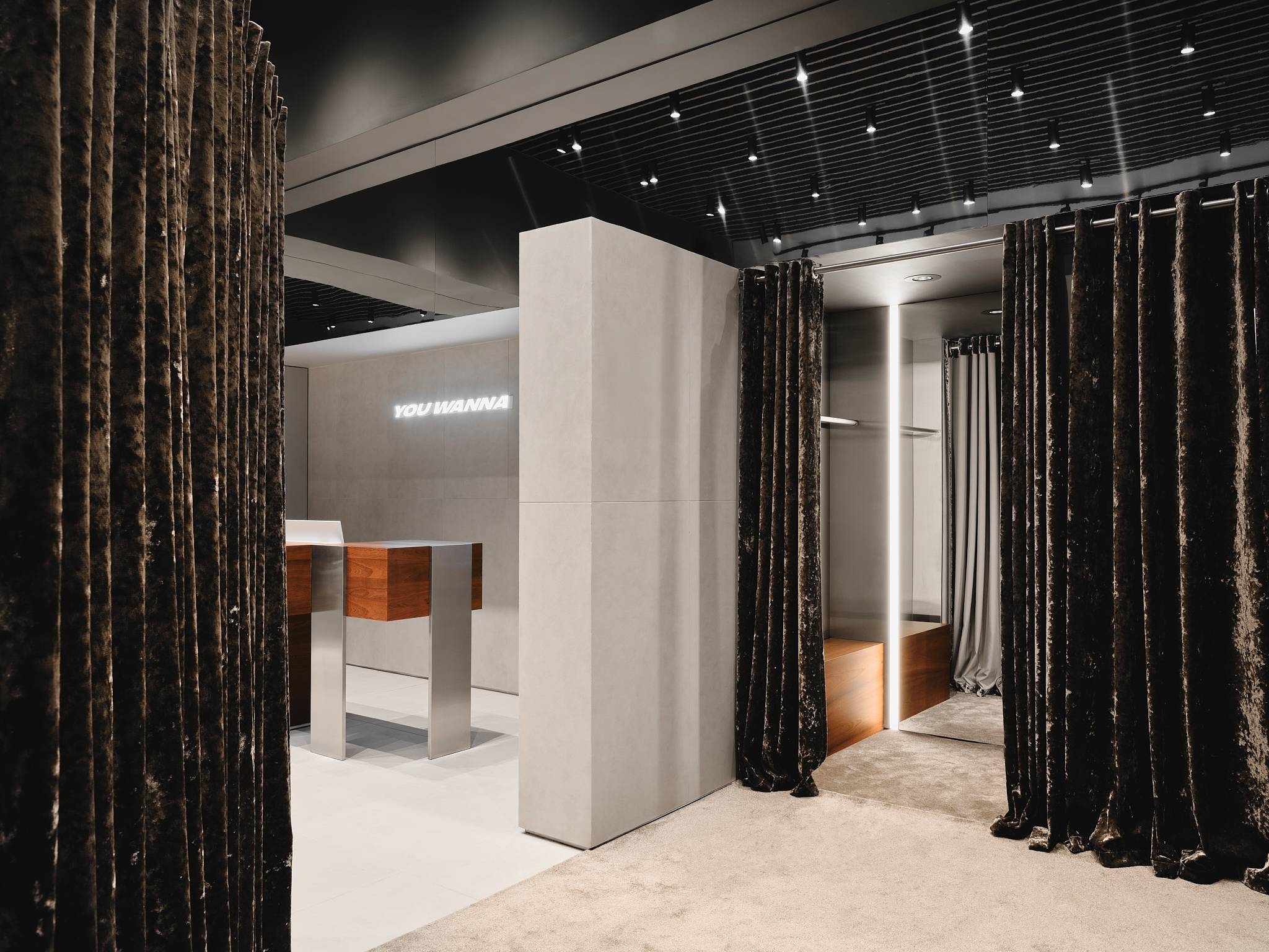
Half the walls are finished in porcelain stoneware in the same shade as the flooring — a more expensive choice than plaster, but the one that sustains the idea of a single material the entire space seems carved from. Further in, that stoneware visually flows into fabric — a semicircular column wrapped in cloth appears to unravel as it leads toward the fitting rooms.
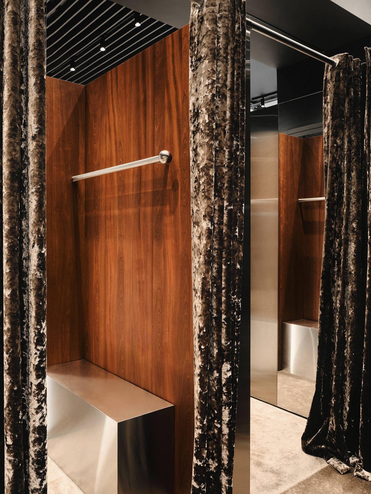
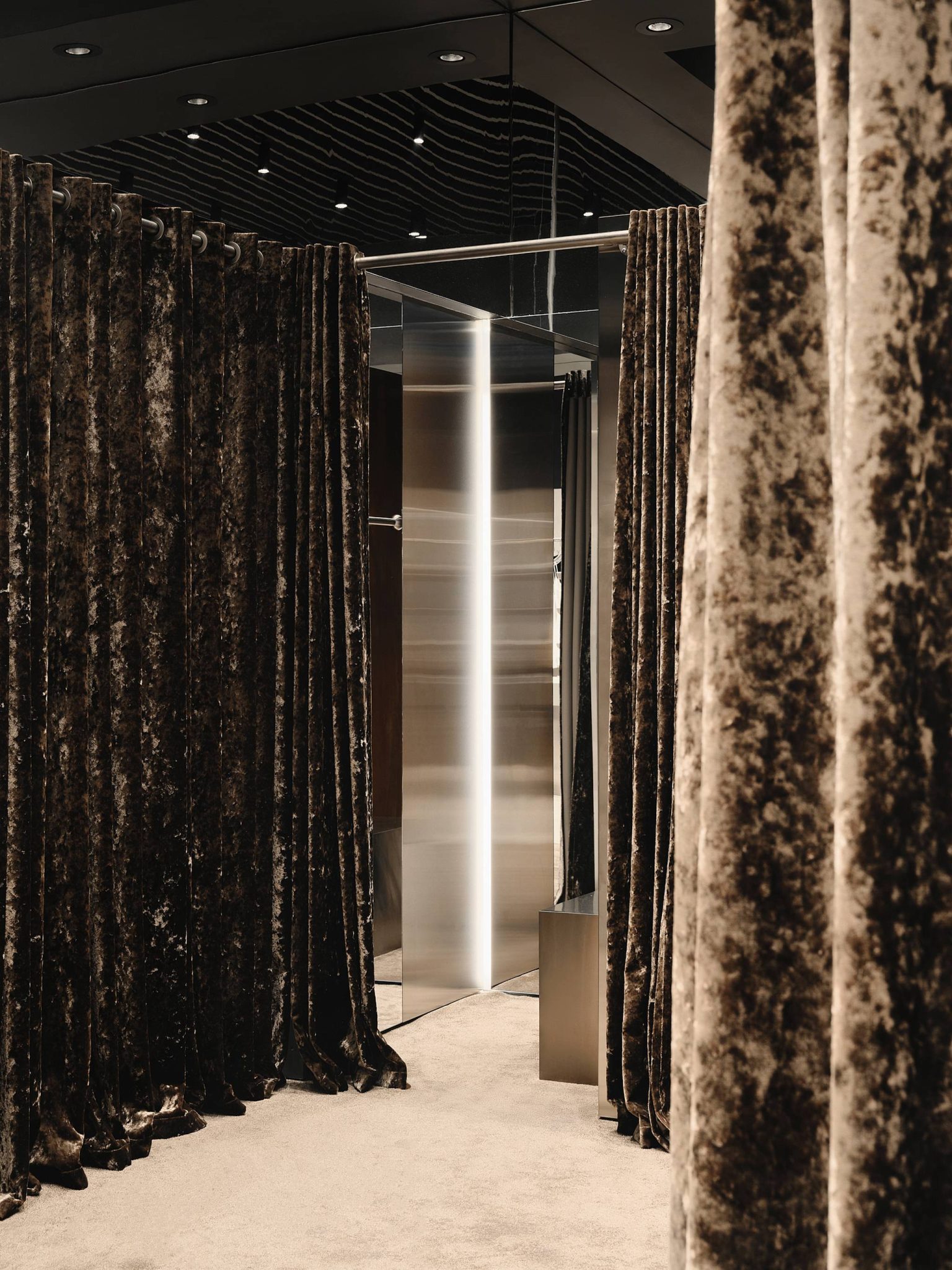
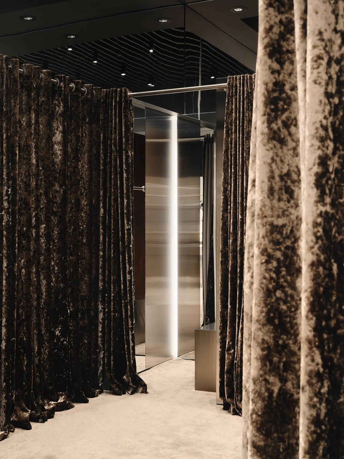
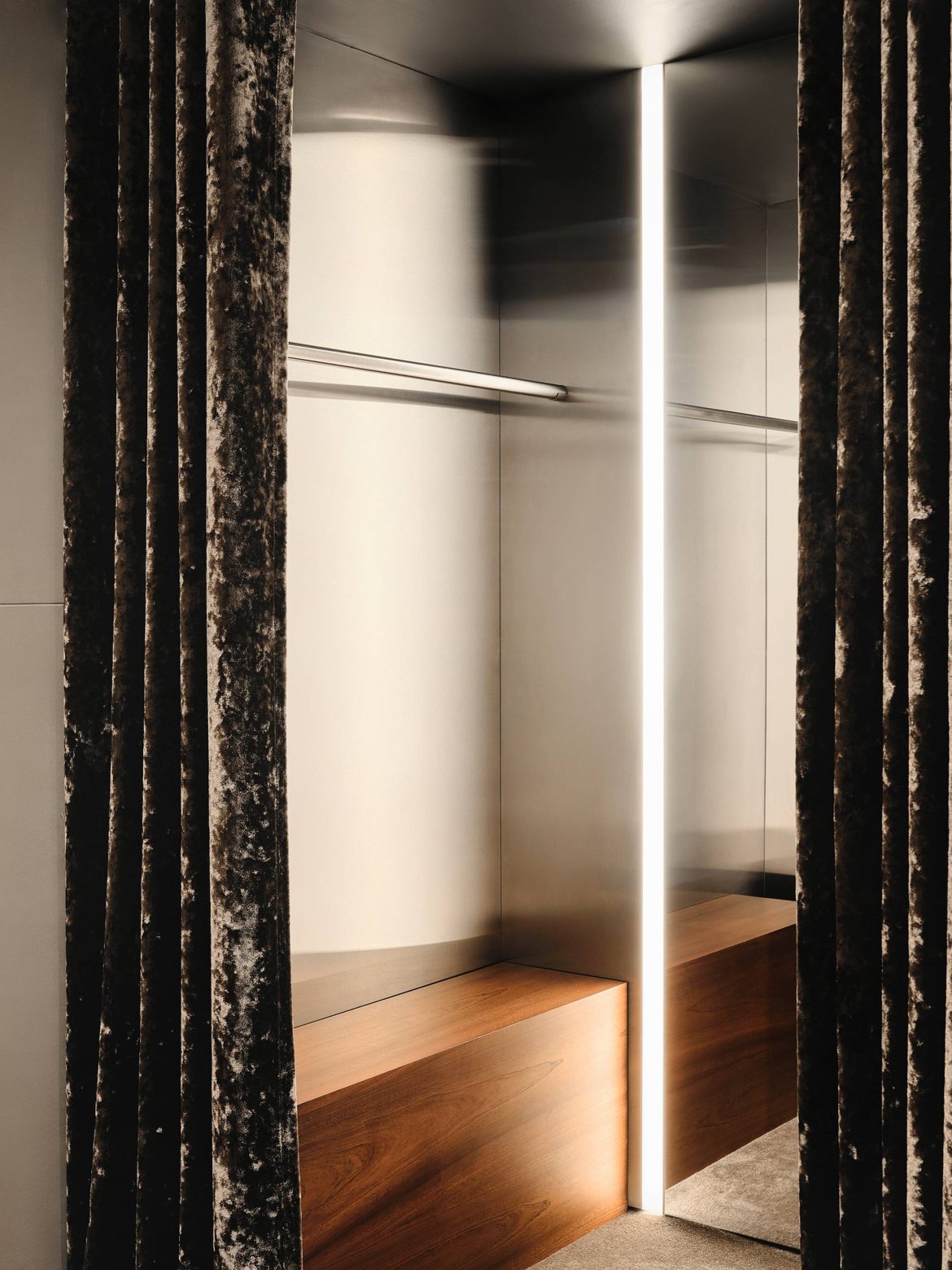
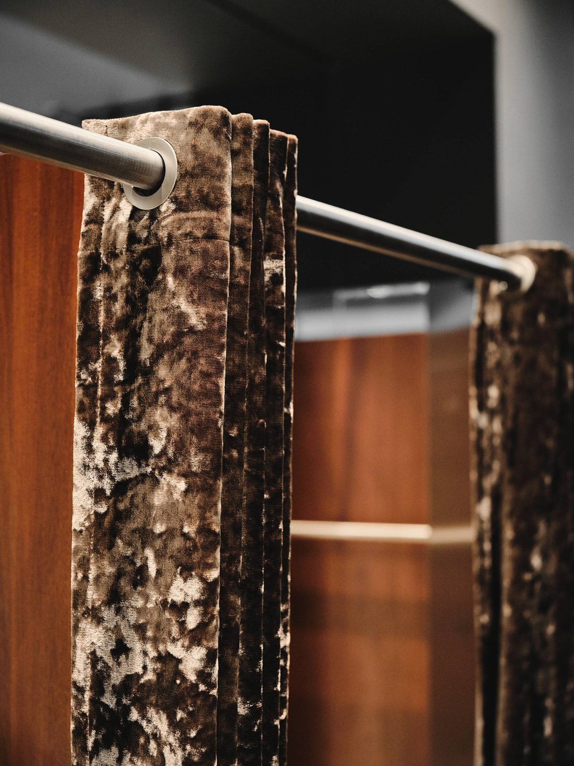
The fitting rooms are the most fully realized part of the project. We selected the curtain fabric, the carpet, and the wall tone so a visitor would feel as if they were stepping inside a piece of cloth. We designed the lighting here separately, together with the lighting studio Tochka Opory, combining frontal and overhead light so that mirror reflections would come out flattering. For an audience that actively photographs itself in fitting rooms, this is a functional detail, not a decorative gesture.
In contrast to the bright main floor, the fitting rooms are done in a dark, almost intimate palette — with a sheen in the carpet and fabric that produces an effect that feels less luxury-showroom and more unexpectedly personal. We wanted the shift from the main floor into the fitting room to feel like a change of state, not just a change in lighting.
YOU MIGHT ALSO LIKE
Materials and furniture
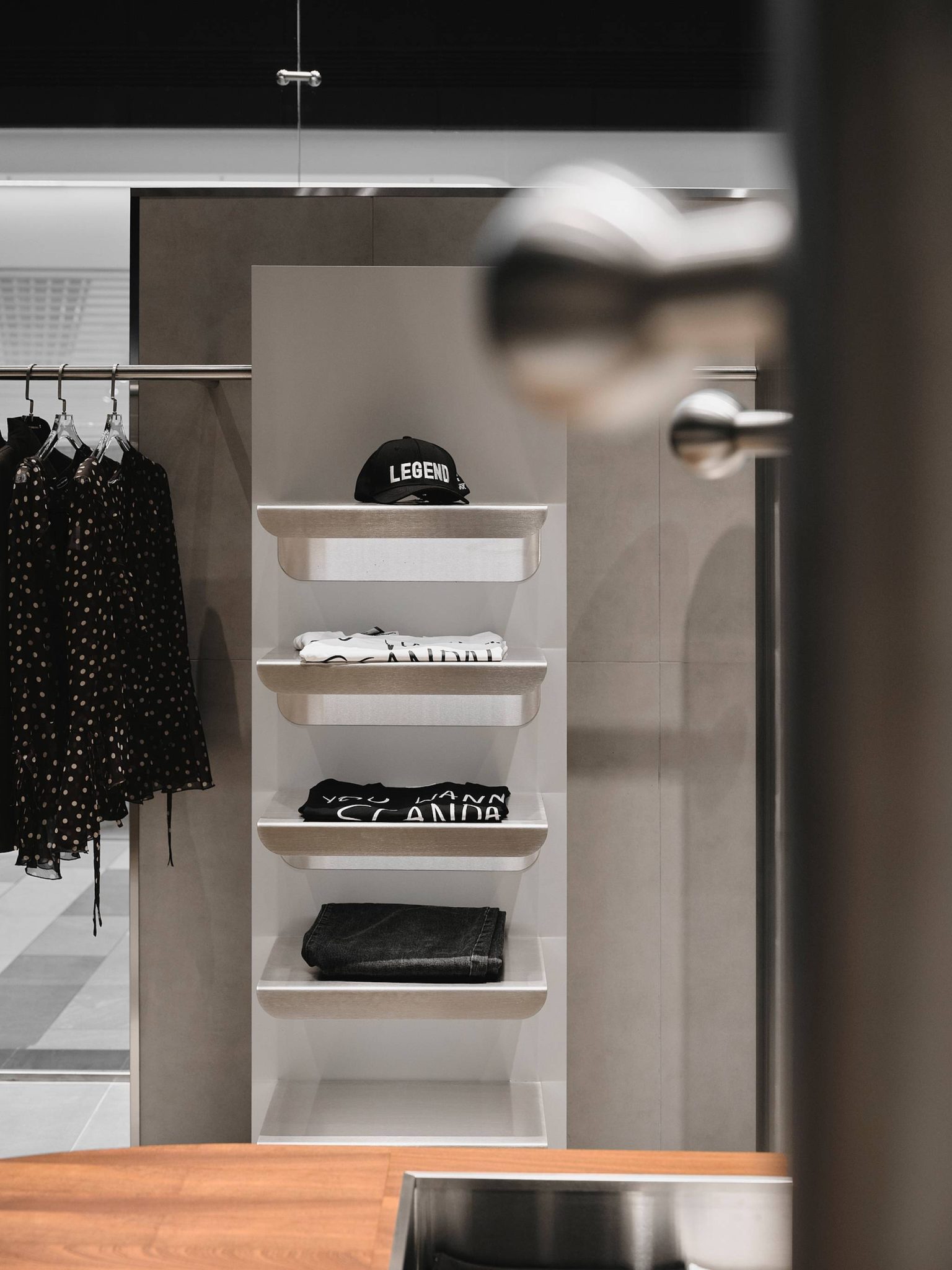
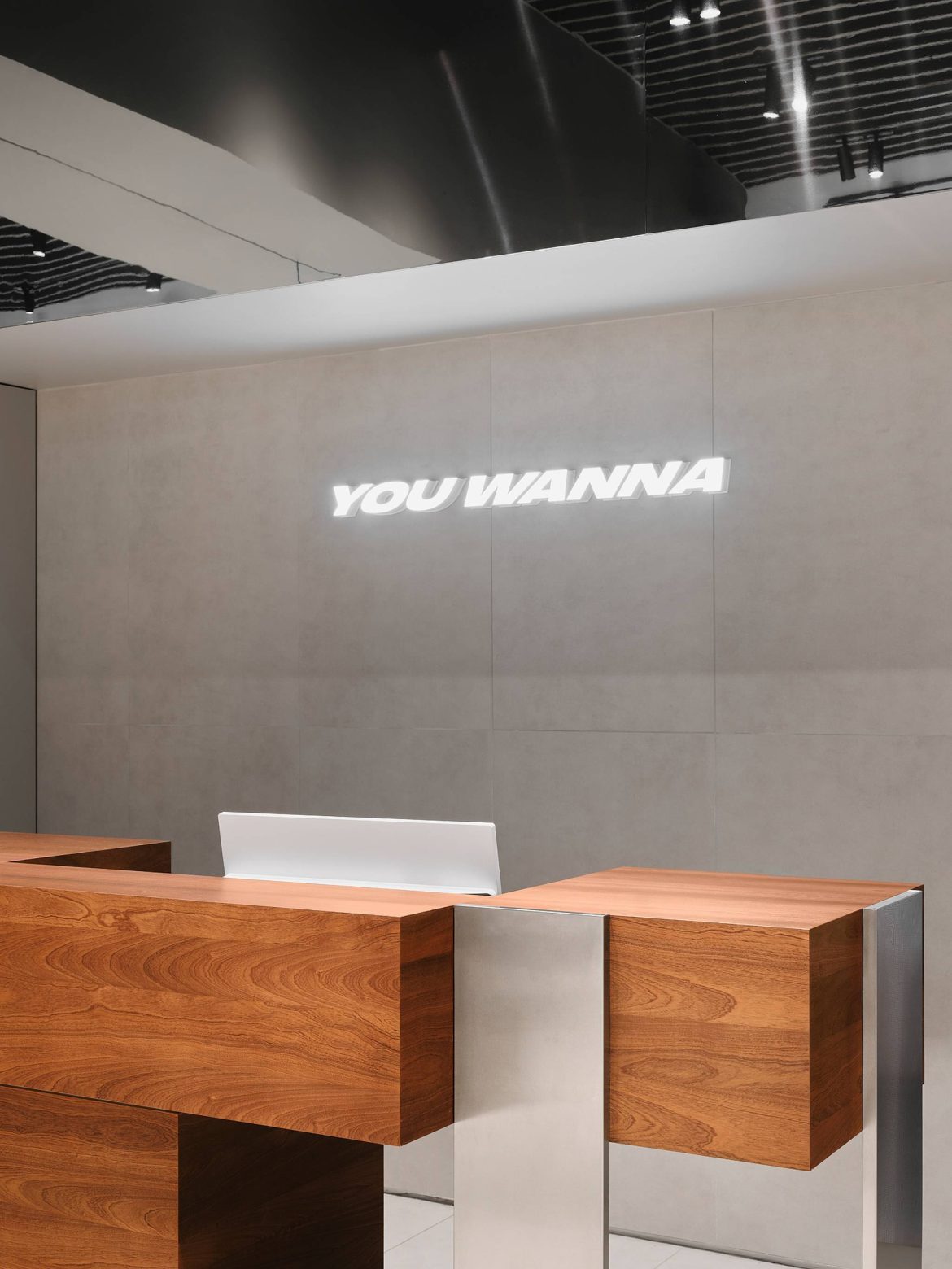
The store’s furniture was produced by Best Studio Group — primarily the fixtures: the checkout counter and two horizontally arranged tables of unusual shape, where the stainless steel is positioned to hold its own graphic presence in the space. Lighting fell under Tochka Opory’s scope, and we consider it one of the project’s strongest elements: even light gradients across the walls, with soft accents at focal points.
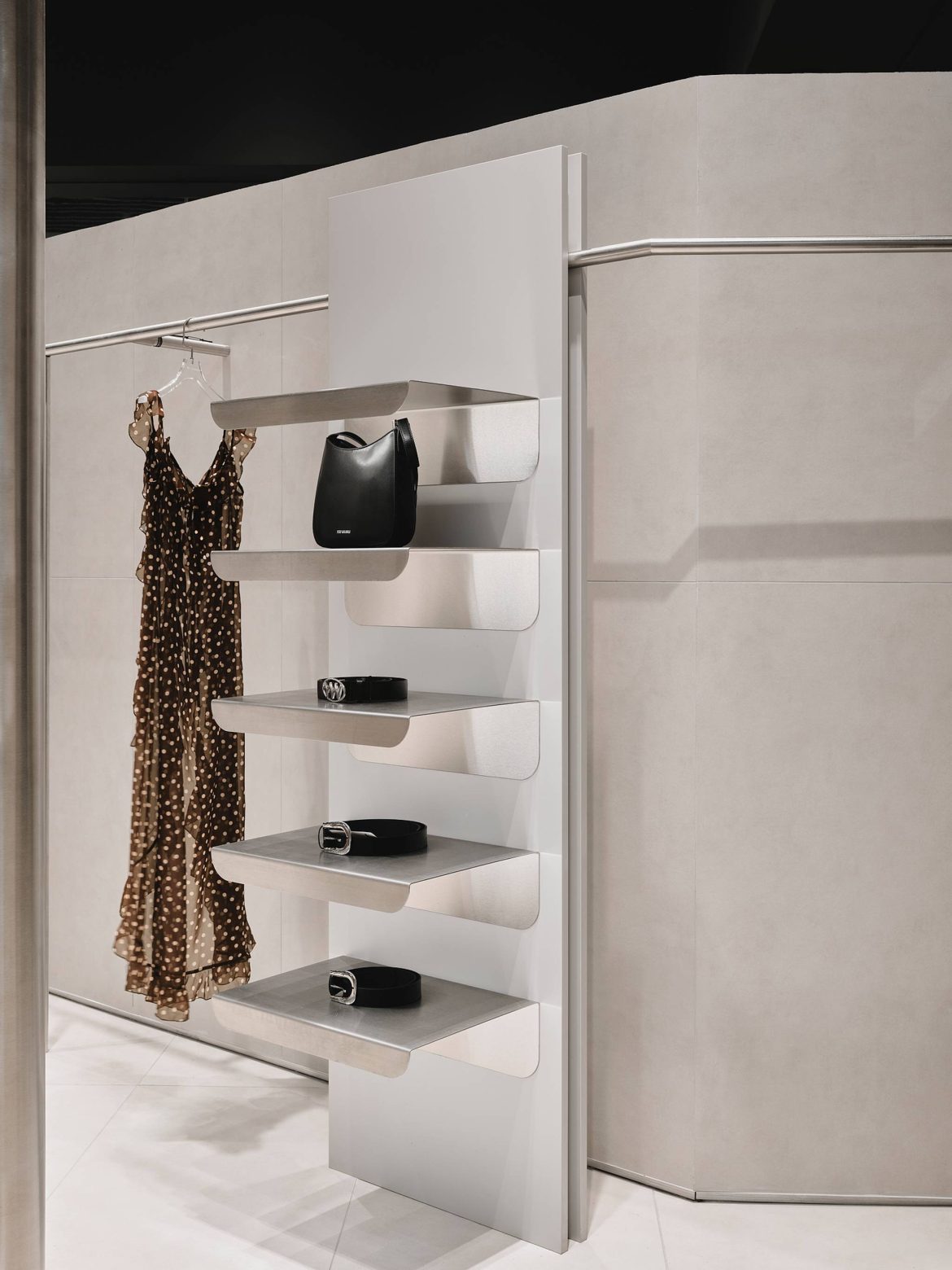
We deliberately avoided building the store around reference-based storytelling. No single spatial gesture here points to a specific image or style — this isn’t a showcase with a narrative. The brand’s form comes not from stories but from restrained, unusual materials and volumes: polished stainless steel, porcelain stoneware, draped fabric, sculptural accents at the entrance. It’s precisely this restraint that generates so many distinct, self-sufficient angles throughout the store — good both for customers photographing themselves and for photographing the space itself.
What changed during construction
Some decisions had to shift once work was underway. The open ceiling we’d originally planned was closed off by the contractors and covered with a grille. The semicircular column we intended to upholster in fabric ended up simply draped like a curtain, for budget reasons. The mirrored panel above the checkout area was replaced with Alucobond — the mall’s safety requirements don’t permit mirrors in that zone. One clear miss was the base of the plaster sculpture at the entrance: per the design, it was meant to be stainless steel, but during execution it was painted beige, which pulls it out of the space’s overall light and color logic. We didn’t include it in the final photography.
Approvals with the mall were not straightforward: the finer points of the visual concept took a long time to sign off, until we moved from email threads to a short call and resolved everything in one conversation. That’s become a rule we now try to apply on other projects too: half an hour on the phone saves weeks of back-and-forth over drawings and comments.
What we took from this project
The YOUWANNA store came out almost exactly as we’d originally envisioned it — a rare case where the built result matched the renderings nearly one to one. For us, it confirms that a brand’s working formula doesn’t need to rely on literal imagery: getting the temperature of materials, light, and the contrast between zones right is enough for a space to read as a recognizable brand identity — while still remaining scalable to the chain’s next locations.